


-
tdaniel2000Asked on December 14, 2017 at 7:27 AM
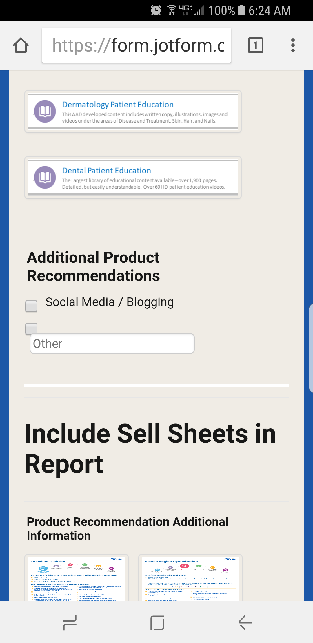
1) I'm using the Multiple Choice Properties feature on my form.
2) Under the tab "Options", you can select a button called "Display other Option"
Looks ok on the desktop
3) However when the form is viewed using a mobile browser on a Samsung S8 phone there is an alignment problem with the check box and the input field.
screenshot of phone attached, that's using Chrome, same thing happens on the Samsung mobile browser.
Please have this fixed ASAP
-
agonhasaniReplied on December 14, 2017 at 8:09 AM
You can fix that quickly if you add the following CSS code to your form:
.form-checkbox-item .form-checkbox-other-input {
width: 115px !important;
}
.form-checkbox-item label {
vertical-align: middle;
}
If you don't know how to inject Custom CSS, please take a look at the guide below
https://www.jotform.com/help/117-How-to-Inject-Custom-CSS-Codes
Please let me know if you have any problems.
-
Ardian_LReplied on December 14, 2017 at 11:11 AM
Hi,
The CSS code provided by @agonhasani is correct, but I would recommend to put this code just for mobile devices.
@media (max-width: 1024px){
.form-checkbox-item .form-checkbox-other-input {
width: 115px !important;
}
.form-checkbox-item label {
vertical-align: middle;
}
}
Please let us know if you have any other question.
- Templates
- Integrations
- INTEGRATIONS
- See 100+ integrations
- FEATURED INTEGRATIONS
 PayPal
- Slack
- Google Sheets
- Mailchimp
- Zoom
- Dropbox
- Google Calendar
- Hubspot
- Salesforce
- See more Integrations
- Products
- PRODUCTS
- Form Builder
- Jotform Enterprise
- Jotform Apps
- Store Builder
- Jotform Tables
- Jotform Inbox
- Jotform Mobile App
- Jotform Approvals
- Report Builder
- Smart PDF Forms
- PDF Editor
- Jotform Sign
- Jotform for Salesforce Discover Now
- Support
