


-
MiamiContainerAsked on December 14, 2017 at 10:37 AM
Good morning,
What can i do to get my form centered on the phone. Its shifted to the left on both portent and landscape. Looks ok on iPad.
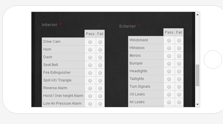
Also I'm trying to figure out how to make the Pass/Fail columns on my matrix table wider.
Thank you as always.
Page URL: https://form.jotform.com/73454095597166 -
Richie JotForm SupportReplied on December 14, 2017 at 11:11 AM
You can add this css codes in your form to adjust it to center.
@media (max-width:480px){
div.form-all{
margin-left:8px!important;
}
div.form-all:before{
background-size:100% 100%;
}
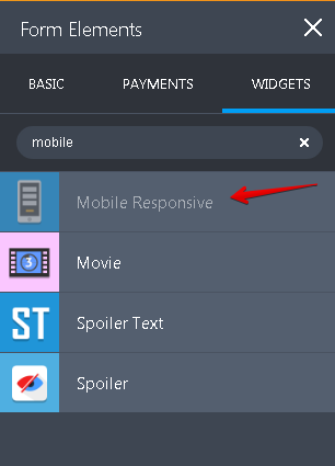
}then add the mobile responsive widget in your form to fix the matrix table.
Here is a guide on how to insert custom css. How-to-Inject-Custom-CSS-Codes
Please let us know if we can be of further assistance. -
MiamiContainerReplied on December 14, 2017 at 11:38 AM
thanks the CSS code works great for adjusting center on Portrait but on landscape its still all the way to the left.
-
Richie JotForm SupportReplied on December 14, 2017 at 12:10 PM
I'm sorry, I forgot to place the css code for the landscape view.
Here is the code .
@media(max-width:600px) and (min-width:481px){
.form-line{
margin-left:20px;/* you can edit the margin*/
}
#label_17{
position: absolute;
margin-top: -360px;
margin-left: 261px;
}
#cid_17{/* this is the code for the exterior matrix table*/
position: absolute;
margin-top: -345px;
margin-left: 291px;
}
}I have adjusted the matrix table to align correctly.
Please let us know if we can be of further assistance.
-
MiamiContainerReplied on December 14, 2017 at 12:30 PM
code is not working for me when i paste it in.
Also how do i make the pass, fail column wider I've searched for code but none of them seem to work
-
Mike_G JotForm SupportReplied on December 14, 2017 at 2:31 PM
Although the first set of codes my colleague, Richie_P, provided work, can you try replacing those with the CSS codes below and see if that works for you.
.form-all {
margin-left: auto !important;
margin-right: auto !important;
}
As for the making the "Pass" and "Fail" columns of the two matrix table in your form wider, please try the following CSS codes below.
td.form-matrix-values .form-radio {
width: 50px !important;
}
Note: You can adjust the numbers highlighted in yellow to your preferred column width size.
If you have other questions or concerns, please feel free to contact us again anytime.
-
MiamiContainerReplied on December 15, 2017 at 9:09 AM
awesome codes work great however is there anyway to center the radio buttons inside the cell?
-
BJoannaReplied on December 15, 2017 at 10:38 AM
I inspected your form and the radio buttons are centered on my end.
However, I do not have an iPhone to test the form there. Can you please provide us a screenshot from your end?
You can also try to add this CSS code to see if that fix the issue on your end:
td.form-matrix-values{
margin-left: auto !important;
margin-right: auto !important;
}
-
MiamiContainerReplied on December 15, 2017 at 10:44 AM

-
BJoannaReplied on December 15, 2017 at 12:23 PM
Please try with this CSS code:
@media only screen and (max-width: 550px){
td.form-matrix-values{
padding-right:40px!important;
}
}
-
MiamiContainerReplied on December 15, 2017 at 12:54 PM
that seemed to just make the columns wider.
-
Mike_G JotForm SupportReplied on December 15, 2017 at 2:16 PM
I was able to reproduce the issue you described in your screenshot when I checked it from an iPhone 6S+ emulator.

To fix the issue, may I suggest you add the following CSS codes to your form, please?
@media only screen and (min-device-width : 375px) and (max-device-width : 667px) {
td.form-matrix-values .form-radio {
position: relative !important;
left: 18px !important;
}
}
I hope this helps. If you have other questions or concerns, please feel free to contact us again anytime.
- Templates
- Integrations
- INTEGRATIONS
- See 100+ integrations
- FEATURED INTEGRATIONS
 PayPal
- Slack
- Google Sheets
- Mailchimp
- Zoom
- Dropbox
- Google Calendar
- Hubspot
- Salesforce
- See more Integrations
- Products
- PRODUCTS
- Form Builder
- Jotform Enterprise
- Jotform Apps
- Store Builder
- Jotform Tables
- Jotform Inbox
- Jotform Mobile App
- Jotform Approvals
- Report Builder
- Smart PDF Forms
- PDF Editor
- Jotform Sign
- Jotform for Salesforce Discover Now
- Support


