


-
loganpeakdentalAsked on December 14, 2017 at 4:16 PM
Hello jot form Friends :)
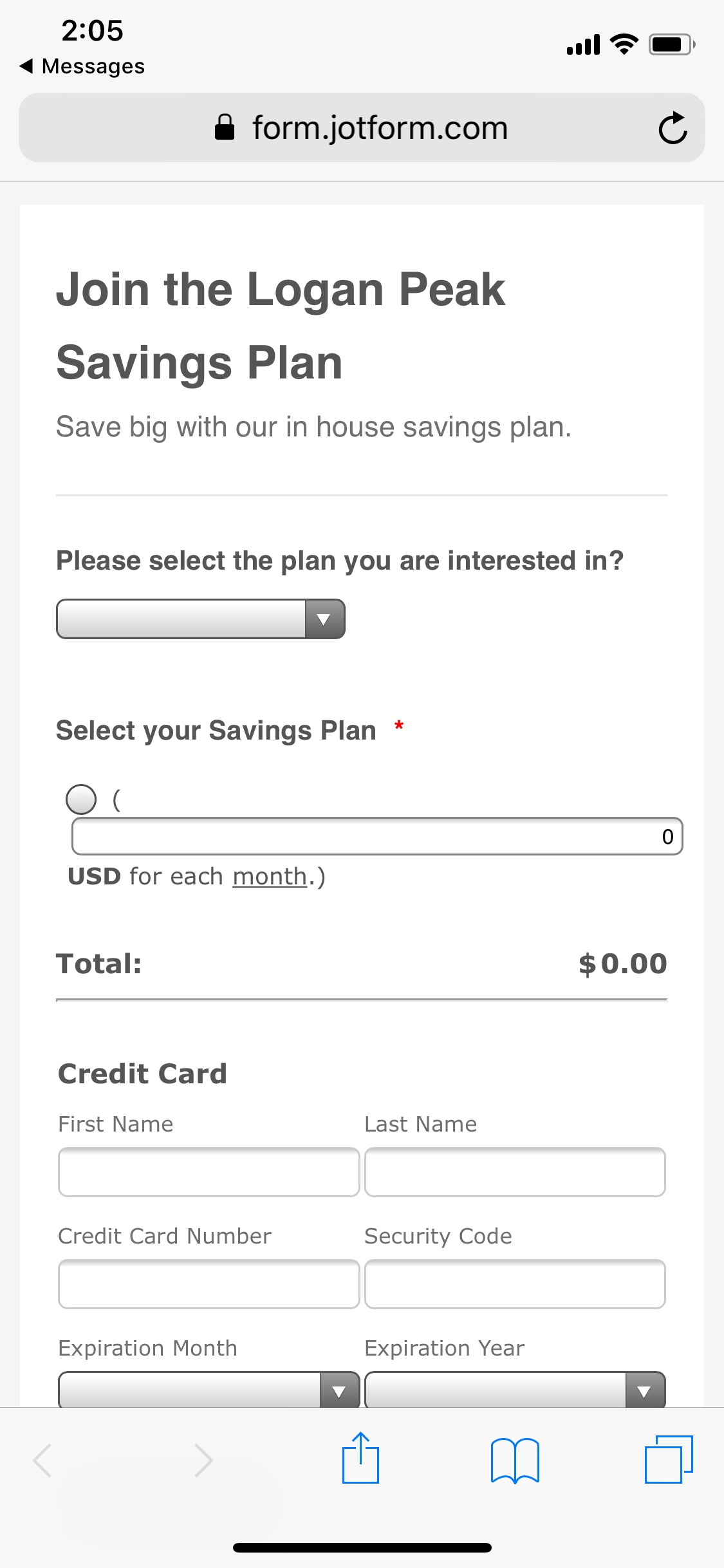
1) We are having a formatting problem with our Authorize.net integration for mobile devices. (see screenshot) Is there a way for us to fix the problem with the parenthesis going to the next line right under select your savings plan?
2) Is there a way to make the radio buttons larger on mobile? sometimes is a bit difficult to press them
3) We have some simple math calculations going on in this form... however, if they have selected on part of the form list already, but then go to the first question and swap to a different plan, it doesn't remove the current calculation (because it is still selected in the radio buttons that were just hidden and swapped with a different list because of the 1st choice question). Is there any way to get that reset if someone were to change their mind in the middle of filling out their form? I'm drawing a blank on how to do that...Thank you for you help!
 Page URL: https://form.jotform.com/73465311193151
 -
agonhasaniReplied on December 14, 2017 at 5:10 PM
The first two problems are solved if Inject the following CSS code to your form:
@media screen and (max-width: 480px),
screen and (max-device-width: 767px) and (orientation: portrait),
screen and (max-device-width: 415px) and (orientation: landscape) {
/*fixes parenthesis problem*/
.form-product-custom_price {
width: 100px !important;
}
/*fixes radio buttons size problem*/
.form-radio {
width: 20px !important;
height: 20px !important;
}
.form-radio-item label {
vertical-align: bottom;
}
}
If you don't know how to inject Custom CSS code to your form, see this guide:
https://www.jotform.com/help/117-How-to-Inject-Custom-CSS-Codes
As for the third problem, do the calculation when the answer to the first question changes. So an UPDATE / CALCULATE FIELD conditional when answer 1 Is Filled.
-
jonathanReplied on December 14, 2017 at 7:33 PM
As suggested already please inject the custom CSS code on your form
@media screen and (max-width: 480px),
screen and (max-device-width: 767px) and (orientation: portrait),
screen and (max-device-width: 415px) and (orientation: landscape) {
/*fixes parenthesis problem*/
.form-product-custom_price {
width: 100px !important;
}
/*fixes radio buttons size problem*/
.form-radio {
width: 20px !important;
height: 20px !important;
}
.form-radio-item label {
vertical-align: bottom;
}
}
It should work and will work like this

the other question is about a different feature. We will fix it here
https://www.jotform.com/answers/1324042
- Templates
- Integrations
- INTEGRATIONS
- See 100+ integrations
- FEATURED INTEGRATIONS
 PayPal
- Slack
- Google Sheets
- Mailchimp
- Zoom
- Dropbox
- Google Calendar
- Hubspot
- Salesforce
- See more Integrations
- Products
- PRODUCTS
- Form Builder
- Jotform Enterprise
- Jotform Apps
- Store Builder
- Jotform Tables
- Jotform Inbox
- Jotform Mobile App
- Jotform Approvals
- Report Builder
- Smart PDF Forms
- PDF Editor
- Jotform Sign
- Jotform for Salesforce Discover Now
- Support


