


-
appshopAsked on December 17, 2017 at 12:41 AM
Trying to build a responsive time sheet for drivers to submit start and finish times on each day of the week. Started by adding a widget / Multi Select Grid.
Unfortuantely the grid doesn't appear to be responsive. Prefer no scrolling and for users to just touch day/time start and finish, complete other details (still to be added) then submit.
Any ideas?
Thank you
Kind regards
Brad
-
Elton Support Team LeadReplied on December 17, 2017 at 1:17 AM
You are using the new form layout which has a height limit on each page. Switch your form to the standard layout, that should help.
Here's how:
1. Go to Settings > Form Settings > Show More Options
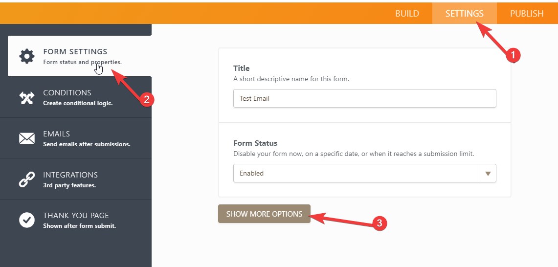
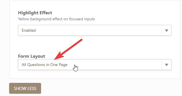
2. Scroll down and look for the Form Layout then select All Questions in One Page.
3. Go back to Build tab then preview the form. It should display the full grid.
If you need further assistance, let us know.
-
appshopReplied on December 17, 2017 at 3:49 AM
Thank you EltonCris,
Do you know if we can access the css to change column width and row height on this particular widget? Have had a look but there appears to be limited access.
Kind regards
Brad
-
John_BensonReplied on December 17, 2017 at 4:29 AM
Hi Brad,
Yes, you can add custom CSS code to some widget. To do that, please follow this guide: https://www.jotform.com/help/428-How-to-Inject-CSS-Codes-to-Widgets
Please keep in mind that it will not work on Card form or Single Questions in One Page.
I hope this helps. Please contact us again if you need assistance.
-
appshopReplied on December 17, 2017 at 5:23 PM
Thanks John_Benson
I'm not able to find the css id/class for the columns and rows in this widget.
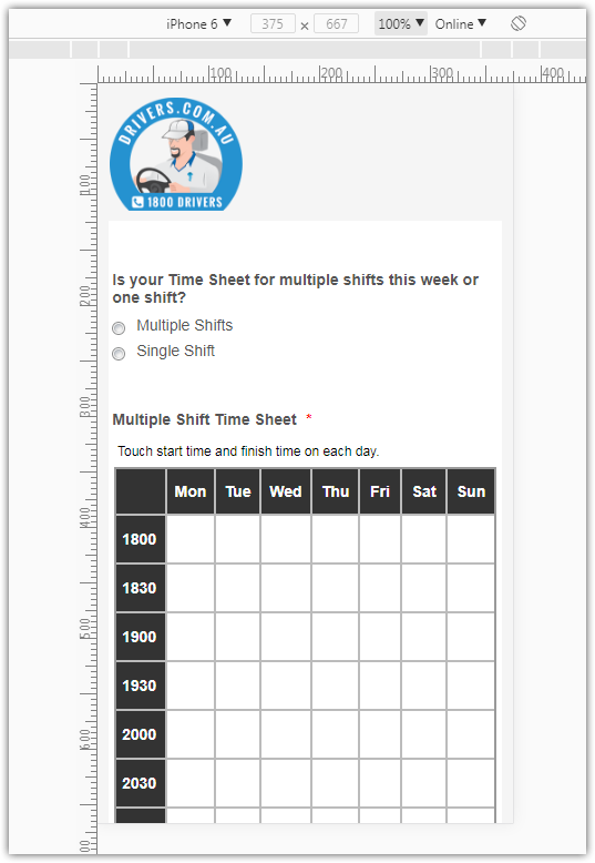
Do you have any ideas on how we can make the section for multiple shifts in the Time Sheet more mobile user friendly and if there is limited customisation of this widget are you able to make a recommendation or give us a price on developing an easy to use multiple day/24hour start and finish time selector? - https://form.jotform.co/appshop/1800drivers
Thank you
Kind regards
Brad
-
MikeReplied on December 17, 2017 at 6:03 PM
We do not offer development services.
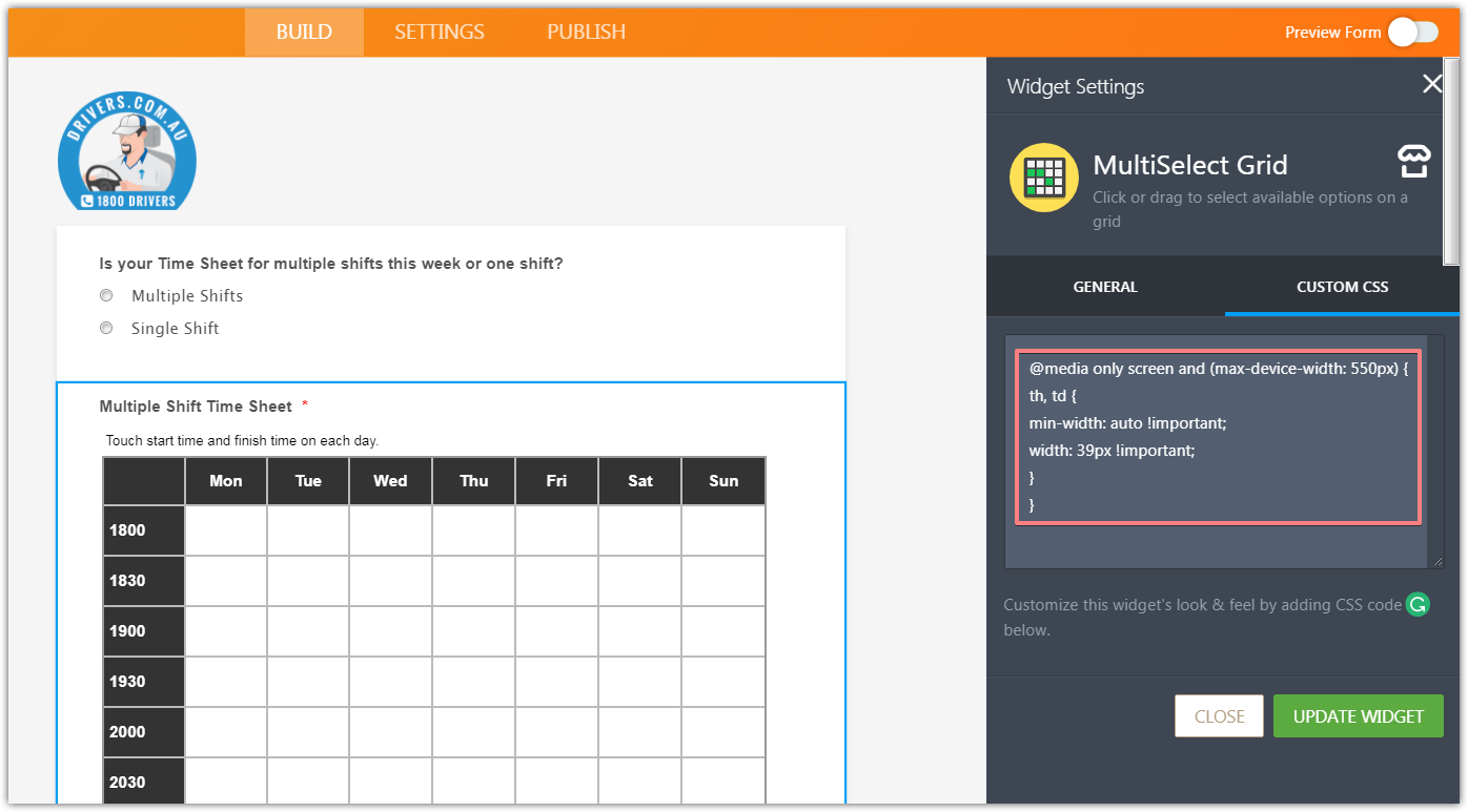
Please try adding the next CSS to the widget:
@media only screen and (max-device-width: 550px) {
th, td {
min-width: auto !important;
width: 39px !important;
}
}
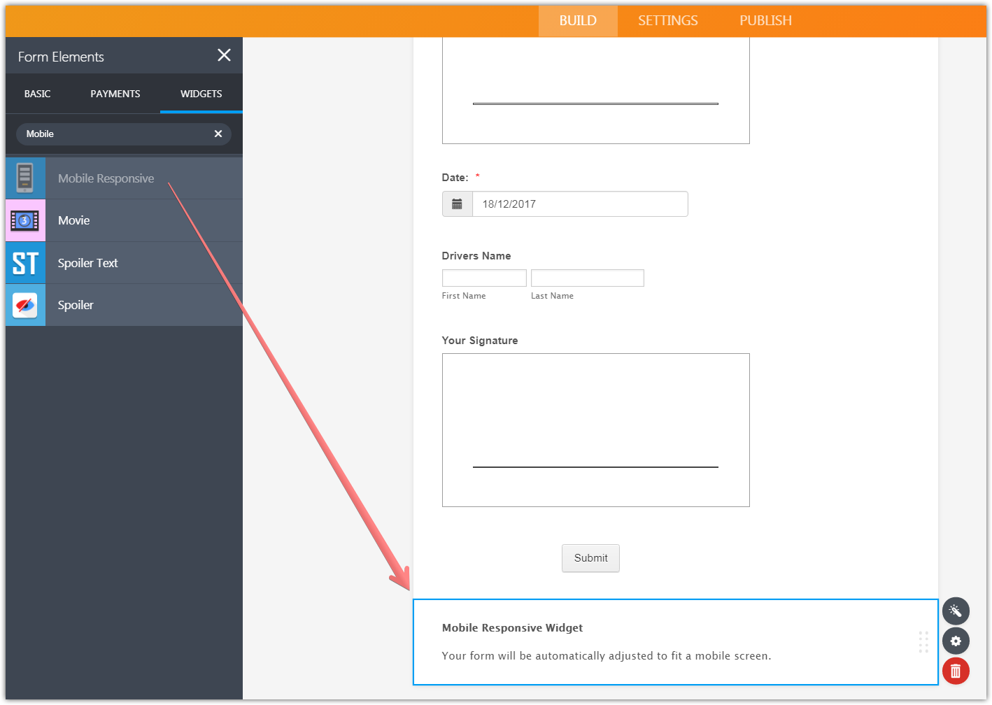
Also, add a Mobile Responsive widget to the form.
Result:
Thank you.
- Templates
- Integrations
- INTEGRATIONS
- See 100+ integrations
- FEATURED INTEGRATIONS
 PayPal
- Slack
- Google Sheets
- Mailchimp
- Zoom
- Dropbox
- Google Calendar
- Hubspot
- Salesforce
- See more Integrations
- Products
- PRODUCTS
- Form Builder
- Jotform Enterprise
- Jotform Apps
- Store Builder
- Jotform Tables
- Jotform Inbox
- Jotform Mobile App
- Jotform Approvals
- Report Builder
- Smart PDF Forms
- PDF Editor
- Jotform Sign
- Jotform for Salesforce Discover Now
- Support


