


-
papelezAsked on December 18, 2017 at 5:13 AM
-
Nik_CReplied on December 18, 2017 at 5:20 AM
You can try adjusting the width of the map widget field (I assume you're referring to that field when viewed on a mobile) and see if shrinking it a bit would work better:

Since there is no other way to adjust that field for mobile devices.
Let us know if that could work for you so we can escalate the issue further.
Thank you!
-
papelezReplied on December 18, 2017 at 9:10 AM
Yes I have already tried that but the address text field also shrinks with it. Is there a way to put the field title above the text box... at least that way it doesnt need to add up to the width of the field
-
papelezReplied on December 18, 2017 at 9:18 AM
Or alternatively is there any way to hide the address fields on the gmap widget. Add a separate address field and have a rule that will auto populate the gmap address field with it.
-
Elton Support Team LeadReplied on December 18, 2017 at 10:19 AM
Separating the fields isn't possible. You can't also customize the map or inject custom CSS codes due to the new form layout restriction.
The easier way to overcome this is to switch to the standard form layout if you like.
Here's how:
1. Go to Settings > Form Settings > Show More Options
2. Look for Form Layout then select "All Questions in One Page"
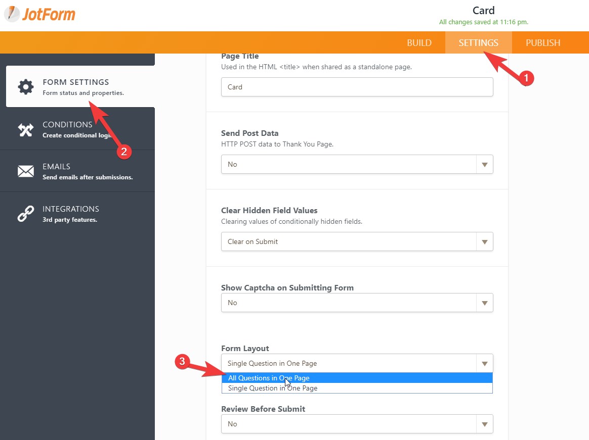
The standard form layout should automatically make the widgets responsive. If not, it can be easily customized by injecting custom CSS codes to it.
Hope this will help!
- Templates
- Integrations
- INTEGRATIONS
- See 100+ integrations
- FEATURED INTEGRATIONS
 PayPal
- Slack
- Google Sheets
- Mailchimp
- Zoom
- Dropbox
- Google Calendar
- Hubspot
- Salesforce
- See more Integrations
- Products
- PRODUCTS
- Form Builder
- Jotform Enterprise
- Jotform Apps
- Store Builder
- Jotform Tables
- Jotform Inbox
- Jotform Mobile App
- Jotform Approvals
- Report Builder
- Smart PDF Forms
- PDF Editor
- Jotform Sign
- Jotform for Salesforce Discover Now
- Support


