


-
mcozzieAsked on December 26, 2017 at 6:14 PM
The tabs do not look good on the page. Each tab is a different length and not centered on the page. Wondering if there is some CSS to make it look better. Here is the current view:

Here is what I would like to see:

Thanks!
Michael
-
Kevin Support Team LeadReplied on December 26, 2017 at 7:40 PM
You may achieve something similar doing the following:
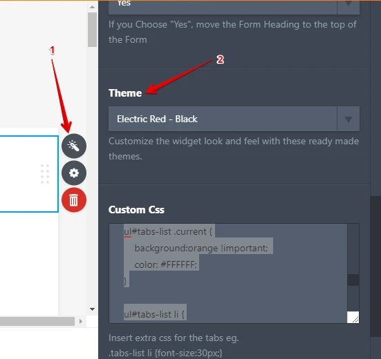
1. Select the theme "Electric Red" on the form tabs widget settings:
2. Inject the following CSS code to the widge, the option will be found under the widget settings as well:
ul#tabs-list .current {
background:orange !important;
color: #FFFFFF;
}
ul#tabs-list li {
background: #FFFFFF !important;
color: #000000;
border-top: 4px solid orange;
width: 216px;
margin: 0px !important;
padding-right: 5px;
padding-left: 5px;
}
ul#tabs-list {
margin: 0px !important;
padding: 0px !important;
top: 0px;
}
.form-all{
padding-top: 0px;
border-top: 0px solid transparent;
}
3. Increase the form's width to 1130px:
 Here is an example about how it will work: https://form.jotform.com/73597069196978
 Feel free to clone my form following this guide: https://www.jotform.com/help/42-How-to-Clone-an-Existing-Form-from-a-URL
I hope this helps.
-
mcozzieReplied on December 26, 2017 at 8:19 PM
This worked great thanks!
- Templates
- Integrations
- INTEGRATIONS
- See 100+ integrations
- FEATURED INTEGRATIONS
 PayPal
- Slack
- Google Sheets
- Mailchimp
- Zoom
- Dropbox
- Google Calendar
- Hubspot
- Salesforce
- See more Integrations
- Products
- PRODUCTS
- Form Builder
- Jotform Enterprise
- Jotform Apps
- Store Builder
- Jotform Tables
- Jotform Inbox
- Jotform Mobile App
- Jotform Approvals
- Report Builder
- Smart PDF Forms
- PDF Editor
- Jotform Sign
- Jotform for Salesforce Discover Now
- Support


 Here is an example about how it will work: