
-
mcozzieAsked on January 8, 2018 at 3:57 PM
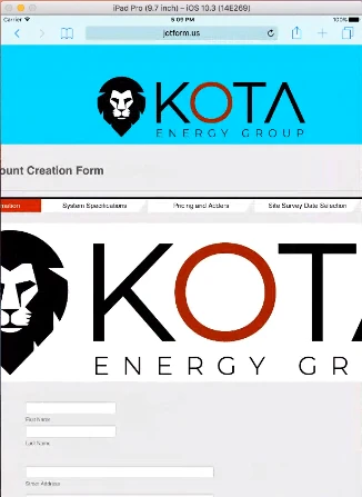
My logo doesn't format to fit different screens on different devices. I've tried it both as a logo and as an image element added to the form.
As a logo, it doesn't fit the iPhone or iPad in portrait view.
As an image it only works on the iPhone in portrait.
-
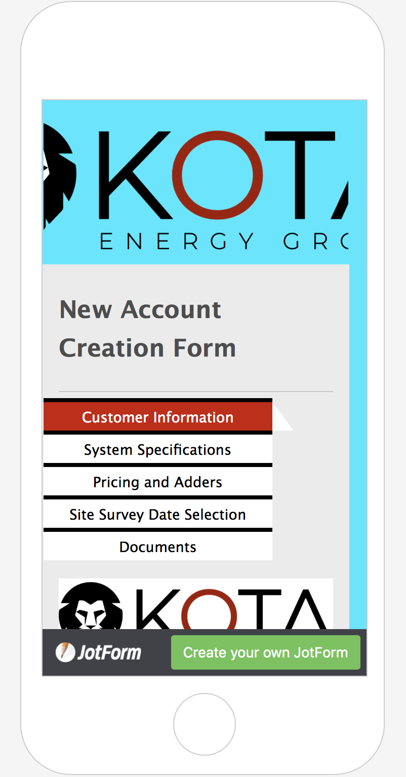
Kevin Support Team LeadReplied on January 8, 2018 at 5:15 PM
I have checked your form and it seems to be cutting off on iPhone devices, but this code should help you correcting that:
@media screen and (max-device-width: 667px){
.form-all:before {
background-size: 325px 105px !important;
}
}
This guide will help you injecting the code to your form: https://www.jotform.com/help/117-How-to-Inject-Custom-CSS-Codes
I also checked your form in an iPad emulator and it works like this:
Please inject the code and let us know how it goes.
- Templates
- Integrations
- INTEGRATIONS
- See 100+ integrations
- FEATURED INTEGRATIONS
 PayPal
- Slack
- Google Sheets
- Mailchimp
- Zoom
- Dropbox
- Google Calendar
- Hubspot
- Salesforce
- See more Integrations
- Products
- PRODUCTS
- Form Builder
- Jotform Enterprise
- Jotform Apps
- Store Builder
- Jotform Tables
- Jotform Inbox
- Jotform Mobile App
- Jotform Approvals
- Report Builder
- Smart PDF Forms
- PDF Editor
- Jotform Sign
- Jotform for Salesforce Discover Now
- Support