


-
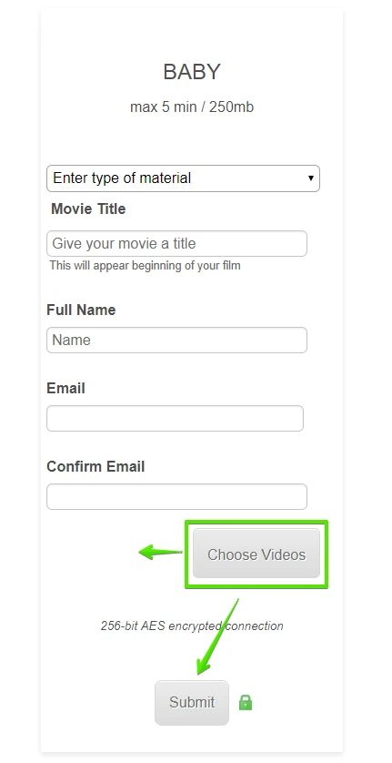
movzAsked on January 12, 2018 at 2:19 PM
I did look here https://www.jotform.com/answers/554353-Center-File-Upload-and-submit-buttons
But can't that to work for me. Did some simple adjusting the form in Form Designer and suddenly things went pear shaped. The text on the Upload button decided to sit at the top instead of middle. What am I missing?
Pls take a look at the form any help much appreciated.
-
AdrianReplied on January 12, 2018 at 3:45 PM
I have added this Custom CSS to your form:
.qq-uploader {
width: auto !important;
}
.form-all .qq-upload-button {
line-height: 40px;
margin-left: auto;
margin-right: auto;
}
.form-all .form-submit-button {
height: 60px;
}
Here is a guide on how you can Inject Custom CSS to your form:
https://www.jotform.com/help/117-How-to-Inject-Custom-CSS-Codes
Kindly refresh the form and let us know if you have further questions.
-
movzReplied on January 12, 2018 at 6:54 PM
Thank you. Now the upload button (choose videos) is expanded 10-20pix to the right.
The form builder preview looks perfect, real world is different.
Embedded and on the computer it's slight off centre but no expanding at least.
On mobile phone both safari & chrome it expands to the right.
any thoughts?
-
John_BensonReplied on January 12, 2018 at 9:03 PM
Do you want to center the "Choose Videos" button on your form?
(Screenshot is taken on the form direct link)
Also, I checked the form in the Form Builder and it is almost the same location except for the size. Here's a screenshot of taken from the Form Builder:
When you say embedded, did you mean you embedded the form to a website? If yes, please provide the link so we can check it further.
We'll wait for your reply. Thank you.
-
movzReplied on January 13, 2018 at 8:55 PM
No it was to do with the text within the 'Choose Video' which was at the top of the button, that somehow resolved it self after a bit of fiddling around in designer.
Yes it's embedded into a Wix webpage https://flmjet6.wixsite.com/mysite/copy-of-trim-tidy-1, who tends to block upper level privileges for third party apps but that's not the issue with this particular thing.
While I got you there's a huge discrepancy between what I see on Jotform and real world.
To compare between what you show me and what see myself in on the Jotform here's a screen grab from both my iphone5 and my laptop both using safari but have also tested in chrome with same result.
So one is never sure if what I do in Jotform is also actually happening in actuality.

-
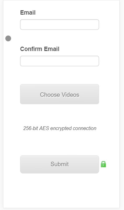
Elton Support Team LeadReplied on January 14, 2018 at 12:31 AM
Are you referring to the two buttons that expands to the right?
If yes, you can fix it by injecting the following CSS codes to your form.
@media screen and (max-width:480px){
.form-line {padding: 12px !important;}
.form-submit-button.icon-encrypt:before {width: 22px;right: -24px;}
}
Guide: http://www.jotform.com/help/117-How-to-Inject-Custom-CSS-Codes
Result:
If I have missed something, let us know.
-
movzReplied on January 14, 2018 at 8:46 AM
Yes was referring to the upload (choose videos) & the submit button.
My iphone shows all form fields correct length, on my mac browsers (safari, chrome & opera) those two buttons & the dropdown are longer than the text fields.
In the Jotform simulator the builder & form designer & preview they are all off?!
Injected your CSS but no change.
-
John_BensonReplied on January 14, 2018 at 10:58 AM
Thank you for the added information.
Let me check this further. I will contact you again once I am done creating the custom CSS code.
-
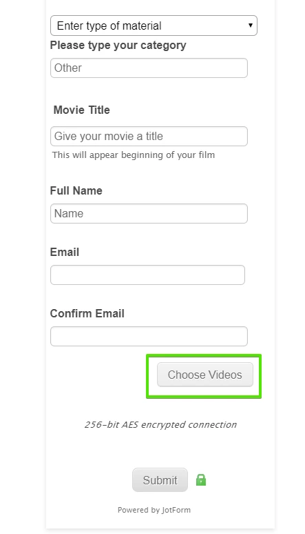
John_BensonReplied on January 14, 2018 at 1:08 PM
Please check this cloned form: https://form.jotform.com/80135150404947
If that is what you're trying to achieve, please follow this guide:
1. Open the form in the Form Builder.
2. Select the Upload field and change the Label Alignment to Top.

3. Add this custom CSS code to your form:
[data-type="control_dropdown"] .form-dropdown {
max-width: none !important;
}
[data-type="control_dropdown"] .form-input-wide {
max-width: none !important;
}
@media only screen and (max-width: 40em) {
.form-all .form-textbox, .form-all .form-dropdown {
width: 100% !important;
}
#input_10 {
width: 100% !important;
}
#input_9 {
width: 490px !important;
}
#input_2 {
width: 90%;
}
#id_9, #id_6, #id_8, #id_13 {
width: 95% !important;
}
}
@media only screen and (max-width: 30em) {
#input_9 {
width: 252px !important;
}
}
#input_2 {
width: 85%;
}
I hope this works. If not, please let us know. Thank you.
-
movzReplied on January 14, 2018 at 1:38 PM
That's great I really appreciate this, the only thing is every time I get help with CSS due to my lack of CSS knowledge it just gets piled on top of what's already there and suddenly I get lost in what's what and the form gets errors.
I am learning and take onboard all the gold nuggets I get from support, but it's a difficult learning curve.If you don't mind could you please help me with what I need to change as one of the text fields (Movie Title) is suddenly expanded off screen.
Iphone

.form-all {
margin-top : -50px !important;
}
.form-line {
padding-left : 15px;
padding : 5px;
}
.qq-uploader {
width : auto !important;
}
.qq-upload-list:empty {
display : none !important;
}
.qq-upload-list {
overflow-y : scroll !important;
max-height : 280px !important;
height : 250px !important;
margin : 10px 0;
padding : 0;
list-style : none;
}
.form-all .qq-upload-button {
line-height : 40px;
margin-left : auto;
margin-right : auto;
}
.form-all .form-submit-button {
height : 50px;
}
.form-dropdown {
height : 30px;
width : 100%;
}
.form-section.page-section {
}
#input_10 {
font-size : 16px;
padding : 5px;
}
.form-textbox {
}
#input_11 {
padding : 5px;
}
.form-label.form-label-top {
}
#label_11 {
padding : 5px px px px;
}
#input_9 {
padding : 5px;
}
#input_6 {
padding : 5px;
}
#input_13 {
padding : 5px;
}
#label_9 {
padding : 5px;
}
.form-sub-label {
}
.form-buttons-wrapper {
}
@media screen and (max-width:480px){
.form-line {padding: 12px !important;}
.form-submit-button.icon-encrypt:before {width: 22px;right: -24px;}
}
[data-type="control_dropdown"] .form-dropdown {
max-width: none !important;
}
[data-type="control_dropdown"] .form-input-wide {
max-width: none !important;
}
@media only screen and (max-width: 40em) {
.form-all .form-textbox, .form-all .form-dropdown {
width: 100% !important;
}
#input_10 {
width: 100% !important;
}
#input_9 {
width: 490px !important;
}
#input_2 {
width: 90%;
}
#id_9, #id_6, #id_8, #id_13 {
width: 95% !important;
}
}
@media only screen and (max-width: 30em) {
#input_9 {
width: 252px !important;
}
}
#input_2 {
width: 85%;
}
-
Welvin Support Team LeadReplied on January 14, 2018 at 2:06 PM
I've fixed it. You have the following custom CSS codes in the form:
@media only screen and (max-width: 30em) {
#input_9 {
width: 252px !important;
}
}
#input_9 {
width: 490px !important;
}
These are duplicates. I remove the one with 490px and change 252px to 100%. That fixed it.
Let us know if you need further assistance.
-
movzReplied on January 14, 2018 at 3:05 PM
Thank you so much for doing this!
- Templates
- Integrations
- INTEGRATIONS
- See 100+ integrations
- FEATURED INTEGRATIONS
 PayPal
- Slack
- Google Sheets
- Mailchimp
- Zoom
- Dropbox
- Google Calendar
- Hubspot
- Salesforce
- See more Integrations
- Products
- PRODUCTS
- Form Builder
- Jotform Enterprise
- Jotform Apps
- Store Builder
- Jotform Tables
- Jotform Inbox
- Jotform Mobile App
- Jotform Approvals
- Report Builder
- Smart PDF Forms
- PDF Editor
- Jotform Sign
- Jotform for Salesforce Discover Now
- Support


