


-
office803Asked on January 12, 2018 at 2:46 PM
https://form.jotform.com/62568034491156
The form above has a table in it. When people are opening this up on their mobile device to fill out,
the width of the table is not enlarging enough for them to see what they are typing. Can I fix that?
-
MarvihReplied on January 12, 2018 at 3:57 PM
Please try injecting the CSS code below into your Custom CSS field. https://www.jotform.com/help/117-How-to-Inject-Custom-CSS-Codes
@media screen and (max-width: 480px), screen and (max-device-width: 768px) and (orientation: portrait), screen and (max-device-width: 415px) and (orientation: landscape) {
.form-matrix-row-headers{
width: 6% !important;
word-break: break-all;
min-width: 100% !important;
}
}
-
office803Replied on January 12, 2018 at 4:04 PM
 I added it at line #23, is that correct? If so, I saw no change on my mobile device. Sorry...not fluent in code AT ALL. :0(
 -
MarvihReplied on January 12, 2018 at 4:35 PM
Yes that is correct. May I know the mobile device you are using and the model?
Please try clearing your Browser's cache too or use a different Web Browser such as Google Chrome or Mozilla Firefox.
http://www.refreshyourcache.com/en/home/This is what your form looked like on an iPhone 7.

And this what it looked like on Galaxy S5

-
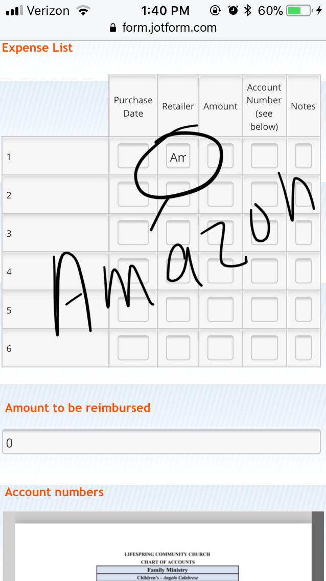
office803Replied on January 12, 2018 at 5:02 PM
iphone 6
Yes, this is what I see too, but I need to be able to enlarge the width of the cells so I can see everything that is typed within the cells. The same as what I see when I'm on a desktop.
Nancy
-
MarvihReplied on January 12, 2018 at 5:30 PM
It will depend on the Web Browser you are using. I was able to use "Desktop View" on my Google Chrome browser.


-
office803Replied on January 12, 2018 at 5:43 PMAh..Thank you!
... -
MarvihReplied on January 12, 2018 at 6:00 PM
No worries :)
-
office803Replied on January 15, 2018 at 10:40 AM
-
Kevin Support Team LeadReplied on January 15, 2018 at 12:11 PM
In order to assist you better I've moved your last question to another thread, we will assist you as soon as possible here: https://www.jotform.com/answers/1349669
- Templates
- Integrations
- INTEGRATIONS
- See 100+ integrations
- FEATURED INTEGRATIONS
 PayPal
- Slack
- Google Sheets
- Mailchimp
- Zoom
- Dropbox
- Google Calendar
- Hubspot
- Salesforce
- See more Integrations
- Products
- PRODUCTS
- Form Builder
- Jotform Enterprise
- Jotform Apps
- Store Builder
- Jotform Tables
- Jotform Inbox
- Jotform Mobile App
- Jotform Approvals
- Report Builder
- Smart PDF Forms
- PDF Editor
- Jotform Sign
- Jotform for Salesforce Discover Now
- Support


 I added it at line #23, is that correct? If so, I saw no change on my mobile device. Sorry...not fluent in code AT ALL. :0(


