


-
davidtoddAsked on January 16, 2018 at 10:03 AM
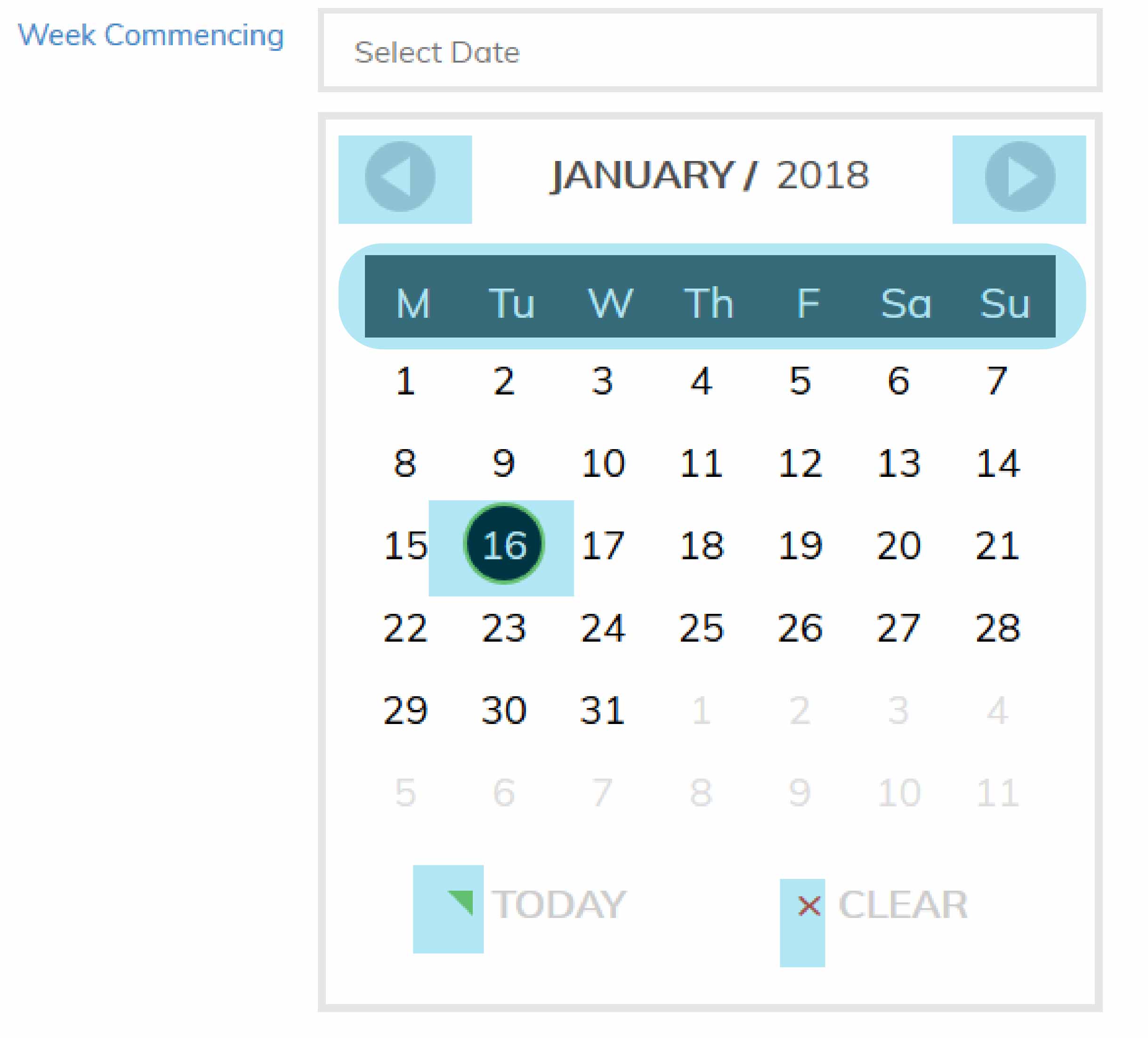
Can you point me in the correct direction to adjust the background colour of elements in the large date picker widget
Elements that require changing are highlighted in the screenshot
-
BJoannaReplied on January 16, 2018 at 10:50 AM
Here is the CSS code that you can use to change the color of the elements that you highlighted:
/*next and back arrows*/
.Grey .picker__nav--next, .Grey .picker__nav--prev {
background: #ca1d1d!important;
}
/*weekdays*/
.Grey thead tr {
background: #161990!important;
}
/*selected date*/
.Grey .picker--focused .picker__day--highlighted, .Grey .picker__day--highlighted:hover {
background: #b9bb1c!important;
}
/*today*/
.Grey .picker__button--today:before {
border-top: .66em solid #ad0f92!important;
}
/*clear*/
.picker__button--clear:before {
color: #2cbfbf!important;
}
Add CSS code to the Custom CSS field of the widget.

Here is my demo form: https://form.jotform.com/80154758551965
Feel free to test it and clone it.
Let us know if you need further assistance.
-
davidtoddReplied on January 16, 2018 at 11:14 AM
Wonderful. Thank you for the swift response. I have applied the changes and it looks great. When you click on a date other than today the day is highlighted green. I would like to change this and also the border around the selected day circle (16 on the screen shot)
Thank you again
-
BJoannaReplied on January 16, 2018 at 11:50 AM
Add this CSS code for the today's date color.
.Grey .picker__day--today:before {
border-top: .5em solid #b10a0a!important;
}
.Grey .picker__day--today {
color: #b10a0a!important;
}
If I see correctly the border is shown only when the current day is selected. You can use this CSS code to change the border color:
.Grey .picker__day--selected.picker__day--today, .Grey .picker__day:hover.picker__day--today {
border: 2px solid #1c088a;
}
I added the new CSS codes to the form I previously provided. Please test the form again.
- Templates
- Integrations
- INTEGRATIONS
- See 100+ integrations
- FEATURED INTEGRATIONS
 PayPal
- Slack
- Google Sheets
- Mailchimp
- Zoom
- Dropbox
- Google Calendar
- Hubspot
- Salesforce
- See more Integrations
- Products
- PRODUCTS
- Form Builder
- Jotform Enterprise
- Jotform Apps
- Store Builder
- Jotform Tables
- Jotform Inbox
- Jotform Mobile App
- Jotform Approvals
- Report Builder
- Smart PDF Forms
- PDF Editor
- Jotform Sign
- Jotform for Salesforce Discover Now
- Support


