


-
TycenDemolitionsAsked on January 24, 2018 at 10:50 PM
Hi
My form has an Input Table element. The title of each row is the day of the week. I cannot seem to prevent the column from wrapping to the next line in the middle of words when i view the form on mobile devices. on PC based browsers everything looks great.
I've tried loads of css that i found on the Jotform support site, but Android and iPhone seem to be ignoring all the css. i can see the changes in PC browsers straight away but mobile devices always seem to use some 'default' setting for input tables. Is there a way to control the appearance of Input Tables on mobile devices?
I've tried adding and removing the Mobile Responsiveness widget but that did not affect the column wrapping.
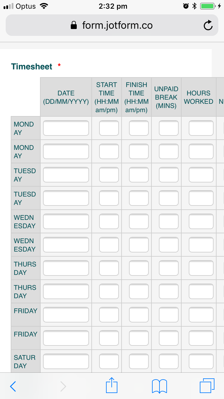 Page URL: https://form.jotform.co/61517882082863
 -
BJoannaReplied on January 25, 2018 at 5:16 AM
Add this CSS code to your form, to resolve the issue:
@media screen and (max-width: 480px), screen and (max-device-width: 767px) and (orientation: portrait), screen and (max-device-width: 415px) and (orientation: landscape){
.form-matrix-row-headers {
min-width: 71px!important;
}}
How to Inject Custom CSS Codes

Here is my form: https://form.jotform.com/80242757840963
Feel free to test it and clone it.
Let us know if you need further assistance.
-
TycenDemolitionsReplied on January 25, 2018 at 5:47 AM
Hi
Thank you for taking the time to look into it BJoanna.
That worked.
both on iPhone and Android, thank you.
I hate to follow up with another question... can i specify the width of the rest of the columns to be the same width as the DATE column?
-
aubreybourkeReplied on January 25, 2018 at 9:42 AM
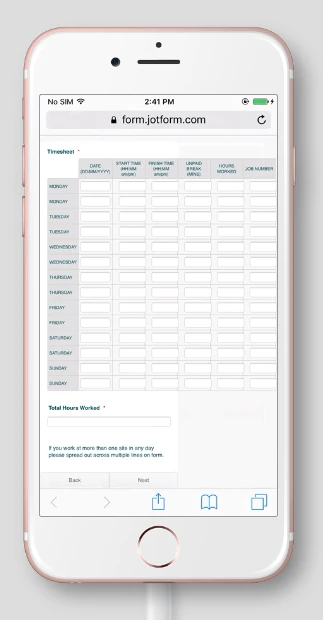
Please replace the previous code with this:
@media screen and (max-width: 480px), screen and (max-device-width: 767px) and (orientation: portrait), screen and (max-device-width: 415px) and (orientation: landscape){
.form-matrix-row-headers {
min-width : 71px!important;
}
.form-textbox {
min-width : 70px;
}
}
It should look like this:
- Templates
- Integrations
- INTEGRATIONS
- See 100+ integrations
- FEATURED INTEGRATIONS
 PayPal
- Slack
- Google Sheets
- Mailchimp
- Zoom
- Dropbox
- Google Calendar
- Hubspot
- Salesforce
- See more Integrations
- Products
- PRODUCTS
- Form Builder
- Jotform Enterprise
- Jotform Apps
- Store Builder
- Jotform Tables
- Jotform Inbox
- Jotform Mobile App
- Jotform Approvals
- Report Builder
- Smart PDF Forms
- PDF Editor
- Jotform Sign
- Jotform for Salesforce Discover Now
- Support


