


-
ThatOnelifestyleAsked on January 29, 2018 at 12:06 AM
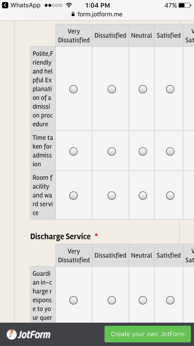
Added Input table on the form, when preview on the phone, the question very difficult to read, how to solution the problem?
-
BJoannaReplied on January 29, 2018 at 6:36 AM
The Input tables are too big to fit on the screen of the phones and because of that, the row headers are shrinked.
You can increase the size of the row headers with the CSS. Add this CSS code to your form:
@media screen and (max-width: 480px), screen and (max-device-width: 767px) and (orientation: portrait), screen and (max-device-width: 415px) and (orientation: landscape){
.form-matrix-row-headers {
min-width: 120px!important;
}}
How to Inject Custom CSS Codes
Or you can use the Star Rating or Scale Rating fields insisted of the Input Table fields.

- Templates
- Integrations
- INTEGRATIONS
- See 100+ integrations
- FEATURED INTEGRATIONS
 PayPal
- Slack
- Google Sheets
- Mailchimp
- Zoom
- Dropbox
- Google Calendar
- Hubspot
- Salesforce
- See more Integrations
- Products
- PRODUCTS
- Form Builder
- Jotform Enterprise
- Jotform Apps
- Store Builder
- Jotform Tables
- Jotform Inbox
- Jotform Mobile App
- Jotform Approvals
- Report Builder
- Smart PDF Forms
- PDF Editor
- Jotform Sign
- Jotform for Salesforce Discover Now
- Support

