


-
evank001Asked on February 6, 2018 at 1:37 PM
Hi guys,
I gotta an issue with this form :
https://form.jotformeu.com/73310817188357
When I put it on my website, on computer with 17" screen, no problem, but when it comes to 15" or worse 13", it is cut like below :

Can you help me on that ?
Thanks guys -
AdrianReplied on February 6, 2018 at 3:16 PM
I have added this custom CSS to your form.
.form-all {
max-width: 100%;
box-sizing: border-box;
}
iframe {
max-width: 100%;
}
and this to the widget
li {
max-width: calc(20% - 20px) !important;
box-sizing: border-box;
}
img {
max-width: 100% !important;
}
Here is how the form looks on a 13 inch screen:
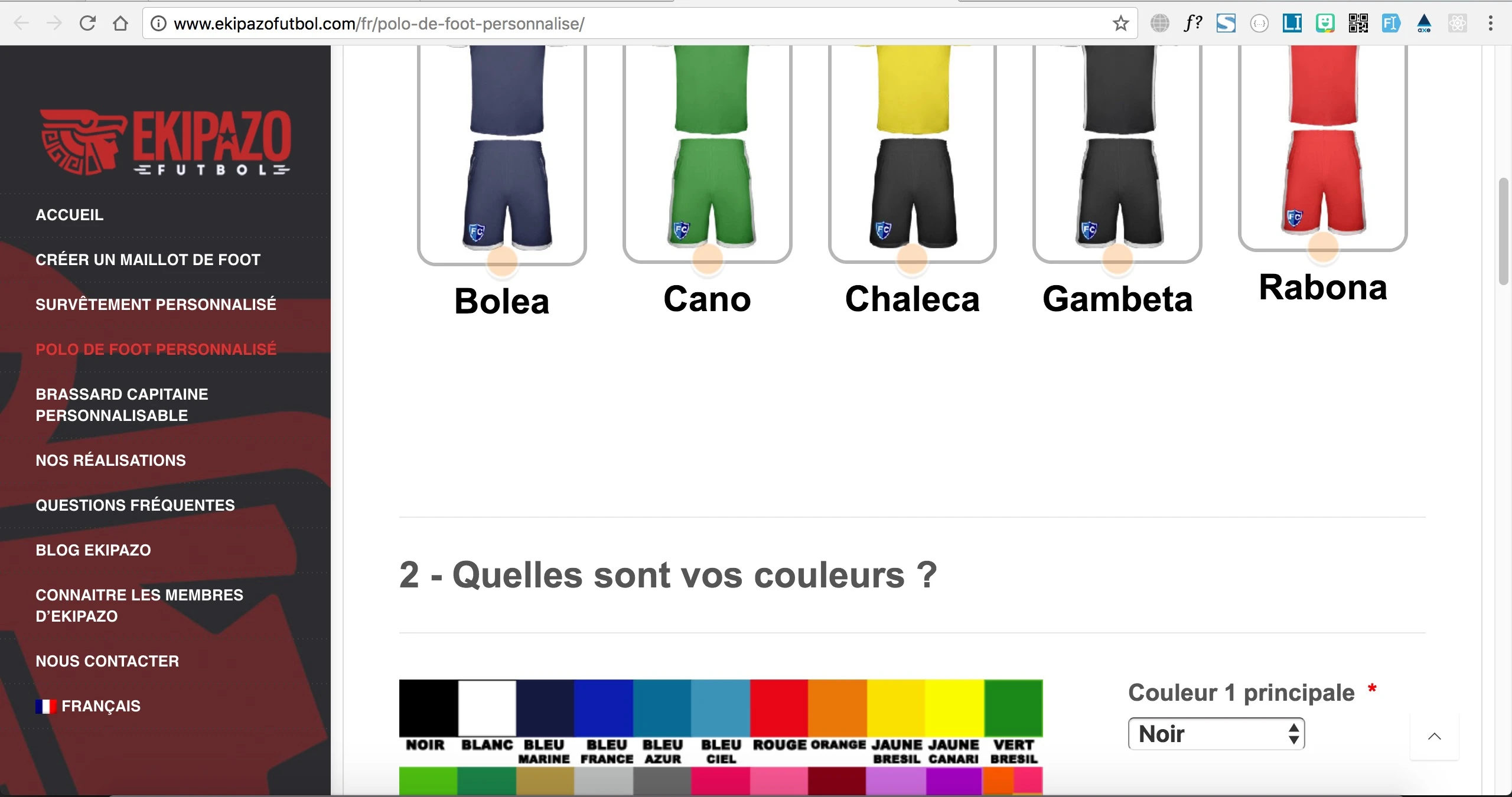
Let us know if you need further help.
-
evank001Replied on February 7, 2018 at 4:39 AM
Thanks a lot for your help, it works on small computer screen but mess up the view on mobile phone (it worked perfectly on mobile before), have a look below :
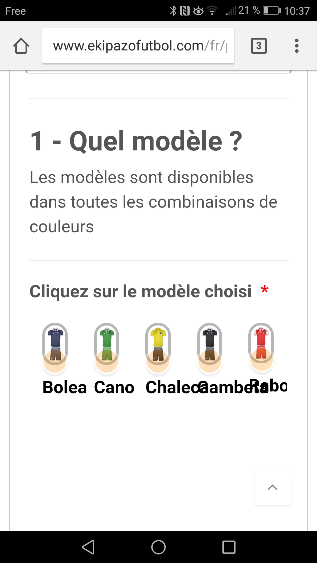
Is there a way to adapt following the size of the screen ?
-
AdrianReplied on February 7, 2018 at 6:26 AM
I put the CSS code of the widget inside a media query, so it does not affect smaller screens (mobiles).
The form should look good on mobiles and desktops now.
Let us know if you need further assistance.
- Templates
- Integrations
- INTEGRATIONS
- See 100+ integrations
- FEATURED INTEGRATIONS
 PayPal
- Slack
- Google Sheets
- Mailchimp
- Zoom
- Dropbox
- Google Calendar
- Hubspot
- Salesforce
- See more Integrations
- Products
- PRODUCTS
- Form Builder
- Jotform Enterprise
- Jotform Apps
- Store Builder
- Jotform Tables
- Jotform Inbox
- Jotform Mobile App
- Jotform Approvals
- Report Builder
- Smart PDF Forms
- PDF Editor
- Jotform Sign
- Jotform for Salesforce Discover Now
- Support

