-
RFOneVisionAsked on February 14, 2018 at 9:22 AM
I seemed to be running into a variety of formatting issues on my original form due to it having been originally based on a template.
So I have decided to start again with a brand new, clean slate form.
This is bringing some additional formatting issues. Could you please assist me to:
- bring the accommodation options closer to the 'Accommodation' label - best is to be aligned under the age group column
- compress the vertical spacing on the accommodation options to match the age options above
- bring 'I'm willing to share' under the 'Linen required' field (it currently displays that way, but if I reduce the font or make the screen smaller to force them to a new line, they are displaying in one row rather than in a column).
- reduce the width of the 'Meals:' calculated field
- explain why a width of '10' chars on my previous form is not the same on my new form - the 'Group name', 'Email' and 'Phone number' fields are not displaying in the width they're defined with (10, 20, 10 respectively).
- the meals grid fields are correctly displaying right justified in the designer, but revert to left-justified in preview??
Thanks,
David
Page URL: https://form.jotform.co/80430686629867 -
Richie JotForm SupportReplied on February 14, 2018 at 10:41 AM
I will get back to you as soon as I set your formatted fields.
Thank you
-
Richie JotForm SupportReplied on February 14, 2018 at 11:16 AM
Here is the css codes for the corrected format.
#cid_15 {
margin-right: -40px;
position: inherit;
right: 30px;
}
#input_15_1{
margin-top: -3px;
}
#label_input_15_1{
margin-top: -20px;
margin-left: 20px;
display: block;
}
#input_15_2{
margin-top: -2px;
}
#label_input_15_2{
display: block;
margin-top: -17px;
margin-left: 20px;
}
#input_15_3{
margin-top: -3px;
}
#label_input_15_3{
display: block;
margin-top: -18px;
margin-left: 20px;
}
#input_15_4{
margin-top: -3px;
}
#label_input_15_4{
display: block;
margin-top: -18px;
margin-left: 20px;
}
#input_15_5{
margin-top: -3px;
}
#label_input_15_5{
display: block;
margin-top: -18px;
margin-left: 20px;
}
#input_17_0{
margin-top: -16px!important;
}
#label_input_17_0{
display: block;
margin-top: -33px;
margin-left: 22px;
}
#input_36{
width: 60px;
}- explain why a width of '10' chars on my previous form is not the same on my new form - the 'Group name', 'Email' and 'Phone number' fields are not displaying in the width they're defined with (10, 20, 10 respectively).
The character width can be changed in your custom css, even if you change your width to 1 in your builder but you have inputted a custom css, it will follow the custom css code. The width 10 chars is a representation that the field can hold up to 10 characters with it width.
- the meals grid fields are correctly displaying right justified in the designer, but revert to left-justified in preview??
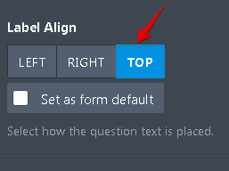
You meals grid fields are aligned as TOP and the default preview of the builder would align them on the right. I'm not really sure why they are aligned left with the preview but it seems its part of the left to right format on how you read.

I hope this answers your questions,please let us know if we can be of further assistance.
Thank you.
-
RFOneVisionReplied on February 14, 2018 at 11:32 PM
With respect to the meals grid, I'm not talking about the labels, but the amounts within the fields. They are correctly displaying right justified in the designer, but revert to left-justified in preview??
-
AdrianReplied on February 15, 2018 at 4:20 AM
Please inject this CSS code to align the meals grid fields to the right.
#id_22 input,
#id_23 input,
#id_24 input,
#id_25 input,
#id_26 input,
#id_27 input,
#id_28 input,
#id_29 input,
#id_30 input,
#id_36 input,
#id_37 input,
#id_38 input,
#id_29 input {
text-align: right;
}
Let us know if you need further help.
-
RFOneVisionReplied on February 15, 2018 at 5:07 AM
Thanks - that worked.
However the meals field also has a discrepancy between design and preview in its width.
I am using:
#input_36, #input_40, #input_41,
#input_42, #input_43, #input_44,
#input_45, #input_46, {width: 90px;}
and it looks great in design. But not preview.
I also need to adjust the actual display width of the first three text fields (name/email/phone)
Am I doing something wrong to keep getting this inconsistency? I have reverted to using a standard font and started with a blank template.
Thanks
-
AdrianReplied on February 15, 2018 at 7:01 AM
The font will not affect the changes you make in the form design.
Make sure you are using the correct CSS selector (ID Selector in this case).
To see how to find the fields ID see the guide below:
How to Find Field IDs and Names
To change the width of the fields that we changed the text alignment to right, just add one more line of CSS there.
#id_22 input,
#id_23 input,
#id_24 input,
#id_25 input,
#id_26 input,
#id_27 input,
#id_28 input,
#id_29 input,
#id_30 input,
#id_36 input,
#id_37 input,
#id_38 input,
#id_29 input {
text-align: right;
width: 90px;
}
Let us know if you need further assistance.
- Mobile Forms
- My Forms
- Templates
- Integrations
- INTEGRATIONS
- See 100+ integrations
- FEATURED INTEGRATIONS
PayPal
Slack
Google Sheets
Mailchimp
Zoom
Dropbox
Google Calendar
Hubspot
Salesforce
- See more Integrations
- Products
- PRODUCTS
Form Builder
Jotform Enterprise
Jotform Apps
Store Builder
Jotform Tables
Jotform Inbox
Jotform Mobile App
Jotform Approvals
Report Builder
Smart PDF Forms
PDF Editor
Jotform Sign
Jotform for Salesforce Discover Now
- Support
- GET HELP
- Contact Support
- Help Center
- FAQ
- Dedicated Support
Get a dedicated support team with Jotform Enterprise.
Contact SalesDedicated Enterprise supportApply to Jotform Enterprise for a dedicated support team.
Apply Now - Professional ServicesExplore
- Enterprise
- Pricing


