


-
mecoxbaydairyAsked on February 26, 2018 at 5:31 PM
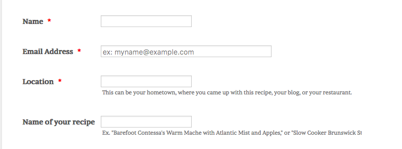
When I make my browser window smaller, my embedded form field descriptions get cut off because they are longer than the form field. How can make the form responsive both on mobile and on desktop so that my descriptions do not get cut off?
-
John_BensonReplied on February 26, 2018 at 7:59 PM
Please provide the website where you embed the form so we can investigate it further. By default, all forms created in the Form Builder should be mobile responsive. If not, try adding the Mobile Responsive widget. Here's the link: https://widgets.jotform.com/widget/mobile_responsive
We'll wait for your response. Thank you.
-
mecoxbaydairyReplied on February 26, 2018 at 10:37 PM
Mobile Responsiveness is not the problem, small desktop windows are. However, I have solved the problem with some custom css.
-
BJoannaReplied on February 27, 2018 at 3:17 AM
We are glad to hear that you resolved your issue.
Feel free to contact us if you have any other issues or questions.
- Templates
- Integrations
- INTEGRATIONS
- See 100+ integrations
- FEATURED INTEGRATIONS
 PayPal
- Slack
- Google Sheets
- Mailchimp
- Zoom
- Dropbox
- Google Calendar
- Hubspot
- Salesforce
- See more Integrations
- Products
- PRODUCTS
- Form Builder
- Jotform Enterprise
- Jotform Apps
- Store Builder
- Jotform Tables
- Jotform Inbox
- Jotform Mobile App
- Jotform Approvals
- Report Builder
- Smart PDF Forms
- PDF Editor
- Jotform Sign
- Jotform for Salesforce Discover Now
- Support

