


-
AEGOrganiserAsked on March 24, 2018 at 3:34 AM
I have a form which will be used on mobiles and desktops, and I would like to embed it within another website. However I'm having trouble with the width of the form.
If I just embed it then it is too wide on a desktop, perfect on mobile portrait, and far too wide on mobile landscape. The use of iframes does not change anything.
I can use CSS to change control the width of the form but then it is too wide for mobile portrait or landscape.
Even if I don't embed the form and access it directly then the desktop is fine, as is mobile portrait but again mobile landscape is to wide.
Do you have any suggestions?
On a similar note if I use a wide logo, this presents correctly on a desktop but never on a mobile either in landscape or portrait.
Again do you have any suggestions?
Regards,
Malcolm
-
AEGOrganiserReplied on March 24, 2018 at 3:50 AM
I have found the Mobile Responsive widget which helps with the presentation on mobiles. However:
1. When I embed the form in my website it is still too wide. https://abbeyedgegrove.weebly.com/entry-form-2019.html
2. The image at the top of the form is too wide on the mobile.
-
AdrianReplied on March 24, 2018 at 9:12 AM
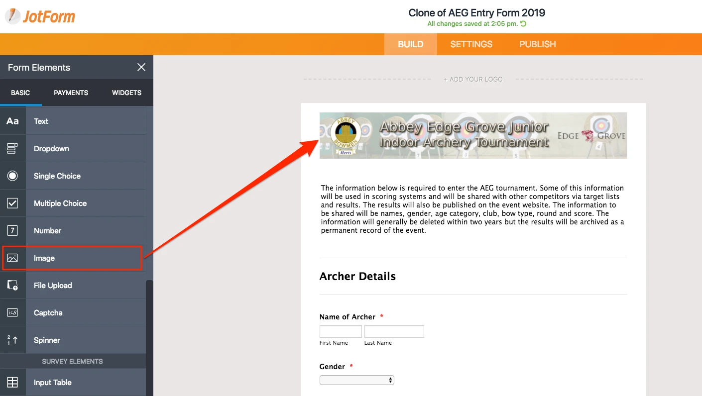
I suggest you remove the logo from your form and add it as an Image element instead.
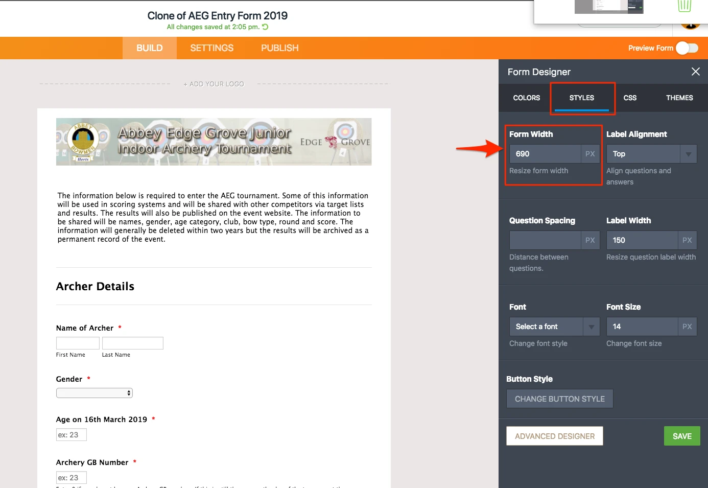
Also, change the width of the form to something smaller like 690px.
Then, add the following Custom CSS to your form.
img.form-image {
width: 100% !important;
height: auto !important;
max-width: 100% !important;
}
.form-all {
margin-left: auto !important;
margin-right: auto !important;
}
(How to Inject Custom CSS Codes)
Let us know if you need further assistance.
- Templates
- Integrations
- INTEGRATIONS
- See 100+ integrations
- FEATURED INTEGRATIONS
 PayPal
- Slack
- Google Sheets
- Mailchimp
- Zoom
- Dropbox
- Google Calendar
- Hubspot
- Salesforce
- See more Integrations
- Products
- PRODUCTS
- Form Builder
- Jotform Enterprise
- Jotform Apps
- Store Builder
- Jotform Tables
- Jotform Inbox
- Jotform Mobile App
- Jotform Approvals
- Report Builder
- Smart PDF Forms
- PDF Editor
- Jotform Sign
- Jotform for Salesforce Discover Now
- Support
