


-
IceMeltAsked on April 4, 2018 at 3:11 PM
I saw a post on how to hide the year dropdown by injecting the code below to the Custom CSS section of configurable list.
select.y {
display: none;
}
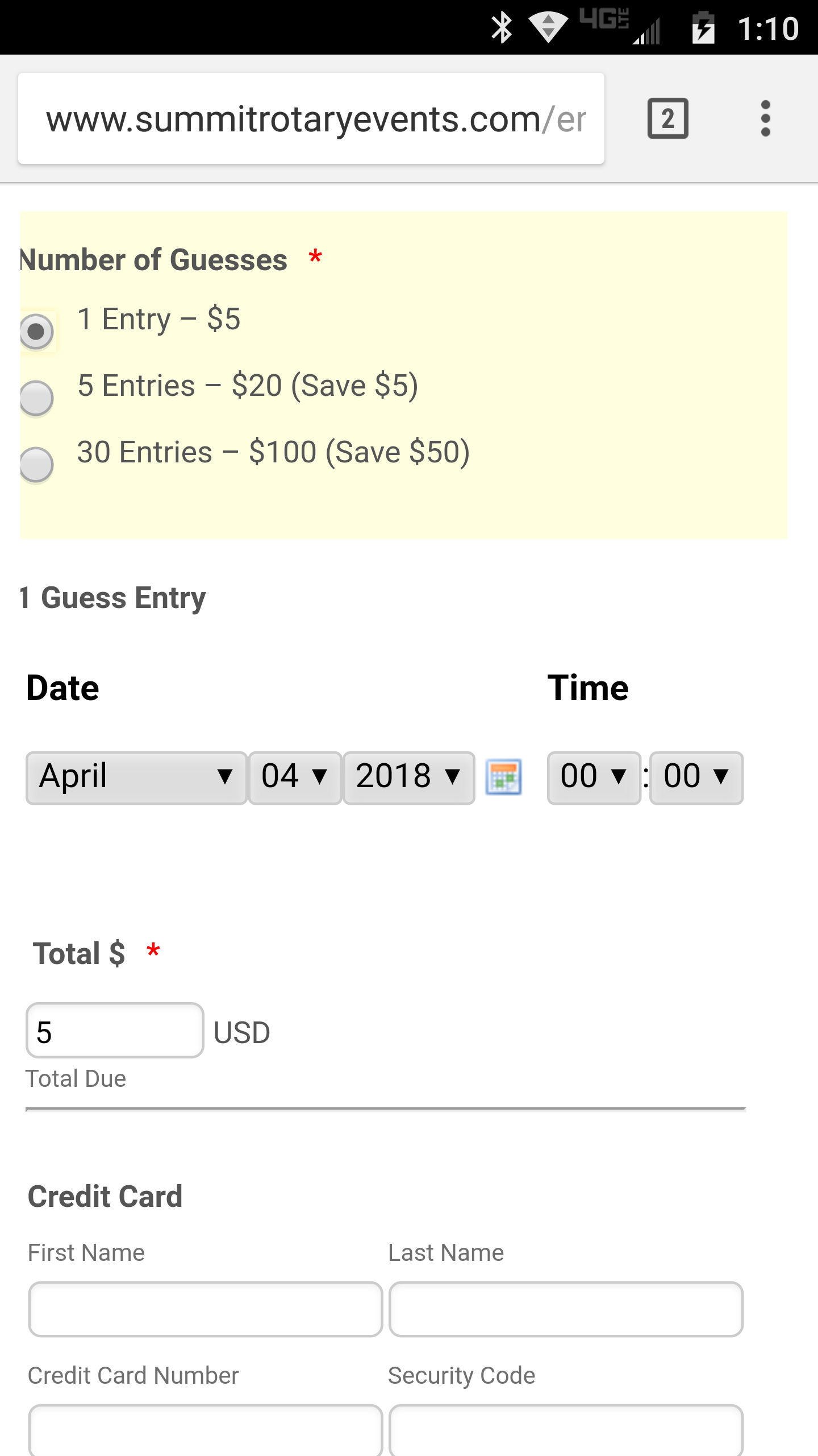
This works on the desktop view of the form, However, this doesn't seem to work for the mobile view, it still shows the year dropdown. How can we fix? Here is the form with the date dropdowns for 1, 5 or 10 guesses where we want to hide the year so that it all fits on mobile displays. Right now, you can't seem the Temp guessing field on mobile.
Here is the page it is on where the temp fields are getting cut off on the right:
http://www.summitrotaryevents.com/enter-ice-melt-contest
Original form:
https://form.jotform.com/60177084526154
Is there anyway to make it more mobile friendly? See screenshot.
-
IceMeltReplied on April 4, 2018 at 3:17 PM
Here's a marked screenshot to see what you better what I mean.

-
Jed_CReplied on April 4, 2018 at 4:47 PM
Try making the widget in vertical view instead of horizontal. Please copy the CSS code in this guide here https://www.jotform.com/help/456-How-to-Make-the-Configurable-List-Widget-Mobile-Responsive and inject the mobile responsive code in each of your configurable widget CSS code.
Vertical mobile view:

Let us know if you need further help.
-
IceMeltReplied on April 4, 2018 at 5:23 PM
I've inserted the code, but it doesn't seem to refresh or change on mobile... but, now it shows up as vertical in desktop, which is not preferred. Is there a way to make it show up vertically on mobile and horizontal on desktops? Is there something else I need to do?
Thanks for your help!
http://www.summitrotaryevents.com/enter-ice-melt-contest -
jonathanReplied on April 4, 2018 at 7:24 PM
I suggest you also review the steps provided in the user guide:
How-to-Make-the-Configurable-List-Widget-Mobile-Responsive
Add the @media query code also for the mobile responsive browser to work.

- Templates
- Integrations
- INTEGRATIONS
- See 100+ integrations
- FEATURED INTEGRATIONS
 PayPal
- Slack
- Google Sheets
- Mailchimp
- Zoom
- Dropbox
- Google Calendar
- Hubspot
- Salesforce
- See more Integrations
- Products
- PRODUCTS
- Form Builder
- Jotform Enterprise
- Jotform Apps
- Store Builder
- Jotform Tables
- Jotform Inbox
- Jotform Mobile App
- Jotform Approvals
- Report Builder
- Smart PDF Forms
- PDF Editor
- Jotform Sign
- Jotform for Salesforce Discover Now
- Support


