


-
portraitkanrishaAsked on May 27, 2018 at 4:26 AM
Hi,
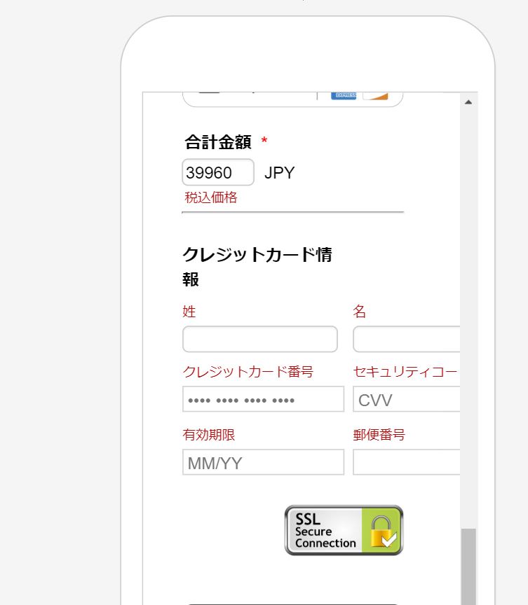
I am currently using a square payment widget on my form and after playing with the CSS injections for a while, I can't quite figure out how to make the fields align properly with the window when in mobile mode. (works on IPhone 6 but not on 5/5S)
As you can see on the screenshot, the fields on the right are cut out..
I tried to move the whole div to the left, adjust the textbox sizes, but didn't manage to come up with something acceptable..
Thank you in advance ! :)
 Page URL: https://form.jotform.me/81410850784457
 -
portraitkanrishaReplied on May 27, 2018 at 5:45 AM
I have improved it a little bit compared to the screenshot I provided earlier but the fields are still a little bit cut.
-
AdrianReplied on May 27, 2018 at 5:47 AM
I can see that you have made further changes to the form but the field is still a little bit cut off.

Please inject this additional CSS to your form to fix this.
@media (max-width: 350px) {
#cid_22 .form-address-table td:last-child .form-sub-label-container {
margin-left: 0;
}
}Let us know if you need further assistance.
-
portraitkanrishaReplied on May 27, 2018 at 6:00 AM
Hi Adrian,
Absolutely right on spot, just what I needed ! :) Thanks for your great help !
- Templates
- Integrations
- INTEGRATIONS
- See 100+ integrations
- FEATURED INTEGRATIONS
 PayPal
- Slack
- Google Sheets
- Mailchimp
- Zoom
- Dropbox
- Google Calendar
- Hubspot
- Salesforce
- See more Integrations
- Products
- PRODUCTS
- Form Builder
- Jotform Enterprise
- Jotform Apps
- Store Builder
- Jotform Tables
- Jotform Inbox
- Jotform Mobile App
- Jotform Approvals
- Report Builder
- Smart PDF Forms
- PDF Editor
- Jotform Sign
- Jotform for Salesforce Discover Now
- Support

