


-
theblastingroomAsked on June 20, 2018 at 12:00 PM
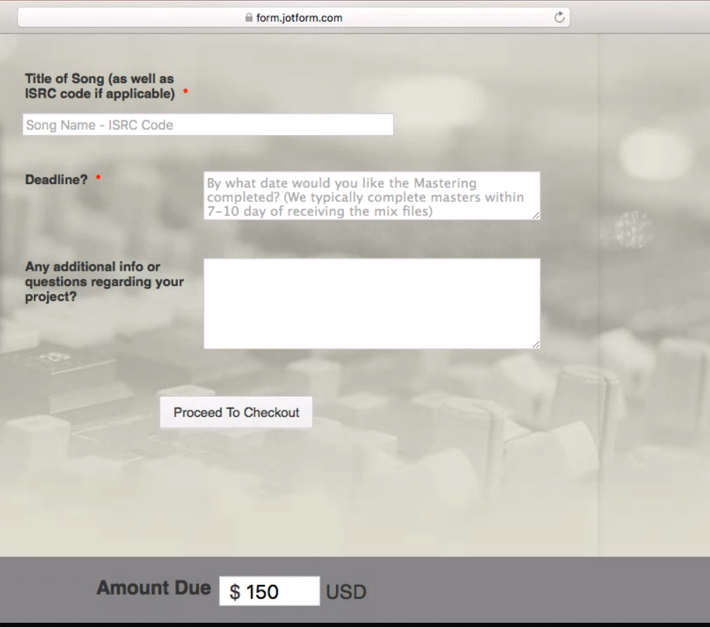
Hi, I'm having a difficult time figuring out how to add the dollar sign to the Amount Due in the PayPal widget. Also, I have made the amount due at the bottom fixed, but would also like to have it be center justified and I also can't seem to figure that out. Any help would greatly appreciated.
Thanks!
Page URL: https://form.jotform.com/81638620284156 -
Richie JotForm SupportReplied on June 20, 2018 at 1:25 PM
To place a dollar sign in your payment, you can use these custom CSS code:
#cid_31 span.form-sub-label-container::before {
content: "$";
font-size: 22px;
left: 15px;
margin-right: -10px;
position: relative;
}
#cid_31 input[data-custom-amount-field] {
padding-left: 1em;
}For the the amount due to be centered,
Kindly remove your previous CSS code for #id_31 and replace it with
#id_31{
background-color: #848484;
position: fixed;
bottom: 0px;
width: 50%;
margin: auto;
text-align: center;
}Sample screenshot:

Please give it a try and let us know how it goes.
Thank you.
-
theblastingroomReplied on June 20, 2018 at 1:36 PM
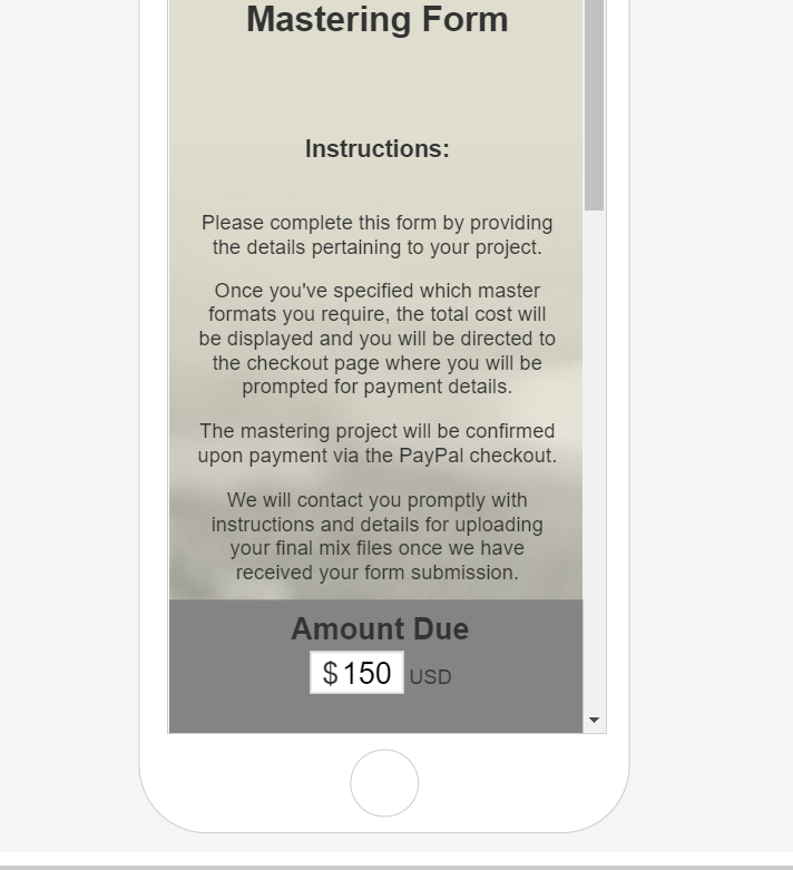
Thanks Richie! The only thing is that I preferred to have the bar go all the way across the screen, like it did with my original CSS code. Is there anyway to have it be center justified and have the background color fill the screen from left to right? Attached is a photo of how it used to look.

-
Richie JotForm SupportReplied on June 20, 2018 at 2:54 PM
Kindly remove again the CSS I have given #id_31 to
#id_31{
background-color: #848484;
position: fixed;
bottom: 0px;
left: 0;
margin: auto;
}To center the text.
#label_31 {
font-size: 22px;
width: 90%!important;
margin: auto;
text-align: center;
}
#cid_31{
margin-left: -40%!important;
}Please give it a try and let us know how it goes.
Thank you.
-
theblastingroomReplied on June 20, 2018 at 3:49 PM
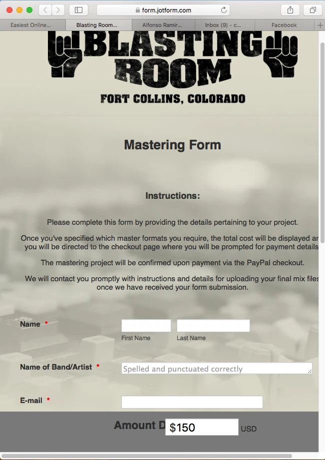
You are a saint! The only thing now is that it is glitchy when you minimize the window and on tablet / phone. Is it possible to make it work on desktop, tablet, and phone? Also, the "Amount Due" on desktop is really tight next to the actual amount box. Anyway to get a little more space there?
-
Richie JotForm SupportReplied on June 20, 2018 at 4:14 PM
You can add these CSS codes to make your form mobile responsive.
@media screen and (max-width: 480px){
#label_31 {
font-size: 22px;
width: 10%;
margin: auto;
text-align: center;
}
#cid_31{
margin-left: 30%;
}}
Sample Screenshot:
-
theblastingroomReplied on June 20, 2018 at 4:46 PM
Screenshot looks great, but it doesn't seem to have worked for me... Any idea why?
-
Richie JotForm SupportReplied on June 20, 2018 at 5:40 PM
I checked your form and it seems that there was a conflict in the CSS code. I have cleaned the form CSS for you and it should be working correctly now in mobile view.
Please test your form and let us know how it goes.
Thank you.
-
theblastingroomReplied on June 20, 2018 at 5:57 PM
Thanks for clearing that up. It looks great on mobile now, but it still gets crowded and messed up on tablet, landscape view on mobile, and when you adjust the width to be narrower on desktop. Do you know of any way to fix that so the "Amount Due" text hide behind the Number box? You've been absolutely amazing and I can't thank you enough for your help. A+++ for Jotform support!
-
Jed_CReplied on June 20, 2018 at 7:37 PM
Please try adding the CSS code below for tablet view. It should align the amount due field in center.
@media (min-width: 768px) and (max-width: 1024px) {
#cid_31{
margin-left: 35% !important;
}
}
%20-%20Google%20Chrome%202018-06-21%2007.38.31.png)
Let us know if you have any questions or if you need further assistance.
-
theblastingroomReplied on June 21, 2018 at 1:01 AM
Hmmm... That didn't seem to work very well. It worked it landscape on the tablet, but not in portrait, so I removed it for the time being. Also, I'm still having the issue where if the browser window isn't big enough on desktop, the "Amount Due" text gets covered up. I attached a screenshot so you can see what I'm talking about. Any ideas to try to fix this would be greatly appreciated!
-
Support_Management Jotform SupportReplied on June 21, 2018 at 5:03 AM
I know this can be daunting but please remove all your CSS codes and replace them with the ones below:
.header-text, .header-logo {
display : block !important;
}
#input_31_donation {
width : 80px;
}
#label_31 {
display: contents;
}
#id_31 {
font-size : 22px;
background-color : #848484;
position : fixed;
bottom : 0px;
left : 0;
margin : 0 auto;
text-align : center;
padding : 20px 0 0 0;
}
#cid_31 span.form-sub-label-container::before {
content : "$";
font-size : 22px;
left : 15px;
margin-right : -15px;
position : relative;
}
#cid_31 input[data-custom-amount-field] {
padding-left : 30px;
}
Hopefully, these codes should take care of mobile / tablet (both in portrait and landscape modes) and even on different browser viewport sizes. This should also take care of the overlapping issue you mentioned with the "Amount Due" label.
-
theblastingroomReplied on June 21, 2018 at 9:51 AM
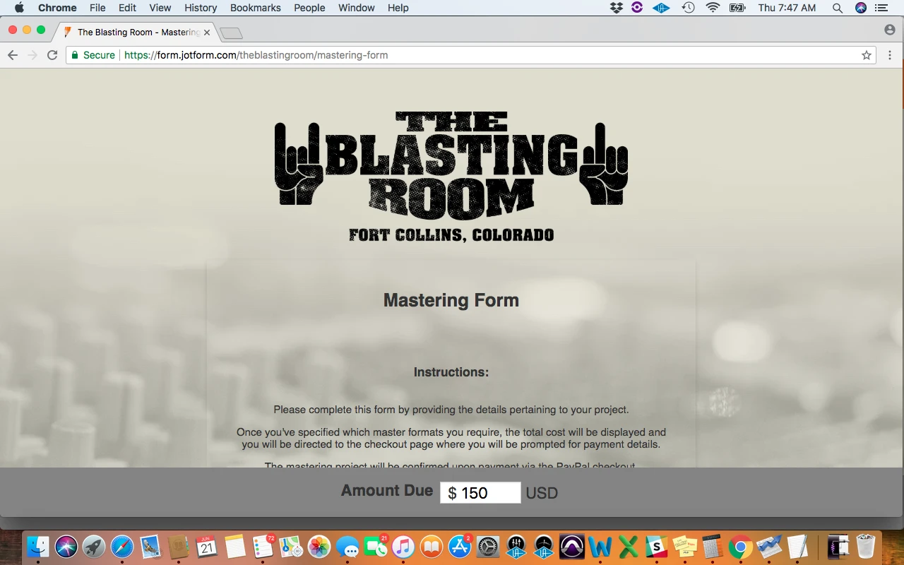
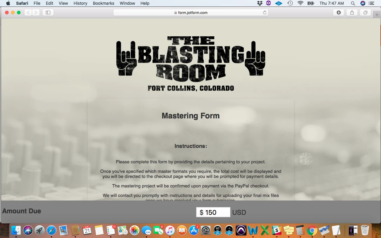
On Chrome that functions EXACTLY how I was hoping, so thank you Jim!! The weird thing though is that on Safari it justifies the "Amount Due" Label left. Any idea why that would be happening? I have attached two screenshots (first one of Chrome and second one of safari) so that you can see what I'm talking about.
-
Richie JotForm SupportReplied on June 21, 2018 at 11:29 AM
I have tested your form on Safari and replicated the issue.

However, this seems to be a bug on Safari. We have added a CSS code display:contents that would align the label next your input box, however this is converted back to display:inline when run on Safari.
You can check this article for more information. https://snook.ca/archives/html_and_css/safari-display-contents-bug
We can however, change the CSS code again of the #label_31 to
#label_31 {
margin-left: -140px;
position: absolute;
}Then add this extra code to ensure, mobile responsiveness.
@media screen and (max-width: 480px){
#label_31 {
margin-left: 120px;
position: relative;
}
}
Please give it a try and let us know how it goes.
Thank you.
-
theblastingroomReplied on June 21, 2018 at 5:34 PM
Wow. That fixed it! It's all functioning perfectly now. Thanks you so much!! This was honestly the best customer service experience I think I've ever had. Everything is functioning how I envisioned and I learned a ton. Thanks and take care!
-
Richie JotForm SupportReplied on June 21, 2018 at 5:37 PM
On behalf of my colleagues you're welcome.
If you need further assistance you can contact us.
Thank you.
- Templates
- Integrations
- INTEGRATIONS
- See 100+ integrations
- FEATURED INTEGRATIONS
 PayPal
- Slack
- Google Sheets
- Mailchimp
- Zoom
- Dropbox
- Google Calendar
- Hubspot
- Salesforce
- See more Integrations
- Products
- PRODUCTS
- Form Builder
- Jotform Enterprise
- Jotform Apps
- Store Builder
- Jotform Tables
- Jotform Inbox
- Jotform Mobile App
- Jotform Approvals
- Report Builder
- Smart PDF Forms
- PDF Editor
- Jotform Sign
- Jotform for Salesforce Discover Now
- Support


%20-%20Google%20Chrome%202018-06-21%2007.38.31.png)
