


-
mhowe479Asked on July 17, 2018 at 11:43 PM
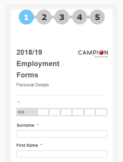
I have created a field called BSB which is the first field. It works well on desktop but the field input view on mobile is too small. There is some css that you guys sent me in the form but I don't know enough about css to change it to appear better.
-
Elton Support Team LeadReplied on July 18, 2018 at 3:08 AM
It's indeed terrible on mobile. :)
Inject this CSS codes to your form. This should correct it.
@media screen and (max-width:480px){
table.form-matrix-table {
width: 100% !important;
}
td.form-matrix-values {
padding: 1px;
}
[data-type="control_matrix"] .form-number-input {
width: 36px !important;
}}
Result:
-
mhowe479Replied on July 22, 2018 at 7:31 PM
Thank you for this, this has indeed fixed the mobile result. I have added a few more input tables in the same form, some with more than 6 inputs up to 10 11 inputs, and while they still look fine on mobile, the result in normal PC view doesn't look nearly as good. Do you have any css suggestion to improve this?
-
Elton Support Team LeadReplied on July 22, 2018 at 10:43 PM
You need to expand the width of those 2 tables too. Use the following CSS codes.
#cid_165 .form-matrix-table,
#cid_166 .form-matrix-table {
width: 352px !important;
}
@media screen and (max-width:480px){
#cid_165 .form-matrix-table,
#cid_166 .form-matrix-table {
width: 100% !important;
}
.form-description {
top: 64px;
}
.form-line-error {
overflow: visible;
}
.form-description-arrow {
border-color: transparent transparent #cccccc transparent;
left: 62px;
top: -21px;
}
.form-description-arrow-small {
border-color: transparent transparent #F5F5F5 transparent;
left: 65px;
top: -13px;
}
}
Result:
Mobile:
Desktop:
-
mhowe479Replied on July 22, 2018 at 10:52 PM
Thank you. I have a few more input tables in the form. Do I just add them to both to the first and second part of css you gave for them to be included? Like below:
#cid_165 .form-matrix-table,
#cid_166 .form-matrix-table
#cid_167 .form-matrix-table
#cid_168 .form-matrix-table
#cid_169 .form-matrix-table
#cid_170 .form-matrix-table
#cid_171 .form-matrix-table {
width: 352px !important;
}
@media screen and (max-width:480px){
#cid_165 .form-matrix-table,
#cid_166 .form-matrix-table
#cid_167 .form-matrix-table
#cid_168 .form-matrix-table
#cid_169 .form-matrix-table
#cid_170 .form-matrix-table
#cid_171 .form-matrix-table {
width: 100% !important;
}
.form-description {
top: 64px;
}
.form-line-error {
overflow: visible;
}
.form-description-arrow {
border-color: transparent transparent #cccccc transparent;
left: 62px;
top: -21px;
}
.form-description-arrow-small {
border-color: transparent transparent #F5F5F5 transparent;
left: 65px;
top: -13px;
}
}
-
Elton Support Team LeadReplied on July 22, 2018 at 11:09 PM
Yes, that's correct.
And if a certain table needs more width, you can separate it from others like the following.
#cid_172 .form-matrix-table {
width: 400px !important;
}
By the way, the following part is optional. This moves the field description slightly at the bottom since it covers the field. If it creates issues for some fields, you can remove it.
.form-description {
top: 64px;
}
.form-line-error {
overflow: visible;
}
.form-description-arrow {
border-color: transparent transparent #cccccc transparent;
left: 62px;
top: -21px;
}
.form-description-arrow-small {
border-color: transparent transparent #F5F5F5 transparent;
left: 65px;
top: -13px;
}
-
mhowe479Replied on July 23, 2018 at 12:54 AM
Hi,
It still doesn't look quite right on some of the fields on PC. The box for each individual number input doesn't fit nicely in the centre of the view so they seem to slightly overlap. Is this something to do with the other css in the form or do I just have to make each different input a different size depending ont eh number of inputs (boxes) I need for each one. It looks perfect on mobile.
The only problem with the mobile is I have the preview before submit widget included but the text boxes that I have included in the form do not show properly and I can't scroll to the right to see the full text.
-
Ashwin JotForm SupportReplied on July 23, 2018 at 7:15 AM
I am sorry for the trouble caused to you.
I would suggest you to please share a screenshot of the questions which does not appear correctly in your form and we will take a look.
The following guide should help you how to upload image in forum post: https://www.jotform.com/help/438-How-to-Post-Screenshots-to-Our-Support-Forum
We will wait for your response.
-
mhowe479Replied on July 23, 2018 at 11:18 PM
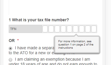
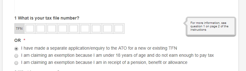
Here are the screenshots. I have labelled them to include the input number they belong to. In the build screen they look perfect but then on the actual entry link they appear like this. Only BSB which is inputs 164 and 170 appears how I would like them all to appear.


Here is what the preview before submit looks like on a mobile:


-
Nik_CReplied on July 24, 2018 at 2:52 AM
Maybe a padding CSS could help with that issue, and you can do that by inserting this CSS:
.form-matrix-values {
padding-right: 10px;
}
That should increase the box so it doesn't overlap:

Or:

Would that work for you?
Thank you!
-
mhowe479Replied on July 24, 2018 at 8:52 PM
Hi, doesn't seem to have made a difference. The second 2 pictures I opened in Mircrosoft Edge to see if it was any different but in fact it looks worse.


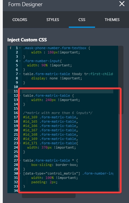
Here is all my current css in the form. Maybe I have made an error adding each time you've responded and I need to take some out?
.mask-phone-number.form-textbox {
width : 180px!important;
}
.form-number-input{
width: 90% !important;
}
table.form-matrix-table tbody tr:first-child{
display: none !important;
}
table.form-matrix-table {
width: 200px !important;
}
[data-type="control_matrix"] .form-number-input {
width: 70% !important;
}
@media screen and (max-width:480px){
table.form-matrix-table {
width: 100% !important;
}
td.form-matrix-values {
padding: 1px;
}
[data-type="control_matrix"] .form-number-input {
width: 18px !important;
}
#cid_165 .form-matrix-table,
#cid_166 .form-matrix-table
#cid_167 .form-matrix-table
#cid_168 .form-matrix-table
#cid_169 .form-matrix-table
#cid_170 .form-matrix-table
#cid_171 .form-matrix-table {
width: 352px !important;
}
@media screen and (max-width:480px){
#cid_165 .form-matrix-table,
#cid_166 .form-matrix-table
#cid_167 .form-matrix-table
#cid_168 .form-matrix-table
#cid_169 .form-matrix-table
#cid_170 .form-matrix-table
#cid_171 .form-matrix-table {
width: 100% !important;
}
.form-description {
top: 64px;
}
.form-line-error {
overflow: visible;
}
.form-description-arrow {
border-color: transparent transparent #cccccc transparent;
left: 62px;
top: -21px;
}
.form-description-arrow-small {
border-color: transparent transparent #F5F5F5 transparent;
left: 65px;
top: -13px;
}
.form-matrix-values {
padding-right: 10px;
}
}
}
-
Jed_CReplied on July 24, 2018 at 10:20 PM
I'm unable to replicate the view you see on other device. Here's what I see when I view your form https://www.jotformpro.com/form/81627759205968.
Chrome mobile screen size view:

MS Edge mobile screen size view:

May I know what device and browser are you using? Looking forward for your response.
-
mhowe479Replied on July 24, 2018 at 10:42 PM
Hi,
The view seems fine on mobile. It is on PC in Google Chrome and MS Edge that the view is as per the images I posted.
-
mhowe479Replied on July 24, 2018 at 10:44 PM
The mobile view issue is with the preview before submit widget which makes all of the heading and text box and some responses wider that the screen view.
-
Elton Support Team LeadReplied on July 25, 2018 at 3:09 AM
Replace the CSS codes I've provided before with the CSS codes here https://pastebin.com/raw/tRT1AaBA
Here's a demo on the cloned version: https://form.jotform.com/82051355991964
This should work fine on any browser.
If you see any problem, let us know.
-
mhowe479Replied on July 25, 2018 at 7:43 PM
Thank you, I am happy enough with the result. The A/C field on mobile goes across the screen and requires a little bit of scrolling but that is ok. Maybe it is because that field is set to require at least one box filled, not every box, as they don't have to be 10 digits long?
I have build a condition that if the TFN is entered above that it automatically copies it into the same required field further on in the form but this doesn't work. Is this because
 it is an input table?
 -
luisvcsilvaReplied on July 25, 2018 at 10:40 PM
You can disable the scrolling in the A/C Field by adding the underlined instruction to the following CSS fragments:
Fragment 1:
/*matrix with more than 6 inputs*/
#id_169 .form-matrix-table,
#id_165 .form-matrix-table,
#id_166 .form-matrix-table,
#id_167 .form-matrix-table,
#id_168 .form-matrix-table,
#id_169 .form-matrix-table,
#id_171 .form-matrix-table{
width: 370px !important;
overflow: hidden;
}
Fragment 2:
@media screen and (max-width:480px){
/*matrix with more than 6 inputs*/
#id_169 .form-matrix-table,
#id_165 .form-matrix-table,
#id_166 .form-matrix-table,
#id_167 .form-matrix-table,
#id_168 .form-matrix-table,
#id_169 .form-matrix-table,
#id_171 .form-matrix-table{
width: 100% !important;
overflow: hidden;
}
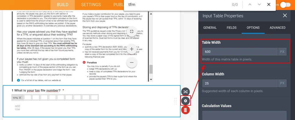
Or by changing the width of the input table, as shown by the image below:
Regarding your question about the conditions, you won't be able to access and/or manipulate the values within an Input Table using Conditional Rules, what you can do in order to copy the value from the field #49 (an input table) to the field #80, is to replace both of them by short text entry, and use an Input Mask in order to restrict the input to match with a valid TFN.
Contact us if you need any assistance,
Thanks.
- Templates
- Integrations
- INTEGRATIONS
- See 100+ integrations
- FEATURED INTEGRATIONS
 PayPal
- Slack
- Google Sheets
- Mailchimp
- Zoom
- Dropbox
- Google Calendar
- Hubspot
- Salesforce
- See more Integrations
- Products
- PRODUCTS
- Form Builder
- Jotform Enterprise
- Jotform Apps
- Store Builder
- Jotform Tables
- Jotform Inbox
- Jotform Mobile App
- Jotform Approvals
- Report Builder
- Smart PDF Forms
- PDF Editor
- Jotform Sign
- Jotform for Salesforce Discover Now
- Support


 it is an input table?