


-
TravisAsked on July 28, 2018 at 11:26 AM
Hi,
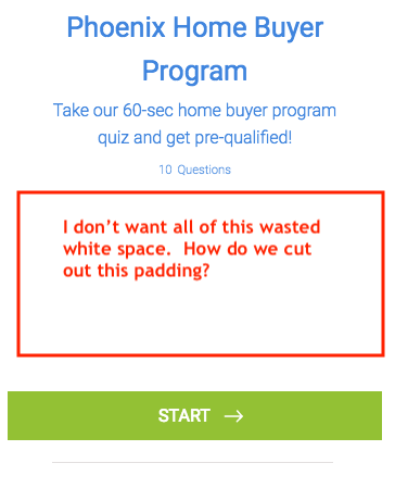
Im using your card feature form and it's nice but when being displayed on mobile there is such a large gap from the element above the embedded form and below it.
It makes it look as if there is no form there until they actually scroll down pass all the padding or margin inside the form.
How can we adjust that or so that there is not so much wasted white space and gap?
Attached are snapshot of the embedded form in my funnel viewed on MOBILE.
-
Kiran Support Team LeadReplied on July 28, 2018 at 12:26 PM
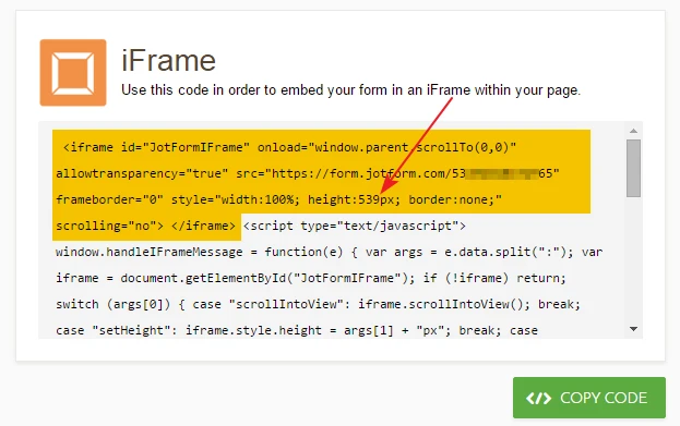
Unfortunately, there is no option to reduce the padding/margin or add any custom CSS to the Card forms. The forms are responsive by the Start/Next buttons are displayed at the bottom of the form based on the device type and the same height will be used when the form is embedded. You may check the form using the direct URL of the form in the mobile browser. However, you may try embedding the form using iframe embed code (use only colored code) by reducing the height to 350px as shown below to see if that works.
Please get back to us if you need any further assistance. We will be happy to help.
-
SocialBoltReplied on July 28, 2018 at 12:43 PMBummer that’s unfortunate. So you’re saying use the iFrame code (only use
the highlighted code) and input that on the page instead of the 3rd party
embedded code?
... -
Kiran Support Team LeadReplied on July 28, 2018 at 12:53 PM
I see that you have embedded the form on your web page using the default Javascript embed method. You may replace the current embed method code with iFrame code on your web page by changing the height of the form so that the form shall be displayed normally on the web page but with reduced height.
Please give it a try and let us know if you need any further assistance. We will be happy to help.
- Templates
- Integrations
- INTEGRATIONS
- See 100+ integrations
- FEATURED INTEGRATIONS
 PayPal
- Slack
- Google Sheets
- Mailchimp
- Zoom
- Dropbox
- Google Calendar
- Hubspot
- Salesforce
- See more Integrations
- Products
- PRODUCTS
- Form Builder
- Jotform Enterprise
- Jotform Apps
- Store Builder
- Jotform Tables
- Jotform Inbox
- Jotform Mobile App
- Jotform Approvals
- Report Builder
- Smart PDF Forms
- PDF Editor
- Jotform Sign
- Jotform for Salesforce Discover Now
- Support
