


-
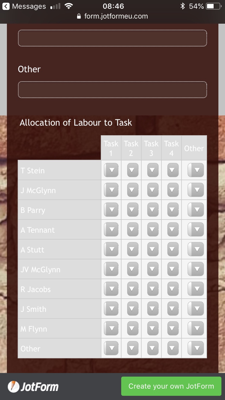
agraham172Asked on August 24, 2018 at 3:47 AM
Hi! Hoping you can help. I've created an input table in a form that allows me to allocate various hours to different tasks. The issue I'm having is that when it is viewed on a smartphone the table only goes to the width of the screen and when the various hours are selected from the drop down list they cant be seen because of the dropdown arrow.
Hoping to let people see their selections prior to submitting. Any advice?
-
BJoannaReplied on August 24, 2018 at 9:35 AM
I saw that you changed the Input Type of the fields to Text Box.
Is your issue now resolved?
You can also add this CSS code to reduce the width of the Row Labels on mobile devices:
@media screen and (max-width: 480px), screen and (max-device-width: 767px) and (orientation: portrait), screen and (max-device-width: 415px) and (orientation: landscape){
.form-matrix-row-headers {
width: 50px!important;
word-break: break-all;
min-width: 50px;
}
How to Inject Custom CSS Codes

- Templates
- Integrations
- INTEGRATIONS
- See 100+ integrations
- FEATURED INTEGRATIONS
 PayPal
- Slack
- Google Sheets
- Mailchimp
- Zoom
- Dropbox
- Google Calendar
- Hubspot
- Salesforce
- See more Integrations
- Products
- PRODUCTS
- Form Builder
- Jotform Enterprise
- Jotform Apps
- Store Builder
- Jotform Tables
- Jotform Inbox
- Jotform Mobile App
- Jotform Approvals
- Report Builder
- Smart PDF Forms
- PDF Editor
- Jotform Sign
- Jotform for Salesforce Discover Now
- Support

