


-
abpoolsAsked on September 5, 2018 at 12:22 PM
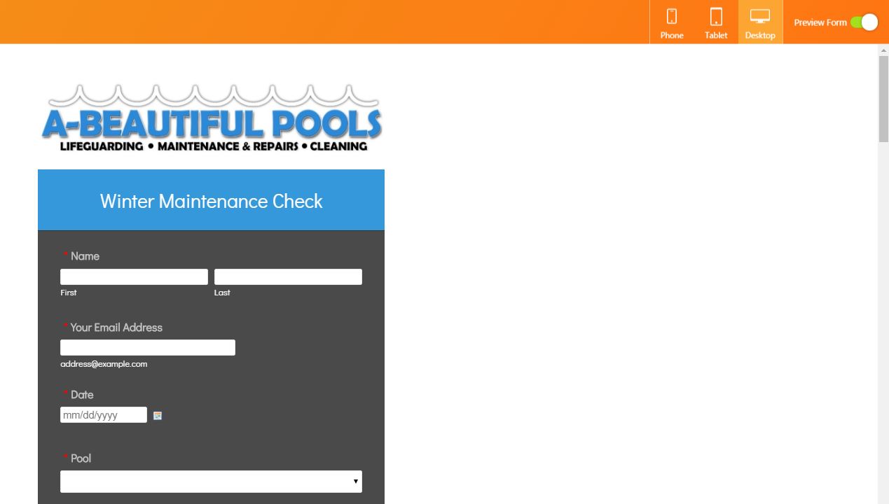
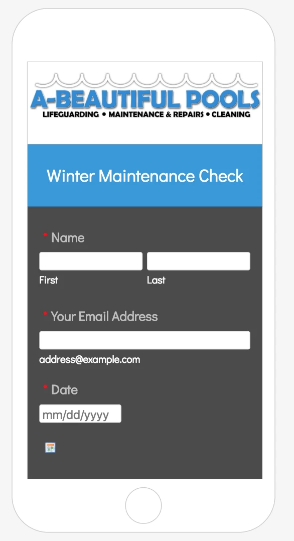
On the form builder, logo is centered and fits perfectly on the desktop form preview. Is there a way to keep the size of the logo as it is right now when on desktop view, but make it smaller on a mobile device so that it will all fit on the screen?
Photos of desktop view and mobile view are attached.

-
AdrianReplied on September 5, 2018 at 1:34 PM
I have added the following CSS to your form to fix this.
@media (max-width: 700px) {
div.form-all {
margin-top: 100px !important;
}
div.form-all:before {
top: -100px !important;
background-size: contain;
}
}Result:
Please check again and let us know if you need further assistance.
- Templates
- Integrations
- INTEGRATIONS
- See 100+ integrations
- FEATURED INTEGRATIONS
 PayPal
- Slack
- Google Sheets
- Mailchimp
- Zoom
- Dropbox
- Google Calendar
- Hubspot
- Salesforce
- See more Integrations
- Products
- PRODUCTS
- Form Builder
- Jotform Enterprise
- Jotform Apps
- Store Builder
- Jotform Tables
- Jotform Inbox
- Jotform Mobile App
- Jotform Approvals
- Report Builder
- Smart PDF Forms
- PDF Editor
- Jotform Sign
- Jotform for Salesforce Discover Now
- Support


