


-
stormingrobotsAsked on October 18, 2018 at 6:20 PM
Hi,
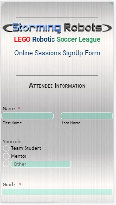
I could not get my form to show properly on a cell phone:
https://www.jotform.com/82906715910156
I have tried to play with the
@media only screen and (max-width: 600px) { ...
no luck . Please help.
-
Kevin Support Team LeadReplied on October 18, 2018 at 9:20 PM
I have been checking your form and it seems like you have customized it with your own CSS code, if I remove the entire code the form displays properly, example:
I would recommend you to edit your CSS code and use the media queries to set the form layout as you need.
You may refer to the following guide in order to learn more about media queries: https://www.w3schools.com/css/css_rwd_mediaqueries.asp
For example, if you need the element ".supernova" to display a width of 75% on desktop and 100% on mobile, then you will need to do the following:
- This code is for desktop:
@media screen and (min-width: 600px) {
.supernova{
width: 75%;
}
}
- This code would be for mobile:
@media screen and (max-width: 480px){
.supernova{
width: 100%;
}
}
This way you will be controlling how the form looks on the specified screen sizes.
Thanks.
-
stormingrobotsReplied on October 19, 2018 at 9:04 AM
Thank you very much!
- Templates
- Integrations
- INTEGRATIONS
- See 100+ integrations
- FEATURED INTEGRATIONS
 PayPal
- Slack
- Google Sheets
- Mailchimp
- Zoom
- Dropbox
- Google Calendar
- Hubspot
- Salesforce
- See more Integrations
- Products
- PRODUCTS
- Form Builder
- Jotform Enterprise
- Jotform Apps
- Store Builder
- Jotform Tables
- Jotform Inbox
- Jotform Mobile App
- Jotform Approvals
- Report Builder
- Smart PDF Forms
- PDF Editor
- Jotform Sign
- Jotform for Salesforce Discover Now
- Support

