


-
mbewleyAsked on January 7, 2019 at 12:47 PM
-
Support_Management Jotform SupportReplied on January 7, 2019 at 12:50 PM
Although I only used an emulator, I failed to reproduce what you had in your screenshot. You can see that the texts wrap as intended in the image below.
Can you tell us the make and model of the iOS device you're using, along with the iOS version? The only way we can properly debug this is if we can reproduce it. If possible, try opening your form in Chrome for iOS for comparison's sake.
-
Michael BewleyReplied on January 7, 2019 at 1:36 PM
Thank you for checking. I'm using iPhone X and iOS version 12.1.2 (16C101).
Furthermore, it's not wrapping on my tablet either. It's an iPad Air 2, WiFi, Oct 14 (A1566).

-
Support_Management Jotform SupportReplied on January 7, 2019 at 3:10 PM
Okay, I managed to reproduce it with an iPhone X. Gave it a run with a cloned copy of your form and here are the codes that I used to fix it:
@media only screen and (min-device-width: 320px) and (max-device-width: 480px) and (-webkit-min-device-pixel-ratio: 2) {
.dd-selected-description-truncated {
white-space: normal !important;
}
}
Please append these to the last codes I provided on the other thread.
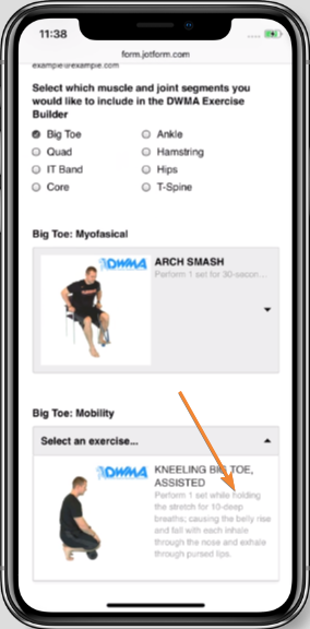
Result:

-
Michael BewleyReplied on January 7, 2019 at 4:23 PM
Okay, thank you! So by appending you mean this...
.dd-selected-image, .dd-option-image {
max-width: 150px !important;
}
@media only screen and (min-device-width: 320px) and (max-device-width: 480px) and (-webkit-min-device-pixel-ratio: 2) {
.dd-selected-description-truncated {
white-space: normal !important;
}
}
-
Michael BewleyReplied on January 7, 2019 at 4:29 PM
Thank you! It seems to be working flawlessly now!!!
- Templates
- Integrations
- INTEGRATIONS
- See 100+ integrations
- FEATURED INTEGRATIONS
 PayPal
- Slack
- Google Sheets
- Mailchimp
- Zoom
- Dropbox
- Google Calendar
- Hubspot
- Salesforce
- See more Integrations
- Products
- PRODUCTS
- Form Builder
- Jotform Enterprise
- Jotform Apps
- Store Builder
- Jotform Tables
- Jotform Inbox
- Jotform Mobile App
- Jotform Approvals
- Report Builder
- Smart PDF Forms
- PDF Editor
- Jotform Sign
- Jotform for Salesforce Discover Now
- Support


