


-
ClintlunaAsked on January 24, 2019 at 7:46 PM
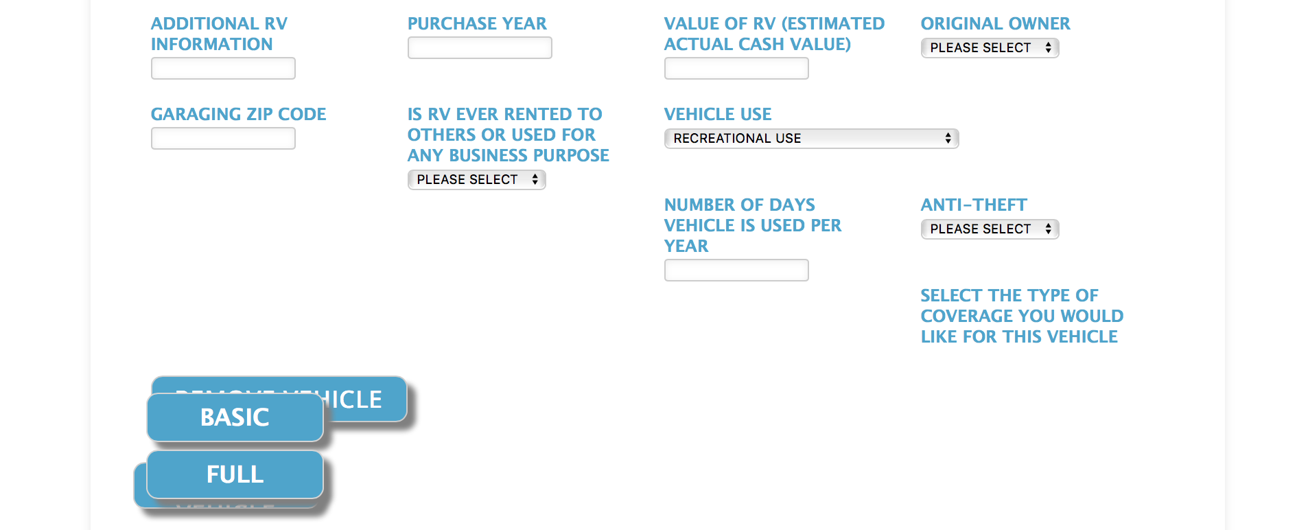
On the form below, where it says "Add Vehicle" on page two, the part that says vehicle gets cut off. I'd like that just to be on one line. Also when I open this config list in preview mode, the very last row of text is not aligned with the other rows' columns and the buttons "basic" and "full" should be right under the text, "select the type of coverage you would like..." Thank you! I've attached a screenshot as well as the form link below.
Form: https://www.jotform.com/build/82772186584166
-
Kevin Support Team LeadReplied on January 24, 2019 at 10:12 PM
It seems you have customized the widget with several CSS codes, while doing this we do recommend to make sure your code does not have conflicts and you're covering all the possible screen sizes where your form will be loaded on.
Now, I have modified some of your code and ended up with the following version: https://form.jotform.com/90237678855976
What you need to do is to remove all the code from your current widget and inject this one instead:
th {
color: #21a6cf !important;
font-family: "Lucida Grande", "Lucida Sans Unicode", "Lucida Sans", Verdana, sans-serif;
}
input[type="text"]{
width: 120px;
}
select{
width: px;
}
#list > tbody > tr:first-child {display: none;}
.mobileColumnName {
width: 190px !important;
display: block;
color: #21a6cf !important;
font-family: "Lucida Grande", "Lucida Sans Unicode", "Lucida Sans", Verdana, sans-serif;
font-weight: bold;
}
td {float: left;}
button {
font-weight: bold;
}
.add, .remove {
border-radius: 10px;
border: 2px solid #21a6cf
padding: px;
width: 150 px;
height: 40px;
color: #ffffff;
font-family: "Open Sans";
font-size: 20px;
box-shadow: 8px 8px 5px grey;
}
.remove {
width: 150 px;
}
.add, .remove {
white-space: pre-wrap;
}
.add, .remove {
background: #21a6cf;
}
td {
padding-left: 15px;
padding-right: 15px;
min-height: 85px;
min-width: 20%;
}
td.col14 input[id*="_row"]:checked:after {
background: #117fa0 !important;
}
td.col14 input[id*="0_row"]:after {
content: "BASIC";
}
td.col14 input[id*="1_row"]:after {
content: "FULL";
}
td.col14 .radio {
height: 50px !important;
}
td.col14 .radio label {
position: relative;
left: 20px;
top: 5px;
}
td.col14 .radio input{
width: 0px !important;
}
.radio {
width: 35% !important;
display: inline-block;
}
td.col14 input[id*="0_row"]:active:after, td.col5 input[id*="1_row"]:active:after {
box-shadow: none !important;
background: #4db7d8 !important;
color: black;
left: -15px !important;
top: -3px !important;
}
td.col14 input[id*="0_row"]:hover:after, td.col14 input[id*="1_row"]:hover:after {
background: #77c8e1 !important;
color: black;
}
@media (max-width: 480px) {
.radio {
display: block !important;
}
.remove {
float:right !important;
} }
.add, .remove {
border-radius: 10px;
border: 2px solid #21a6cf
padding: px;
width: 160px;
height: 40px;
color: #ffffff;
font-family: "Open Sans";
font-size: 20px;
box-shadow: 8px 8px 5px grey;
}
.remove {
width: 220px;
}
.add, .remove {
background: #21a6cf;
}
input[id*="_row"]:after {
display: inline-block;
overflow: hidden;
margin: 0px 0px 9px 0px;
position: relative;
width: 150px;
height: 40px;
font: 700 13px/40px Lato, sans-serif;
text-align: center;
cursor: pointer;
-webkit-transform: translateZ(0);
border-radius: 10px;
color: #ffffff;
font-family: "Lucida Grande", "Lucida Sans Unicode", "Lucida Sans", Verdana, sans-serif;
font-size: 20px;
box-shadow: 8px 8px 5px grey;
background: #21a6cf;
border: 1px solid #d5d5d5;
left: -20px !important;
top: -5px !important;
}
.radio {
width: 35% !important;
display: inline-block;
}
@media (max-width: 480px) {
.radio {
display: block !important;
}
.remove {
float:right !important;
}
}
.add:active, .remove:active {
box-shadow: none !important;
background: #4db7d8 !important;
left: 15px !important;
top: 3px !important;
position:relative;
}
td.col14 > div > div:nth-child(1) {
top: 397px;
left: 11px;
}
td.col14 > div > div:nth-child(2) {
position: absolute;
margin-top: 57px !important;
margin-left: -65px !important;
}
td.col15 {
position: relative;
top: 90px !important;
left: 610px !important;
}
I hope this helps.
-
ClintlunaReplied on January 24, 2019 at 11:28 PM
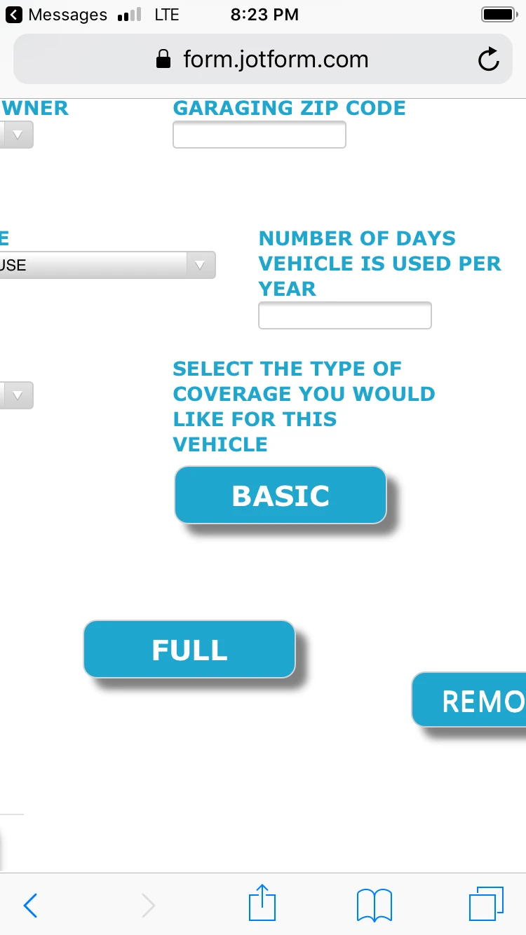
Hi, it looks much better overall! The "Add Vehicle" button still has "Vehicle" cut off. On the desktop the config list looks good, on mobile device (tried on iPhone 6s) the "full" button gets shifted for some reason. Attaching a couple screen shots.
-
Kiran Support Team LeadReplied on January 25, 2019 at 1:08 AM
Please try changing the CSS code in the configurable list widget so that the buttons should be displaying normally on the mobile devices as well.
@media only screen
and (min-device-width : 375px)
and (max-device-width : 667px) {
td.col14 > div > div:nth-child(2) {
margin-left: 0px !important;
}
td.col14 .radio {
height: 20px !important;
}
}
th {
color: #21a6cf !important;
font-family: "Lucida Grande", "Lucida Sans Unicode", "Lucida Sans", Verdana, sans-serif;
}
input[type="text"]{
width: 120px;
}
select{
width: px;
}
#list > tbody > tr:first-child {display: none;}
.mobileColumnName {
width: 190px !important;
display: block;
color: #21a6cf !important;
font-family: "Lucida Grande", "Lucida Sans Unicode", "Lucida Sans", Verdana, sans-serif;
font-weight: bold;
}
td {float: left;}
button {
font-weight: bold;
}
.add, .remove {
border-radius: 10px;
border: 2px solid #21a6cf
padding: px;
width: 150 px;
height: 40px;
color: #ffffff;
font-family: "Open Sans";
font-size: 20px;
box-shadow: 8px 8px 5px grey;
}
.remove {
width: 150 px;
}
.add, .remove {
white-space: pre-wrap;
}
.add, .remove {
background: #21a6cf;
}
td {
padding-left: 15px;
padding-right: 15px;
min-height: 85px;
min-width: 20%;
}
td.col14 input[id*="_row"]:checked:after {
background: #117fa0 !important;
}
td.col14 input[id*="0_row"]:after {
content: "BASIC";
}
td.col14 input[id*="1_row"]:after {
content: "FULL";
}
td.col14 .radio {
height: 50px;
}
td.col14 .radio label {
position: relative;
left: 20px;
top: 5px;
}
td.col14 .radio input{
width: 0px !important;
}
.radio {
width: 35% !important;
display: inline-block;
}
td.col14 input[id*="0_row"]:active:after, td.col5 input[id*="1_row"]:active:after {
box-shadow: none !important;
background: #4db7d8 !important;
color: black;
left: -15px !important;
top: -3px !important;
}
td.col14 input[id*="0_row"]:hover:after, td.col14 input[id*="1_row"]:hover:after {
background: #77c8e1 !important;
color: black;
}
@media (max-width: 480px) {
.radio {
display: block !important;
}
.remove {
float:right !important;
} }
.add, .remove {
border-radius: 10px;
border: 2px solid #21a6cf
padding: px;
width: 160px;
height: 40px;
color: #ffffff;
font-family: "Open Sans";
font-size: 20px;
box-shadow: 8px 8px 5px grey;
}
.remove {
width: 220px;
}
.add, .remove {
background: #21a6cf;
}
input[id*="_row"]:after {
display: inline-block;
overflow: hidden;
margin: 0px 0px 9px 0px;
position: relative;
width: 150px;
height: 40px;
font: 700 13px/40px Lato, sans-serif;
text-align: center;
cursor: pointer;
-webkit-transform: translateZ(0);
border-radius: 10px;
color: #ffffff;
font-family: "Lucida Grande", "Lucida Sans Unicode", "Lucida Sans", Verdana, sans-serif;
font-size: 20px;
box-shadow: 8px 8px 5px grey;
background: #21a6cf;
border: 1px solid #d5d5d5;
left: -20px !important;
top: -5px !important;
}
.radio {
width: 35% !important;
display: inline-block;
}
@media (max-width: 480px) {
.radio {
display: block !important;
}
.remove {
float:right !important;
}
}
.add:active, .remove:active {
box-shadow: none !important;
background: #4db7d8 !important;
left: 15px !important;
top: 3px !important;
position:relative;
}
td.col14 > div > div:nth-child(1) {
top: 397px;
left: 11px;
}
td.col14 > div > div:nth-child(2) {
position: absolute;
margin-top: 57px !important;
margin-left: -65px;
}
td.col15 {
position: relative;
top: 90px !important;
left: 610px !important;
}
Please give it a try and let us know if you need any further assistance. We will be happy to help.
-
ClintlunaReplied on January 25, 2019 at 5:55 PM
Hi Kiran,
Thanks for the reply. It still looks the same as in the pic above on mobile the Basic & Full buttons are not in the same column / by each other.
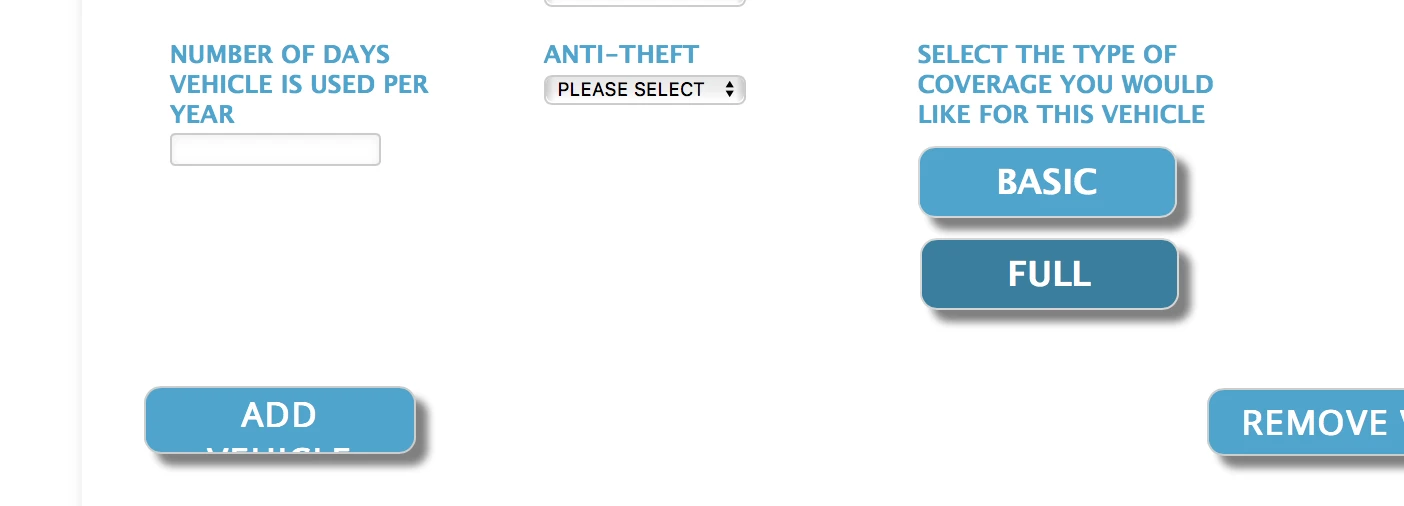
Also "Vehicle" is still cut out on the "Add Vehicle" button. I'd like the text "Add Vehicle" to just be on one line.
-
Kevin Support Team LeadReplied on January 25, 2019 at 9:24 PM
I have been checking your form and I can see the issue, I have modified it a bit in order to display the widget properly on mobile devices as well, please try removing all the existing code in your widget and inject this one instead:
th {
color: #21a6cf !important;
font-family: "Lucida Grande", "Lucida Sans Unicode", "Lucida Sans", Verdana, sans-serif;
}
input[type="text"]{
width: 120px;
}
select{
width: px;
}
#list > tbody > tr:first-child {display: none;}
.mobileColumnName {
width: 190px !important;
display: block;
color: #21a6cf !important;
font-family: "Lucida Grande", "Lucida Sans Unicode", "Lucida Sans", Verdana, sans-serif;
font-weight: bold;
}
td {float: left;}
button {
font-weight: bold;
}
.remove {
width: 150 px;
}
.add, .remove {
white-space: pre-wrap;
}
.add, .remove {
background: #21a6cf;
}
td {
padding-left: 15px;
padding-right: 15px;
min-height: 85px;
min-width: 20%;
}
td.col14 input[id*="_row"]:checked:after {
background: #117fa0 !important;
}
td.col14 input[id*="0_row"]:after {
content: "BASIC";
}
td.col14 input[id*="1_row"]:after {
content: "FULL";
}
td.col14 .radio {
height: 50px;
}
td.col14 .radio label {
position: relative;
left: 20px;
top: 5px;
}
td.col14 .radio input{
width: 0px !important;
}
.radio {
width: 35% !important;
display: inline-block;
}
td.col14 input[id*="0_row"]:active:after, td.col5 input[id*="1_row"]:active:after {
box-shadow: none !important;
background: #4db7d8 !important;
color: black;
left: -15px !important;
top: -3px !important;
}
td.col14 input[id*="0_row"]:hover:after, td.col14 input[id*="1_row"]:hover:after {
background: #77c8e1 !important;
color: black;
}
.add, .remove {
border-radius: 10px;
border: 2px solid #21a6cf
padding: px;
width: 200px;
height: 40px;
color: #ffffff;
font-family: "Open Sans";
font-size: 20px;
box-shadow: 8px 8px 5px grey;
}
.remove {
width: 220px;
}
.add, .remove {
background: #21a6cf;
}
input[id*="_row"]:after {
display: inline-block;
overflow: hidden;
margin: 0px 0px 9px 0px;
position: relative;
width: 150px;
height: 40px;
font: 700 13px/40px Lato, sans-serif;
text-align: center;
cursor: pointer;
-webkit-transform: translateZ(0);
border-radius: 10px;
color: #ffffff;
font-family: "Lucida Grande", "Lucida Sans Unicode", "Lucida Sans", Verdana, sans-serif;
font-size: 20px;
box-shadow: 8px 8px 5px grey;
background: #21a6cf;
border: 1px solid #d5d5d5;
left: -20px !important;
top: -5px !important;
}
.radio {
width: 35% !important;
display: block !important;
}
@media (max-width: 480px) {
.remove {
float:right !important;
}
td.col15 {
position: relate;
top: 15px !important;
left: 0px !important;
}
}
.add:active, .remove:active {
box-shadow: none !important;
background: #4db7d8 !important;
left: 15px !important;
top: 3px !important;
position:relative;
}
td.col14 > div > div:nth-child(1) {
top: 397px;
left: 11px;
}
@media (min-width: 480px) {
td.col15 {
position: relative;
top: 90px !important;
left: 610px !important;
}
}
I hope this helps.
-
ClintlunaReplied on January 26, 2019 at 6:09 PM
@Kevin_G, that looks amazing now - thanks!! Thanks everyone for your help!
- Templates
- Integrations
- INTEGRATIONS
- See 100+ integrations
- FEATURED INTEGRATIONS
 PayPal
- Slack
- Google Sheets
- Mailchimp
- Zoom
- Dropbox
- Google Calendar
- Hubspot
- Salesforce
- See more Integrations
- Products
- PRODUCTS
- Form Builder
- Jotform Enterprise
- Jotform Apps
- Store Builder
- Jotform Tables
- Jotform Inbox
- Jotform Mobile App
- Jotform Approvals
- Report Builder
- Smart PDF Forms
- PDF Editor
- Jotform Sign
- Jotform for Salesforce Discover Now
- Support

