


-
NavilogicAsked on February 13, 2019 at 8:04 AM
I have created a form and it looks good on email and web. But when I view it on my mobile all pictures are compressed on the side only, and it looks so wird.
Have I dont anything wrong?

-
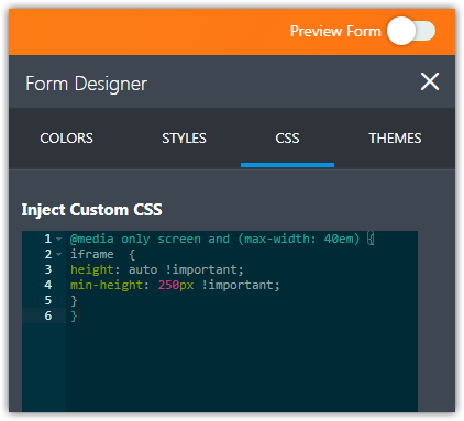
BJoannaReplied on February 13, 2019 at 10:33 AM
Your screenshot is not shown here on the forum, but I assume that the issue is related to the Image Slider widget.
Please add the following CSS code to your form to make it mobile responsive.
@media only screen and (max-width: 40em) {
iframe {
height: auto !important;
}
}
How to Inject Custom CSS Codes

-
NavilogicReplied on February 13, 2019 at 11:43 AMHi,
Better, but not the pictures are way more flat than on the computer. Meaning the issue gets opposite than before, just not that bad.
Do you have better solution ?
Thanks,
Jesper
Fra: JotForm
Sendt: 13. februar 2019 16:34
Til: Jesper Kenborg (NaviLogic) [DK]
Emne: Re: Pictures on mobile looks wrong
A new response has been received:
[JOTFORM]
Answered by BJoanna
Your screenshot is not shown here on the forum, but I assume that the issue is related to the Image Slider widget.
Please add the following CSS code to your form to make it mobile responsive.
@media only screen and (max-width: 40em) {
iframe {
height: auto !important;
}
}
How to Inject Custom CSS Codes
[1550071937responsive.PNG]
View this thread on browser » Unsubscribe Thread
1550072022
... -
Richie JotForm SupportReplied on February 13, 2019 at 1:13 PM
I have checked your form using my mobile device and it seems that the Image slider widget is responsive.
Can you please explain further how you want the Image slider to function?
-
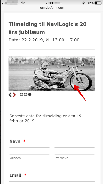
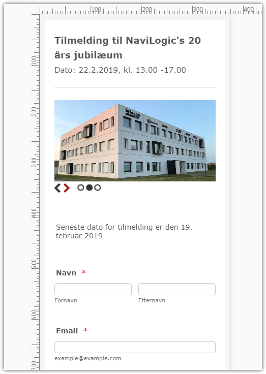
NavilogicReplied on February 13, 2019 at 4:43 PMHere is the layout on my PC, and where the picture is not stretched horizontal:
[cid:image001.png@01D4C3E8.21E2D5D0]
Fra: JotForm
Sendt: 13. februar 2019 19:14
Til: Jesper Kenborg (NaviLogic) [DK]
Emne: Re: Pictures on mobile looks wrong
A new response has been received:
[JOTFORM]
Answered by Richie_P
I have checked your form using my mobile device and it seems that the Image slider widget is responsive.
[https://cms.jotform.com/uploads/image_upload/image_upload/global/78925_1.png]
Can you please explain further how you want the Image slider to function?
View this thread on browser » Unsubscribe Thread
1550081610
... -
Jed_CReplied on February 13, 2019 at 7:25 PM
We are not able to see the image attachment. Please re-attach it by following this guide https://www.jotform.com/help/438-How-to-Post-Screenshots-to-Our-Support-Forum.
Looking forward for your response.
-
NavilogicReplied on February 14, 2019 at 5:57 PM


-
NavilogicReplied on February 14, 2019 at 6:43 PMI don’t get it, I can see the image on the support site? However, I have re-attached a number of images from the mobile interface, you can compare with the on-PC look.
Fra: JotForm
Sendt: 14. februar 2019 01:25
Til: Jesper Kenborg (NaviLogic) [DK]
Emne: Re: Pictures on mobile looks wrong
A new response has been received:
[JOTFORM]
Answered by Jed_C
We are not able to see the image attachment. Please re-attach it by following this guide https://www.jotform.com/help/438-How-to-Post-Screenshots-to-Our-Support-Forum.
Looking forward for your response.
View this thread on browser » Unsubscribe Thread
1550103926
... -
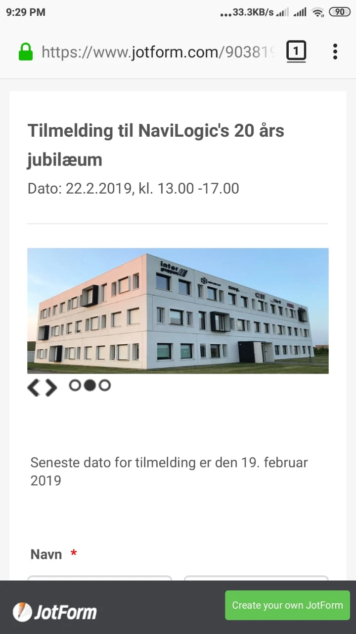
Jed_CReplied on February 14, 2019 at 8:20 PM
I checked your form on mobile view and it doesn't show the building height stretched same as what you have in your screenshot. Below is what I see.

May I know what mobile device and browser you are using? Looking forward for your response.
-
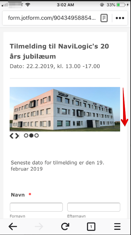
NavilogicReplied on February 15, 2019 at 8:43 AMDear Jed,
This is the building in real life and on the PC, you don’t see any difference?
[cid:image001.png@01D4C537.88CE94A0]
Fra: JotForm
Sendt: 15. februar 2019 02:20
Til: Jesper Kenborg (NaviLogic) [DK]
Emne: Re: Pictures on mobile looks wrong
A new response has been received:
[JOTFORM]
Answered by Jed_C
I checked your form on mobile view and it doesn't show the building height stretched same as what you have in your screenshot. Below is what I see.
[1550193561Tilmelding til NaviLogic's 20]
May I know what mobile device and browser you are using? Looking forward for your response.
View this thread on browser » Unsubscribe Thread
1550193618
... -
Richie JotForm SupportReplied on February 15, 2019 at 10:19 AM
May we know the mobile device and web browser you're using to view your form?
To clarify, do you want to increase the width or height of the image?
Unfortunately, we cannot view the screenshot you have shared. Kindly follow this guide on how to post screenshots in the thread.
Guide:-How-to-add-screenshots-images-to-questions-to-the-support-forum
Looking forward for your response.
-
NavilogicReplied on February 15, 2019 at 12:43 PMSure, Im using Firefox to view the page on my computer and Firefox to view the page on my mobile iPhone 7P.
All screen shots are already on the support page here:
https://www.jotform.com/answers/1731353-Pictures-on-mobile-looks-wrong
Fra: JotForm
Sendt: 15. februar 2019 16:19
Til: Jesper Kenborg (NaviLogic) [DK]
Emne: Re: Pictures on mobile looks wrong
A new response has been received:
[JOTFORM]
Answered by Richie_P
May we know the mobile device and web browser you're using to view your form?
To clarify, do you want to increase the width or height of the image?
Unfortunately, we cannot view the screenshot you have shared. Kindly follow this guide on how to post screenshots in the thread.
Guide:-How-to-add-screenshots-images-to-questions-to-the-support-forum
Looking forward for your response.
View this thread on browser » Unsubscribe Thread
1550243950
... -
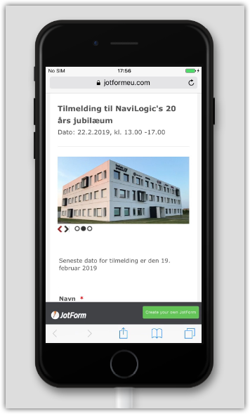
Richie JotForm SupportReplied on February 15, 2019 at 2:16 PM
This is how I view your form using Firefox in my Phone7.
Do you want to increase the height of your slider?
To increase the height of your slide and images, you can use these custom CSS.
@media only screen and (max-width: 40em) {
.slidesjs-container{
height:400px !important;
}
.slidesjs-control{
height:400px !important;
}
}You can adjust the height .
You need to insert the custom CSS inside the Widget settings>custom CSS.
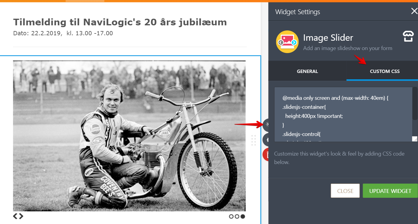
Hope this information helps.
-
NavilogicReplied on February 16, 2019 at 6:43 AMHello Richie,
I have tried out the provided CSS code, but it didn’t do any difference.
If I adjust the Widget CSS to following, and then it works for the mobile:
@media only screen and (max-width: 40em) {
.slidesjs-container{
height:200px !important;
}
.slidesjs-control{
height:200px !important;
}
}
But then the tablet and PC interface get spoiled, now stretched horizontal ☹ ☹
Please advice.
Thanks,
Jesper
Fra: JotForm
Sendt: 15. februar 2019 20:16
Til: Jesper Kenborg (NaviLogic) [DK]
Emne: Re: Pictures on mobile looks wrong
A new response has been received:
[JOTFORM]
Answered by Richie_P
This is how I view your form using Firefox in my Phone7.
[https://cms.jotform.com/uploads/image_upload/image_upload/global/79129_1.png]
Do you want to increase the height of your slider?
To increase the height of your slide and images, you can use these custom CSS.
@media only screen and (max-width: 40em) {
.slidesjs-container{
height:400px !important;
}
.slidesjs-control{
height:400px !important;
}
}
You can adjust the height .
You need to insert the custom CSS inside the Widget settings>custom CSS.
[https://cms.jotform.com/uploads/image_upload/image_upload/global/79130_1.png]
Hope this information helps.
View this thread on browser » Unsubscribe Thread
1550258185
... -
Nik_CReplied on February 16, 2019 at 8:54 AM
I tested your form on the laptop and on an external screen, but I wasn't able to replicate, the images are showing fine:
And that is expected since you set media query CSS for screens that have a maximum width of 40em which is 640px.
So, the changes are not visible for screens above 640px, as it is with laptops, screens and tablets.
On which device(s) did you test?
-
NavilogicReplied on February 16, 2019 at 5:43 PMI tested on an iPhone 7P
Fra: JotForm
Sendt: 16. februar 2019 14:55
Til: Jesper Kenborg (NaviLogic) [DK]
Emne: Re: Pictures on mobile looks wrong
A new response has been received:
[JOTFORM]
Answered by Nik_C
I tested your form on the laptop and on an external screen, but I wasn't able to replicate, the images are showing fine:
[1550324775Screen Shot 2019-02-16 at 2.44]
And that is expected since you set media query CSS for screens that have a maximum width of 40em which is 640px.
So, the changes are not visible for screens above 640px, as it is with laptops, screens and tablets.
On which device(s) did you test?
View this thread on browser » Unsubscribe Thread
1550325282
... -
MikeReplied on February 16, 2019 at 10:03 PM
You may also try the next CSS with a specified minimum height to see if you like it better:
@media only screen and (max-width: 40em) {
iframe {
height: auto !important;
min-height: 185px !important;
}
}
-
NavilogicReplied on February 17, 2019 at 8:43 AMDear Mike,
On your preview it all looks good with the last script in all modes. But on my mobile it still don’t look right – stretched about +20% to the side.
My phone is a iPhone 7P and im using FireFox for browsing.
If I use the link on my PC and also FireFox and compress to like mobile format, it looks good. So this looks like it is a ussue on mobile FireFox.
Thanks,
Jesper
Fra: JotForm
Sendt: 17. februar 2019 04:03
Til: Jesper Kenborg (NaviLogic) [DK]
Emne: Re: Pictures on mobile looks wrong
A new response has been received:
[JOTFORM]
Answered by Mike
You may also try the next CSS with a specified minimum height to see if you like it better:
@media only screen and (max-width: 40em) {
iframe {
height: auto !important;
min-height: 185px !important;
}
}
[https://shots.jotform.com/mike/s/88s72.png]
View this thread on browser » Unsubscribe Thread
1550372599
... -
AndrewHagReplied on February 17, 2019 at 11:18 AM
I tested your form on the mobile device across different browsers, and I see that images are showing fine.
Firefox:
Google Chrome:

Still, you are facing the issue on the mobile device?
-
NavilogicReplied on February 17, 2019 at 12:43 PMDear Andrew,
Both images you have sent are wrong. The building at stretched about 10-20% horizontal, if you compare it to how it looks in real life and on the form on my PC.
Here it is maybe not a bit issue but e.g. the guy on the motorbike become pressed flat.
Thanks,
Jesper
Fra: JotForm
Sendt: 17. februar 2019 17:18
Til: Jesper Kenborg (NaviLogic) [DK]
Emne: Re: Pictures on mobile looks wrong
A new response has been received:
[JOTFORM]
Answered by AndrewHag
I tested your form on the mobile device across different browsers, and I see that images are showing fine.
Firefox:
[1550419817314dced5-2f48-4e2c-bea9-e3e7c5]
Google Chrome:
[1550420051WhatsApp Image 2019-02-17 at 8]
Still, you are facing the issue on the mobile device?
View this thread on browser » Unsubscribe Thread
1550420286
... -
MikeReplied on February 17, 2019 at 1:00 PM
I have added the minimum height parameter to your form CSS. Please recheck your form.
The third photo might have some slight scaling since it has a different size compared to the first two images. In general, it is recommended to use the images with the same sizes in the Image Slider widget.
-
NavilogicReplied on February 17, 2019 at 3:43 PMHey Mike,
Yours looks good, but mine still don’t ☹
All images are the same size, as I understand.
All images are also reduced the same height, so it has nothing to do with one picture – all the same issue.
Hopefully it is only my phone…
Fra: JotForm
Sendt: 17. februar 2019 19:00
Til: Jesper Kenborg (NaviLogic) [DK]
Emne: Re: Image Slider: Pictures on mobile looks wrong
A new response has been received:
[JOTFORM]
Answered by Mike
I have added the minimum height parameter to your form CSS. Please recheck your form.
[https://shots.jotform.com/mike/s/vz7d1.png]
The third photo might have some slight scaling since it has a different size compared to the first two images. In general, it is recommended to use the images with the same sizes in the Image Slider widget.
View this thread on browser » Unsubscribe Thread
1550426423
... -
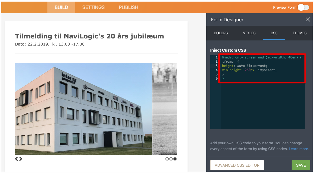
MikeReplied on February 17, 2019 at 4:36 PM
I have updated the CSS in your form to try another layout option.
CSS in widget:
@media only screen and (max-width: 40em) {
img {
width: 100% !important;
height: auto !important;
}
}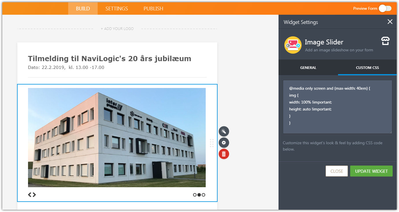
CSS in form:
@media only screen and (max-width: 40em) {
iframe {
height: auto !important;
min-height: 250px !important;
}
}
Please check the form again. Note that the third image will be displayed differently due to different image size.
The current image sizes in your image slider:
Image 1 - 680x381
Image 2 - 680x380
Image 3 - 736x507 -
NavilogicReplied on February 17, 2019 at 5:43 PMDear Mike,
After last adjustment the preview on your site looks good, but in real live the result is not good. All pictures get cut off (see uploaded picture).
I have 2 conclusions from this:
1. Your Preview is not reliable
- I hope you will work on improving the preview functions, as else not of any value.
2. The pictures size, resolution etc. should all be 100% the same, else this will not work what so ever
- I suggest you make this clear on a Q&A or guide on the website
I will live with it as it is for now.
Thanks,
Jesper
Fra: JotForm
Sendt: 17. februar 2019 22:36
Til: Jesper Kenborg (NaviLogic) [DK]
Emne: Re: Image Slider: Pictures on mobile look wrong
A new response has been received:
[JOTFORM]
Answered by Mike
I have updated the CSS in your form to try another layout option.
CSS in widget:
@media only screen and (max-width: 40em) {
img {
width: 100% !important;
height: auto !important;
}
}
[https://shots.jotform.com/mike/s/wi5my.png]
CSS in form:
@media only screen and (max-width: 40em) {
iframe {
height: auto !important;
min-height: 250px !important;
}
}
[https://shots.jotform.com/mike/s/06kpk.png]
Please check the form again. Note that the third image will be displayed differently due to different image size.
The current image sizes in your image slider:
Image 1 - 680x381
Image 2 - 680x380
Image 3 - 736x507
View this thread on browser » Unsubscribe Thread
1550439386
... -
jherwinReplied on February 17, 2019 at 8:26 PM
We are sorry for the inconvenience this may have caused. We can not view or download the screenshot attached to your response. Could you please post it again?
Guide: How to Post Screenshots to Our Support Forum
Is the CSS code provided by my colleague didn't work on your form? We can inject the CSS Code provided by Mike if you like.
-
NavilogicReplied on February 18, 2019 at 2:21 AM

-
jherwinReplied on February 18, 2019 at 2:35 AM
Please allow me some time to run a few tests and I will update you via this thread.
Thank you for your patience.
-
NavilogicReplied on February 18, 2019 at 2:43 AMThat is because the “Post” button on your website don’t work as expected. I had pushed once, but apparently then the page resize to the picture and the push did not get registered. I didn’t know that. I have tried again.
Fra: JotForm
Sendt: 18. februar 2019 02:26
Til: Jesper Kenborg (NaviLogic) [DK]
Emne: Re: Image Slider: Pictures on mobile look wrong
A new response has been received:
[JOTFORM]
Answered by jherwin
We are sorry for the inconvenience this may have caused. We can not view or download the screenshot attached to your response. Could you please post it again?
Guide: How to Post Screenshots to Our Support Forum
Is the CSS code provided by my colleague didn't work on your form? We can inject the CSS Code provided by Mike if you like.
View this thread on browser » Unsubscribe Thread
1550453164
... -
jherwinReplied on February 18, 2019 at 3:13 AM
I injected the code my colleague gave you to the widget and to your form builder. Please check your form and let us know how it looks on your end.
You can see my screencast here using iPhone7:

The code works well on my end, If the screencast on my end matches yours then try to resize all your images to the same width and height so they are all match.
-
NavilogicReplied on February 18, 2019 at 3:43 AMDear Jherwin,
It looks as before, testing on the “Private” invitation.
Lets just close the matter for now.
Thanks,
Jesper
Fra: JotForm
Sendt: 18. februar 2019 09:14
Til: Jesper Kenborg (NaviLogic) [DK]
Emne: Re: Image Slider: Pictures on mobile look wrong
A new response has been received:
[JOTFORM]
Answered by jherwin
I injected the code my colleague gave you to the widget and to your form CSS. Please check your form and let us know how it looks on your end.
You can see my screencast here using iPhone7: https://streamable.com/1jd26
View this thread on browser » Unsubscribe Thread
1550477637
... -
Victoria_KReplied on February 18, 2019 at 5:53 AM
Hello Jesper, We are very sorry that widget could not meet your expectations in full. I have also tried options and, as to me, one of firstly suggested solutions seems to work better if widget's CSS area cleared. This one:

Just in case, here is a test form: https://form.jotform.com/90482621357963
Let us know if you need more help.
-
NavilogicReplied on February 18, 2019 at 10:43 AMDear Victoria,
OK, I will try that – but can you please resend your complete proposed solution witch code in text for copy-paste.
Thanks,
Jesper
Fra: JotForm
Sendt: 18. februar 2019 11:54
Til: Jesper Kenborg (NaviLogic) [DK]
Emne: Re: Image Slider: Pictures on mobile look wrong
A new response has been received:
[JOTFORM]
Answered by Victoria_K
Hello Jesper, We are very sorry that widget could not meet your expectations in full. I have also tried options and, as to me, one of firstly suggested solutions seems to work if widget's CSS area cleared. This one:
[https://shots.jotform.com/victoria/v/forum/iepmw.png]
[1550487036Untitled2.gif]
Just in case, here is a test form: https://form.jotform.com/90482621357963
Let us know if you need more help.
View this thread on browser » Unsubscribe Thread
1550487232
... -
Victoria_KReplied on February 18, 2019 at 11:54 AM
Here the the code used on test form:
@media only screen and (max-width: 40em) {
iframe {
height: auto !important;
min-height: 250px !important;
}
}
It should be added to form's CSS area while widget has no custom codes:
Let us know how it goes for you.
- Templates
- Integrations
- INTEGRATIONS
- See 100+ integrations
- FEATURED INTEGRATIONS
 PayPal
- Slack
- Google Sheets
- Mailchimp
- Zoom
- Dropbox
- Google Calendar
- Hubspot
- Salesforce
- See more Integrations
- Products
- PRODUCTS
- Form Builder
- Jotform Enterprise
- Jotform Apps
- Store Builder
- Jotform Tables
- Jotform Inbox
- Jotform Mobile App
- Jotform Approvals
- Report Builder
- Smart PDF Forms
- PDF Editor
- Jotform Sign
- Jotform for Salesforce Discover Now
- Support


