


-
double2spaceAsked on February 26, 2019 at 2:46 PM
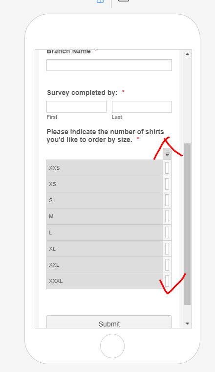
How we include a table in our form that works with mobile?
The input fields get scrunched to the point where they're not usable. See screenshot.
We've tried a number of different column widths and the same thing happens each time.
Please advise asap.
-
Elton Support Team LeadReplied on February 26, 2019 at 4:58 PM
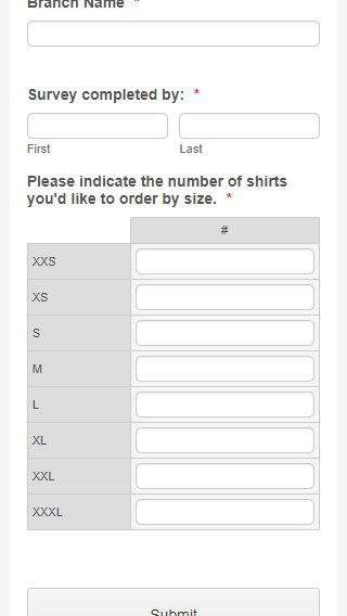
That can be fixed easily by injecting the following custom CSS code in your form.
@media screen and (max-width:480px){
th.form-matrix-row-headers {width: 80px;}
}
Guide: http://www.jotform.com/help/117-How-to-Inject-Custom-CSS-Codes
Result:
-
double2spaceReplied on February 26, 2019 at 4:59 PM
Is there a reason we have to inject custom CSS code to have your form work on mobile?
-
double2spaceReplied on February 26, 2019 at 5:02 PM
Even though having to enter custom CSS to get one of your basic field types to work is a very strange requirement, the solution you proposed worked. Thanks for your help.
-
Elton Support Team LeadReplied on February 26, 2019 at 6:21 PM
I agree with you, CSS shouldn't be necessary on default themed forms. From what I can see currently, the width of the column is based on the width of the column header text, which is on your case is just #.
I have now raised this to our developers so they can correct this on the back end. At least adding a minimum column width when viewed on mobile would help so CSS inject isn't needed.
Thanks
-
double2spaceReplied on February 26, 2019 at 6:42 PM
Got it, that makes sense, thanks again.
-
aykutReplied on March 11, 2019 at 4:28 AM
A minimum with for table column header has been added.
Thank you
- Templates
- Integrations
- INTEGRATIONS
- See 100+ integrations
- FEATURED INTEGRATIONS
 PayPal
- Slack
- Google Sheets
- Mailchimp
- Zoom
- Dropbox
- Google Calendar
- Hubspot
- Salesforce
- See more Integrations
- Products
- PRODUCTS
- Form Builder
- Jotform Enterprise
- Jotform Apps
- Store Builder
- Jotform Tables
- Jotform Inbox
- Jotform Mobile App
- Jotform Approvals
- Report Builder
- Smart PDF Forms
- PDF Editor
- Jotform Sign
- Jotform for Salesforce Discover Now
- Support


