


-
WISSFAsked on March 19, 2019 at 5:50 PM
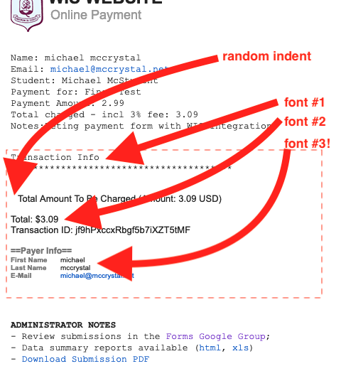
My client is unhappy with the way the notification email looks when it includes payment gateway data.
The barebones notice sent to our comptroller uses basic courier font, but the payment gateway data is all over the place: odd indent, two different fonts, multiple colors, etc.
Why isn't the default formatting consistent for this data? It makes emails - both internal and public facing - look unprofessional. Having granular formatting control of the elements within that data would be great... but as a starting point, it shouldn't be so messy to begin with.
 Page URL: https://form.jotform.com/90650440201139
 -
Elton Support Team LeadReplied on March 19, 2019 at 8:01 PM
Thanks for your feedback.
It is actually possible to change its style according to your email formatting.
You need to strip the payment labels by using extra parameters on the payment field variable.
Here's a guide: https://www.jotform.com/help/231-How-to-Strip-Payment-Labels-and-Separate-Payment-Info-on-Email-Alerts
If you need further assistance, please let us know.
Regards
-
WISSFReplied on March 19, 2019 at 9:28 PM
Thanks for the tip - I'll try that.
The formatting should be clean and consistent by default, however. It's ultra sloppy looking to have the default display provide such a mish-mash of fonts, colors, alignments.
-
Elton Support Team LeadReplied on March 19, 2019 at 10:33 PM
Great! Through this method, the fonts and colors should go with your formattings, not the payments fixed style.
- Templates
- Integrations
- INTEGRATIONS
- See 100+ integrations
- FEATURED INTEGRATIONS
 PayPal
- Slack
- Google Sheets
- Mailchimp
- Zoom
- Dropbox
- Google Calendar
- Hubspot
- Salesforce
- See more Integrations
- Products
- PRODUCTS
- Form Builder
- Jotform Enterprise
- Jotform Apps
- Store Builder
- Jotform Tables
- Jotform Inbox
- Jotform Mobile App
- Jotform Approvals
- Report Builder
- Smart PDF Forms
- PDF Editor
- Jotform Sign
- Jotform for Salesforce Discover Now
- Support

