


-
hammertoAsked on March 20, 2019 at 3:36 AM
Hi,
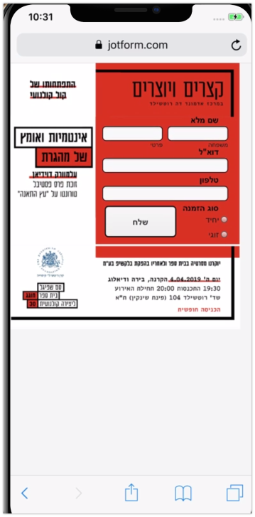
I am trying to get a good looking form that works fine on mobile resolutions.
The desktop version looks fine. The problem is that the form is combined with a backbroung image, a banner (LOGO), and a footer.
On mobile version it falls apart.
BR
TKH
Page URL: https://form.jotform.com/73193348744969 -
Victoria_KReplied on March 20, 2019 at 6:32 AM
Unfortunately, you have not specified how you would like to display fields on mobiles.
I can suggest the following:
You can inject this CSS code to the form:
How-to-Inject-Custom-CSS-Codes
@media screen and (max-device-width: 40em) {
.form-all:before {
background-position: bottom center !important;
}
.form-all {
margin-top: -5em !important;
top: 10em !important;
margin: auto;
background-size: contain;
}
li {
width: 65% !important;
margin-top: -0.5em !important;
margin-bottom: 0 !important;
padding-top: 0 !important;
zoom: 0.95 !important;
}
li:first-child {
margin-top: -2em !important;
}
li:nth-child(2) {
margin-top: -1.5em !important;
}
label {
padding-bottom: 0 !important;
}
.form-sub-label {
margin-top: -0 !important;
}
#id_5 {
position: absolute;
bottom: 8em;
right: 3em;
}
#id_9 {
width: 100% !important;
padding: 0 !important;
}
}
-
TommyReplied on March 22, 2019 at 8:33 AM
Thanks for your help :)
- Templates
- Integrations
- INTEGRATIONS
- See 100+ integrations
- FEATURED INTEGRATIONS
 PayPal
- Slack
- Google Sheets
- Mailchimp
- Zoom
- Dropbox
- Google Calendar
- Hubspot
- Salesforce
- See more Integrations
- Products
- PRODUCTS
- Form Builder
- Jotform Enterprise
- Jotform Apps
- Store Builder
- Jotform Tables
- Jotform Inbox
- Jotform Mobile App
- Jotform Approvals
- Report Builder
- Smart PDF Forms
- PDF Editor
- Jotform Sign
- Jotform for Salesforce Discover Now
- Support

