


-
boldmktgAsked on March 22, 2019 at 10:55 AM
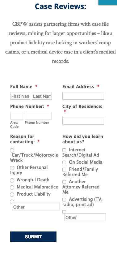
I need this form to switch to be one column at the mobile view.
This form looks great on the desktop as two columns but as the browser shrinks, it looks bad at the tablet and mobile view as the selections start to stack.
https://www.jotform.com/build/90315617703150
Preview on my site:
http://s89.617.myftpupload.com/resources-for-counsel/
Do you have some custom CSS to fix this?
I am embedding to my site via iFrame if that means anything.
Thank you!
-
BJoannaReplied on March 22, 2019 at 12:25 PM
Please add the Mobile Responsive widget to the form to have a single column on mobile devices.
To resolve the issue with the positioning of the "Other" field add this CSS code to the form:
@media screen and (max-width: 480px), screen and (max-device-width: 767px) and (orientation: portrait), screen and (max-device-width: 415px) and (orientation: landscape){
.form-radio-other-input, .form-checkbox-other-input {
position: relative;
margin-left: 18px;
top: -15px!important;
}
}
How to Inject Custom CSS Codes

Here is a demo form - https://form.jotform.com/90805092465964
Feel free to test it and clone it.
- Templates
- Integrations
- INTEGRATIONS
- See 100+ integrations
- FEATURED INTEGRATIONS
 PayPal
- Slack
- Google Sheets
- Mailchimp
- Zoom
- Dropbox
- Google Calendar
- Hubspot
- Salesforce
- See more Integrations
- Products
- PRODUCTS
- Form Builder
- Jotform Enterprise
- Jotform Apps
- Store Builder
- Jotform Tables
- Jotform Inbox
- Jotform Mobile App
- Jotform Approvals
- Report Builder
- Smart PDF Forms
- PDF Editor
- Jotform Sign
- Jotform for Salesforce Discover Now
- Support


