


-
komjati.krisztian.92Asked on March 26, 2019 at 7:06 AM
Hy,
I made changes in order to get more widgets in a row on mobile screen.
So now the current situation is that the widgets are got shrunked in order to get multiple one in a row, but on mobile screen the widgets somehow gets in a new row.What I would like to have, at least 2-3 widgets in a row on mobile screen whithout cutting down parts from the widget.
Here is the form: https://form.jotformeu.com/90832232286355 -
jonathanReplied on March 26, 2019 at 9:01 AM
I test your form on mobile device browser and I see the issue you described.

It can be fixed using injected custom CSS codes specific to mobile viewport.
Allow us more time to check and test. We will update you here as soon as available.
-
komjati.krisztian.92Replied on March 29, 2019 at 11:32 AM
Have you found the solution?
-
jonathanReplied on March 31, 2019 at 7:38 PM
Sorry for the delays. I added the fix custom CSS codes on your form.
@media only screen and (min-device-width : 375px) and (max-device-width : 812px) and (-webkit-device-pixel-ratio : 3) {
#id_46,#id_47,#id_49,#id_52,#id_53,#id_55,#id_56 {
width: 33%;
}
}
It appears better now on mobile browser.

Can you please test/check also.
Let us know how it goes.
-
komjati.krisztian.92Replied on April 3, 2019 at 2:43 PMUnfortunately this is not working fine, because I have chenged the form,
due to the need of form.
Would you be so kind, and make the code for this form, which is basically
the original I wanted to make work properly on mobile.
So, here is the form: https://form.jotformeu.com/90924805781363 And the
element I would like to display on mobile version (max in 3 columns, just
as you made in your previous message on the iphone) is #id=79
This is a widget, an image checkbox, that contains 7 elements.
Please make the code for the element for the proper display on mobile.
Kristian
JotForm ezt írta (időpont: 2019. ápr. 1., H, 1:38):
... -
jonathanReplied on April 3, 2019 at 4:16 PM
I have now fixed also on your cloned form.
Please check/test also on your mobile browser.
It should look like this
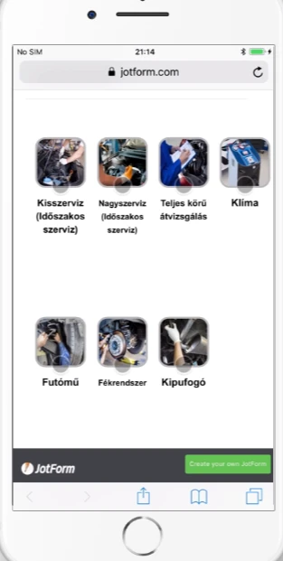
Let us know how it goes.
- Templates
- Integrations
- INTEGRATIONS
- See 100+ integrations
- FEATURED INTEGRATIONS
 PayPal
- Slack
- Google Sheets
- Mailchimp
- Zoom
- Dropbox
- Google Calendar
- Hubspot
- Salesforce
- See more Integrations
- Products
- PRODUCTS
- Form Builder
- Jotform Enterprise
- Jotform Apps
- Store Builder
- Jotform Tables
- Jotform Inbox
- Jotform Mobile App
- Jotform Approvals
- Report Builder
- Smart PDF Forms
- PDF Editor
- Jotform Sign
- Jotform for Salesforce Discover Now
- Support


