


-
ranxeroAsked on April 10, 2019 at 11:28 PM
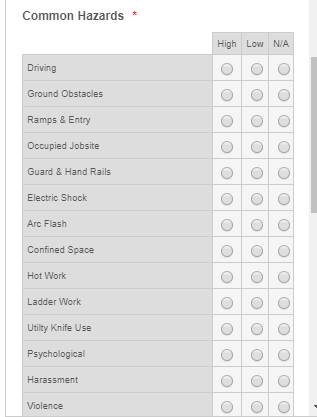
I have a form, Jobsite Hazard..., in it there is a table with radio buttons for the various hazard risks. Recently it looks bigger on screen and I lose the right column. I changed it a bit to make it narrower, but to no avail. Now it fits, but it crams up the words in the first column, and makes the radio button columns wider than necessary. I have tried many things, but it is not working for me. Note: it only does this on the phone preview (and my phone too).
Help!
Page URL: https://form.jotform.com/62877239781269 -
Nik_CReplied on April 11, 2019 at 1:48 AM
Could you please advise which column you would like to adjust:


The above images are viewed on the phone's resolution.
How would you like to adjust them?
Thank you!
-
ranxeroReplied on April 11, 2019 at 7:13 PM
I would like to be able to increase the size of the first column (the text). It seems to smoosh the first column and make the radio button columns too wide.
-
Kevin Support Team LeadReplied on April 11, 2019 at 9:26 PM
Try injecting the following CSS code:
#id_12 table tr td{
width: 10px !important;
}
Let us know how it goes.
-
ranxeroReplied on April 11, 2019 at 11:13 PM
Hi,
I tried the above CSS code. I think I put it in the right spot. It does seem to have changed. I cannot understand why it makes the first column so narrow, even breaking up individual words. I tried putting in a nbsp between words, and it just breaks it before the space.
-
Richie JotForm SupportReplied on April 12, 2019 at 1:15 AM
You may try these custom CSS
@media screen and (max-width: 480px), screen and (max-device-width: 768px) and (orientation: portrait), screen and (max-device-width: 415px) and (orientation: landscape)
{
th.form-matrix-column-headers
{
min-width: 10px !important;
}}
Sample Screenshot:
-
ranxeroReplied on April 12, 2019 at 9:34 PM
Thanks Richie_P,
Your code got it done.
- Templates
- Integrations
- INTEGRATIONS
- See 100+ integrations
- FEATURED INTEGRATIONS
 PayPal
- Slack
- Google Sheets
- Mailchimp
- Zoom
- Dropbox
- Google Calendar
- Hubspot
- Salesforce
- See more Integrations
- Products
- PRODUCTS
- Form Builder
- Jotform Enterprise
- Jotform Apps
- Store Builder
- Jotform Tables
- Jotform Inbox
- Jotform Mobile App
- Jotform Approvals
- Report Builder
- Smart PDF Forms
- PDF Editor
- Jotform Sign
- Jotform for Salesforce Discover Now
- Support


