


-
esponlineAsked on May 23, 2019 at 6:57 PM
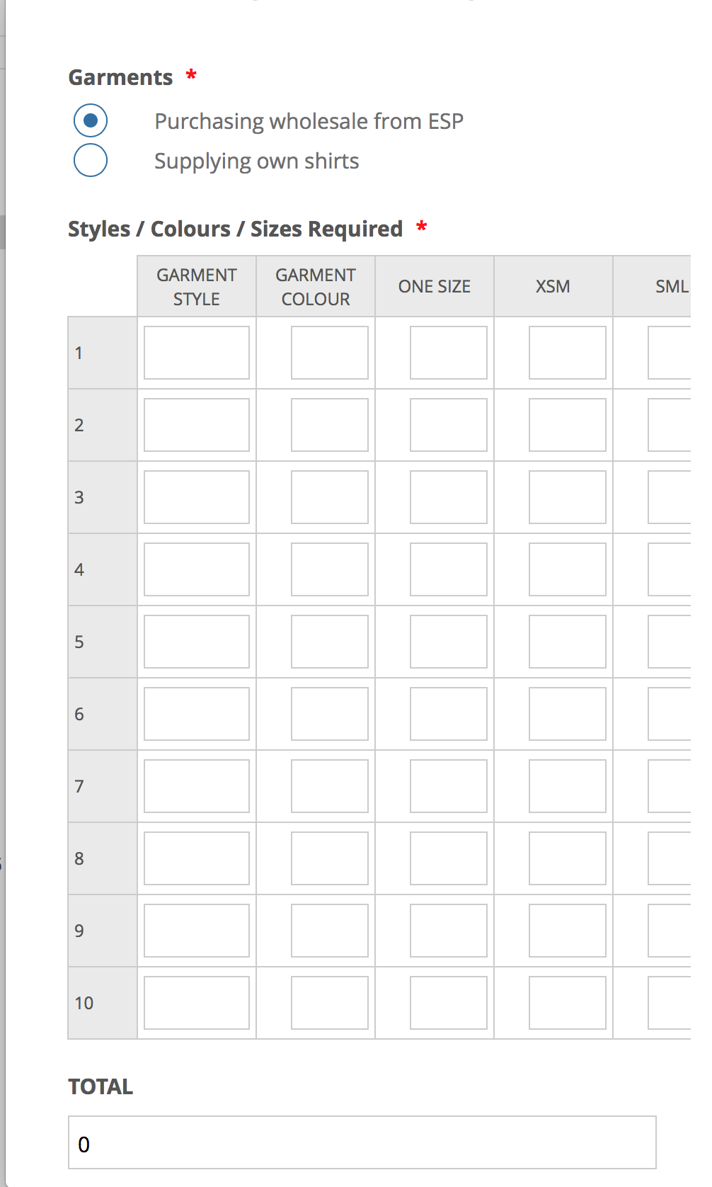
Managed to get our form looking great except for the input field product matrix we have created. It not so great on a mobile device. The form cuts off at size small and you cannot scroll or tab across on a mobile device. Any help?
While I'm at it any suggestions on how I can change the column width on the first two columns?
-
jherwinReplied on May 23, 2019 at 9:50 PM
Please get the CSS Code here: https://pastebin.com/raw/F3xfccwZ and inject it to your form.
Guide: How-to-Inject-Custom-CSS-Codes
Please give it a try and let us know how it goes.
Also, please tell us the device you are using so we can check it with the same.
-
esponlineReplied on May 23, 2019 at 10:03 PM
Thanks for that. I gave that a go and it's better, but still not ideal. Attached are a couple of screenshots from an iPhone in portrait and landscape. Is it possible to swipe left to reveal the additional sizes rather than the current coping out to keep the screen width?


-
jherwinReplied on May 23, 2019 at 11:26 PM
Do you mean to keep the width of text boxes and just allow the scroll to left? Please check this demo form: https://form.jotform.com/91427795297978.
-
esponlineReplied on May 23, 2019 at 11:33 PM
Perfect! That is the answer that I think to best work on a mobile
-
isabelReplied on May 24, 2019 at 1:55 AM
Thank you for your reply. If you need further assistance please let us know.
-
jherwinReplied on May 24, 2019 at 5:21 AM
Please replace the CSS code I gave you before with this:
@media only screen and (max-device-width: 480px){
.form-line {
padding-left : 0px !important;
padding-right : 0px !important;
}
.form-matrix-column-headers {
width : 10% !important;
text-align : left !important;
}
th.form-matrix-row-headers {
width : 10px!important;
}
th.form-matrix-column-headers {
min-width: 60px !important;
}}Guide: How-to-Inject-Custom-CSS-Codes
- Templates
- Integrations
- INTEGRATIONS
- See 100+ integrations
- FEATURED INTEGRATIONS
 PayPal
- Slack
- Google Sheets
- Mailchimp
- Zoom
- Dropbox
- Google Calendar
- Hubspot
- Salesforce
- See more Integrations
- Products
- PRODUCTS
- Form Builder
- Jotform Enterprise
- Jotform Apps
- Store Builder
- Jotform Tables
- Jotform Inbox
- Jotform Mobile App
- Jotform Approvals
- Report Builder
- Smart PDF Forms
- PDF Editor
- Jotform Sign
- Jotform for Salesforce Discover Now
- Support


