


-
crich8Asked on June 3, 2019 at 3:53 PMHi,
Here is the form link: https://form.jotform.com/91356208243151
The link you have is the one I am currently using where I embedded this
form.
I was able to fix the initial problem I had after some serious bugs with
the form editor. But now I want my Yes and No questions to be in 2 columns.
I believe they used to be in columns and were switched back to one. I have
set it to 2 columns in the editor I think it is just bugged right now.
Please see if you can fix this and help me optimize this form to look and
feel better. I can't seem to get the padding right on each part of the form
to make it easy for the user to fill it out.
Connor -
Richie JotForm SupportReplied on June 3, 2019 at 4:33 PM
I have checked your form and the yes or no choice are separated in to two columns. When viewed in the Desktop version.
To clarify, are you referring to the Mobile version?
You may add this custom CSS to align the yes or no question in once column.
@media (max-width: 480px){
.form-checkbox-item:not(#foo), .form-radio-item:not(#foo) {
width: 40%;
}
}Sample Screenshot:
Guide:https://www.jotform.com/help/117-How-to-Inject-Custom-CSS-Codes
Also, how do I make the answers bigger? I want the user to easily tap the
answer they want.Your font questions are large already. However, if you want to increase them you can do it in your Advanced CSS Designer.
Please give it a try and let us know if you need further assistance.
-
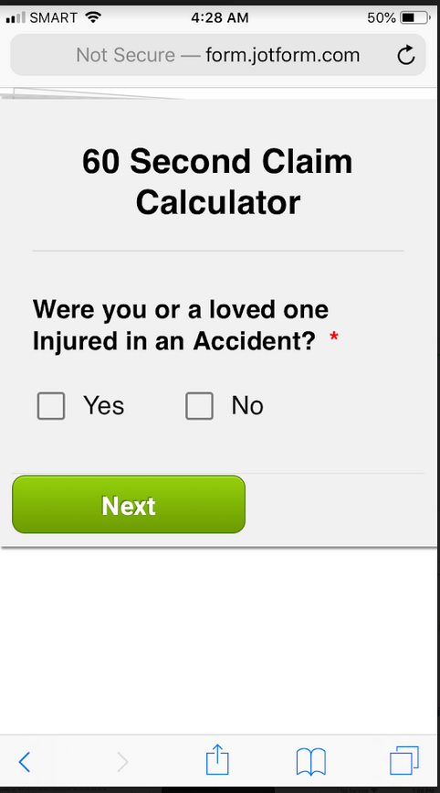
crich8Replied on June 3, 2019 at 5:43 PMYes, I want the Yes and No answers to be separated into two columns on
mobile.
I want to increase the font size and box size for the answers.
... -
Elton Support Team LeadReplied on June 3, 2019 at 7:47 PM
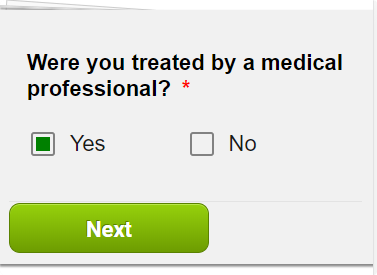
Please inject these CSS codes to your form. This should make the yes/no question side by side.
@media screen and (max-width:480px){
span.form-radio-item {
width: 50% !important;
box-sizing: border-box;
}
}
Guide: How to Inject Custom CSS Codes
Result:
With regards to the font size and the box size, I can see it's increased in size, do you still need them to be changed? If yes, can you specify which fields? Also which box you're referring?
-
crich8Replied on June 5, 2019 at 9:50 AM
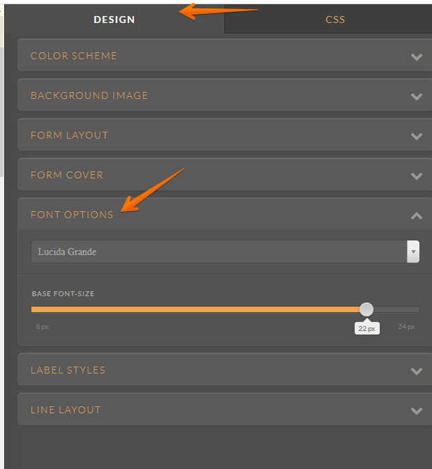
Thank you, I want the check box next to yes and no and the drop down bars to be bigger so it is easier for the user to click these. How do I do this?
Also, I want there to be more space between the next/back buttons and the dropdown bars. On mobile you can clearly see that they are very close to each other I want it to be more spaced out. I noticed that on the yes and no questions the space is fine. It is only a problem on the drop down and fill out questions.
-
crich8Replied on June 5, 2019 at 10:04 AM
Okay so I think I fixed it by making the button size block instead of large and I figured out how to increase the height of the dropdown bar.
Let me know if there is anything else I should do to make my form better for mobile, thanks.
-
crich8Replied on June 5, 2019 at 10:26 AM
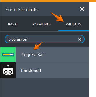
I can't seem to get the progress bar to work either.
-
Richie JotForm SupportReplied on June 5, 2019 at 11:40 AM
I have checked your form but I can't seem to find any progress bar.
You may add a progress bar in your form using the Progress bar widget.
Please give it a try and let us know if you have further questions.
-
crich8Replied on June 6, 2019 at 8:41 AM
Why does my form heading look like this on desktop? https://form.jotform.com/91356208243151
It looks fine on mobile.
-
crich8Replied on June 6, 2019 at 8:50 AM
I have been noticing a steep drop off in conversions the past few days and I can't seem to understand why this is happening. Do you notice anything wrong with my form?
-
Richie JotForm SupportReplied on June 6, 2019 at 9:41 AM
I have checked your form and it seems the header CSS for desktop view was not set.
Kindly remove your old custom CSS and replace it with:
@media screen and (max-width:480px){
span.form-radio-item {
width : 50% !important;
box-sizing : border-box;
}
#header_1{
margin-left: 0px !important;
}
}
#header_1{
margin-left: -240px;
margin-top: 30px;
}Guide:https://www.jotform.com/help/117-How-to-Inject-Custom-CSS-Codes
Sample form:https://form.jotform.com/91563780403962
Regarding a drop of conversion of your form, I can't seem to find any issue with your form except for the headers.
Please give it try and let us know if you need further assistance.
- Templates
- Integrations
- INTEGRATIONS
- See 100+ integrations
- FEATURED INTEGRATIONS
 PayPal
- Slack
- Google Sheets
- Mailchimp
- Zoom
- Dropbox
- Google Calendar
- Hubspot
- Salesforce
- See more Integrations
- Products
- PRODUCTS
- Form Builder
- Jotform Enterprise
- Jotform Apps
- Store Builder
- Jotform Tables
- Jotform Inbox
- Jotform Mobile App
- Jotform Approvals
- Report Builder
- Smart PDF Forms
- PDF Editor
- Jotform Sign
- Jotform for Salesforce Discover Now
- Support

