


-
StankaAsked on June 13, 2019 at 5:26 AM
Hello,
when embedding created form (script or iframe) to my website, the form isn't responsive/mobile friendly. I followed your instructions (https://www.jotform.com/help/311-Deprecated-How-to-Make-the-Form-Responsive-Using-the-Form-Designer-Tool) but I don't have the "Make this form responsive" option under "Form Layout" section. See image attached.Nevertheless the direct link works fine on mobile.
Regards,
Stanka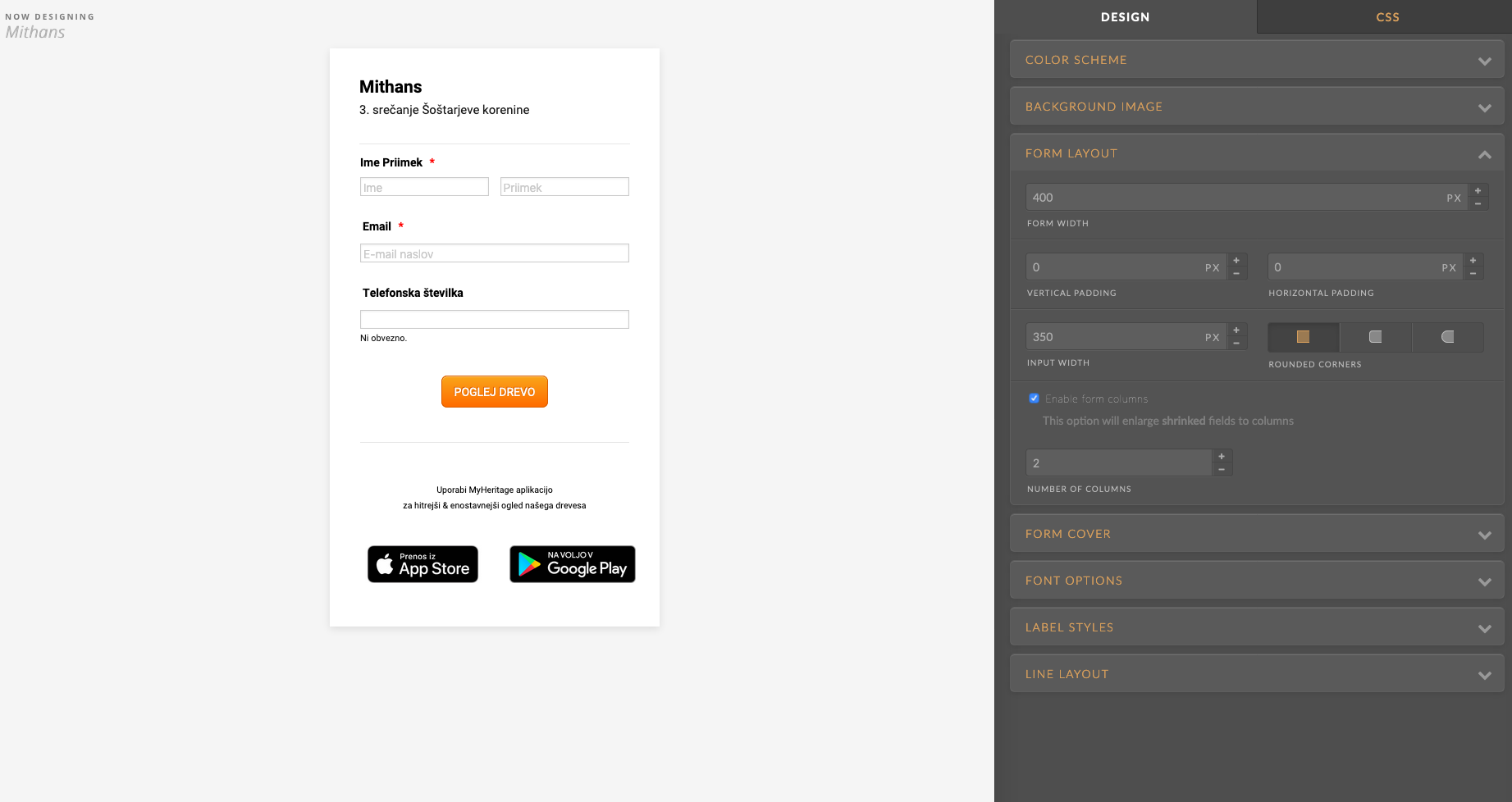
-
AndrewHagReplied on June 13, 2019 at 7:07 AM
Please note that the forms are by default mobile responsive. Could you please try embedding the form using its iFrame code?
Here is the guide: Getting-the-Form-iFrame-Code
Also, please share the URL of the web page if the above solution doesn't work.
-
StankaReplied on June 13, 2019 at 7:35 AM
I have tried with iframe and script and in both cases on my mobile I don't see a resposnsive mobile form
-
Ashwin JotForm SupportReplied on June 13, 2019 at 8:29 AM
I did test your embedded form in mobile device and it seems to be mobile responsive. Fields are displayed correctly. Please check the screenshot below:

If you view the embedded form in landscape mode, the fields size will adjust automatically.
How are you expecting the fields to be displayed?
-
StankaReplied on June 13, 2019 at 8:38 AM
How can that be responsive and mobile friendly if input fields are so small?!
Go to direct link with your mobile device and you will see the difference => this is how embedded code it should look like (img bellow), right? -
Ashwin JotForm SupportReplied on June 13, 2019 at 9:09 AM
Let me test this on what is causing it and will get back to you soon.
-
StankaReplied on June 14, 2019 at 7:40 AM
Hi Ashwin, have you found the reason?
-
Richie JotForm SupportReplied on June 14, 2019 at 9:02 AM
It seems the issue is with your HTML code when your embed the form.
Here is a screenshot of the error in the console log when viewing your web page.
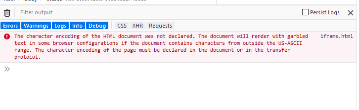
It seems you may have not declared any header,meta tag or body in your HTML.
Kindly try adding this HTML code in your web page
<!DOCTYPE html PUBLIC"-//W3C//DTD XHTML 1.0 Strict//EN"
"http://www.w3.org/TR/xhtml1/DTD/xhtml1-strict.dtd">
<html xmlns="http://www.w3.org/1999/xhtml">
<head>
<meta http-equiv="content-type" content="text/html; charset=utf-8" /><meta name="viewport" content="width=device-width, initial-scale=1, shrink-to-fit=no">
</head>
<body>
<Insert the Iframe Code here>
</body>
</html>
Please give it a try and let us know if the issue still remains.
-
StankaReplied on June 14, 2019 at 10:04 AM
Thank you. That solved the problem.
- Templates
- Integrations
- INTEGRATIONS
- See 100+ integrations
- FEATURED INTEGRATIONS
 PayPal
- Slack
- Google Sheets
- Mailchimp
- Zoom
- Dropbox
- Google Calendar
- Hubspot
- Salesforce
- See more Integrations
- Products
- PRODUCTS
- Form Builder
- Jotform Enterprise
- Jotform Apps
- Store Builder
- Jotform Tables
- Jotform Inbox
- Jotform Mobile App
- Jotform Approvals
- Report Builder
- Smart PDF Forms
- PDF Editor
- Jotform Sign
- Jotform for Salesforce Discover Now
- Support


