


-
MatheusAsked on July 25, 2019 at 8:08 PM
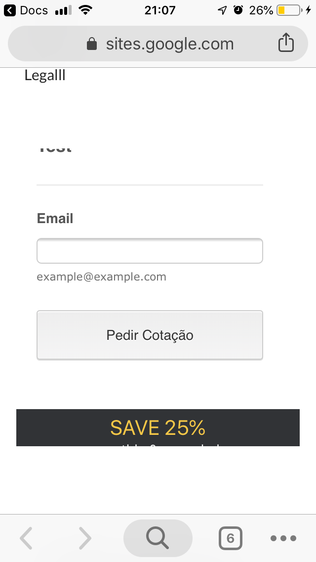
I’m testing several forms apps, but I really like jetform; however, whem I use it in a website created with the new google sites, the form gets buggy, part of the form doesn’t show up without scrolling, on mobile, specially on iPhone SE. Here is the website I’m using for test: https://sites.google.com/view/test-faorms-0/home
-
roneetReplied on July 25, 2019 at 9:53 PM
Could you please re-embed the Form using the iFrame code?
Go into your forms edit mode to get the Iframe code:
https://www.jotform.com/help/148-Getting-the-Form-iFrame-CodeNext use this iFrame code in your Google site:
https://www.jotform.com/help/533-How-to-Embed-Form-on-New-Google-Sites
Let us know how this goes.
Thanks.
-
matheuspaturyReplied on July 26, 2019 at 9:02 AM
I followed the link, https://www.jotform.com/help/533-How-to-Embed-Form-on-New-Google-Sites, replaced the script with the iFrame, and still getting the same results. The form height is bugged on mobile, and the form looks weird on desktop.
-
Vanessa_TReplied on July 26, 2019 at 12:10 PM
I tried embedding your form into my own test Google Site and was able to replicate the issue. I will further investigate this one and will get back to you as soon as I have an update.
-
Vanessa_TReplied on July 26, 2019 at 1:58 PM
Apologies for the late response. It seems that your last reply did not successfully post on our forum, so let me add it in here.

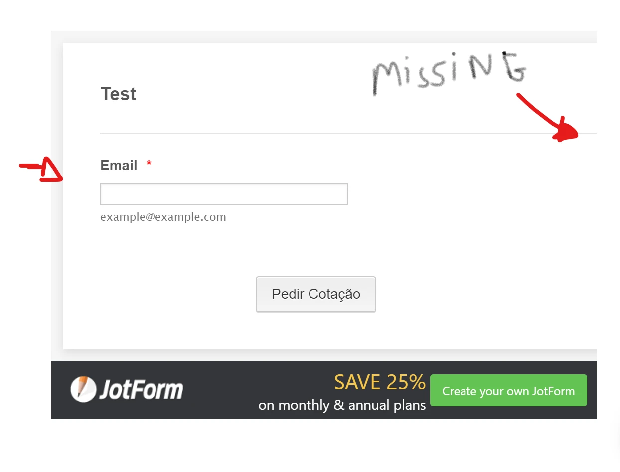
With regards to the missing borders, I was able to fix it on my end by adding a custom CSS to the form.
.form-all {
width: 100%;
}

However, for the scrolling part when viewed on mobile, unfortunately, this seems to be a limitation with the New Google Sites. Eventhough the form's height itself adjusts, however, Google Sites container is fixed and has scrolling enabled.
As a workaround though, you may try to adjust the height on Google Sites builder. You can set a longer height just like below, so when the form is displayed, it will not be restricted by Google Sites container height.
However, please note that this is just a workaround and depending on the complexity of the form that you're gonna make, manually adjusting the height might be cumbersome.

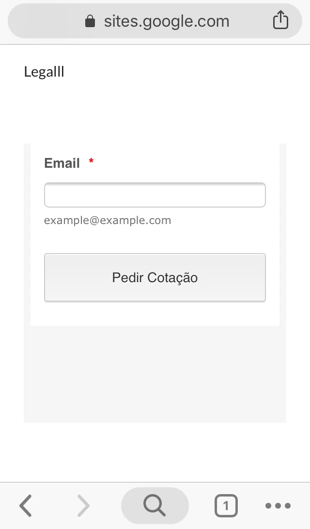
Once you're done with those changes, it should look like below on desktop and mobile.


- Templates
- Integrations
- INTEGRATIONS
- See 100+ integrations
- FEATURED INTEGRATIONS
 PayPal
- Slack
- Google Sheets
- Mailchimp
- Zoom
- Dropbox
- Google Calendar
- Hubspot
- Salesforce
- See more Integrations
- Products
- PRODUCTS
- Form Builder
- Jotform Enterprise
- Jotform Apps
- Store Builder
- Jotform Tables
- Jotform Inbox
- Jotform Mobile App
- Jotform Approvals
- Report Builder
- Smart PDF Forms
- PDF Editor
- Jotform Sign
- Jotform for Salesforce Discover Now
- Support


