


-
marystrachanAsked on July 26, 2019 at 11:09 AM
Hi,
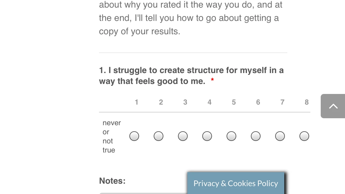
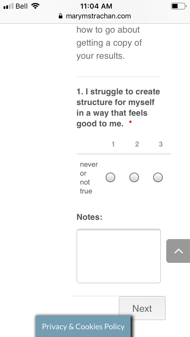
I've used Iframe to embed my form onto my site and just found out that it is not optimized for mobile use. I've attached two pictures for you to see. I've searched the forum and see that I many need to use some CSS and hope you could provide that for me. the first photo is of the form with me holding the phone horizontally, and the second is me holding the phone normally. Thanks. Mary
-
KrisLei Jotform SupportReplied on July 26, 2019 at 11:36 AM
Hello,
Have you tried using the Mobile Responsive Widget? Usually, this widget helps you to improve and optimize your form for mobile devices. You could also provide the link of your form for us to replicate the issue on our end and verify the necessary CSS codes if needed.
Let us know if you need further assistance.
-
marystrachanReplied on July 26, 2019 at 11:47 AM
Hi. So I added that widget, but it looks like some of my form is still cut off. My numbers go up to 10 and there's words missing on the right had side that tell them what 10 represents (like under the 1)

-
BJoannaReplied on July 26, 2019 at 1:13 PM
I assume that the issue is related to your The Assessment form. Is the issue only related to the Scale Rating field?
I was able to reduce the size of the field with CSS on my cloned form, but I also had to remove the Lowest and Highest Rating text.

The following CSS code has to be added to the form:
@media screen and (max-width: 480px) {
.form-scale-table th, .form-scale-table td {
padding: 9px 0px;
}
}
How to Inject Custom CSS Codes

If you want to keep the Lowest and Highest Rating text, I can only suggest you to reduce the number of rating options.
Another option is to use the Star Rating field.
-
marystrachanReplied on July 26, 2019 at 4:43 PMYes, that's the right form, but I have others that I use from 1 -10 as
well. I'll add the code and see what I think. Would the words not
being there only be on the mobile version or on the desktop too?
JotForm wrote on 2019-07-26 1:13 PM:
... -
VincentJayReplied on July 26, 2019 at 6:32 PM
It will affect the desktop version too if you remove the Lowest Rating Text and Highest Rating Text.
Is the issue resolved? If you do not want to remove the Rating Text, please try adding this custom CSS code:
@media screen and (max-width: 480px), screen and (max-device-width: 767px) and (orientation: portrait), screen and (max-device-width: 415px) and (orientation: landscape)
table td + td {
padding-left: 0% !important;
}
@media screen and (max-width: 480px)
.form-scale-table th, .form-scale-table td {
padding: 0px;
}
To add custom CSS code to your form, please follow this guide: https://www.jotform.com/help/117-How-to-Inject-Custom-CSS-Codes
Also, please share the website where you embedded the form so we can check it further and what mobile device you're using so we can also test it on our end.
We'll wait for your reply.
-
marystrachanReplied on July 26, 2019 at 7:43 PMWhen I added the code, the rating words still seem to show up on the
preview phone version. I'll double check it on a real phone but I think
it is resolved.
JotForm wrote on 2019-07-26 6:32 PM:
... -
knolltrainingReplied on July 30, 2019 at 2:26 PM
-
VincentJayReplied on July 30, 2019 at 2:58 PM
To avoid confusion, I moved your question to a new thread. Please check my reply on this thread: https://www.jotform.com/answers/1909394
Thank you.
- Templates
- Integrations
- INTEGRATIONS
- See 100+ integrations
- FEATURED INTEGRATIONS
 PayPal
- Slack
- Google Sheets
- Mailchimp
- Zoom
- Dropbox
- Google Calendar
- Hubspot
- Salesforce
- See more Integrations
- Products
- PRODUCTS
- Form Builder
- Jotform Enterprise
- Jotform Apps
- Store Builder
- Jotform Tables
- Jotform Inbox
- Jotform Mobile App
- Jotform Approvals
- Report Builder
- Smart PDF Forms
- PDF Editor
- Jotform Sign
- Jotform for Salesforce Discover Now
- Support


