


-
HealthyBoxxAsked on August 13, 2019 at 10:36 PM
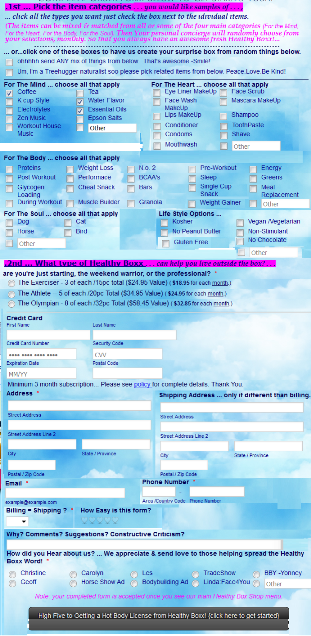
Hi... i'm trying to finalize this attached form,
there are a few things holding it up.
a) .. shipping address is supposed to be on same line as address
b) Life style options next to for the soul
c) ... speed loading & line spacing... so the website where i'm embedding the html code is telling me the form is too long... and when i tested the form with my focus group, they said the line spacing is making it difficult to read/follow the form. -- please HELP!
Thanks & Enjoy your day,
-Chris!
p.s. -- if the form is too difficult to read - please fix in the account.
thanks again
-
Jed_CReplied on August 14, 2019 at 4:01 AM
a) Shipping address is supposed to be on same line as address — Do you mean you want it to be vertically aligned. Currently, the field is on the right side of "Address" field. If so, you can unshrink the field check this guide https://www.jotform.com/help/328-How-to-Position-Fields-in-JotForm
b) Life style options next to for the soul — You can inject the CSS code below to reduce the Lifestyle Options field width.
li#id_8 {
width: 400px;
}
sample output:
c) speed loading & line spacing — As for your last concern, please share to us the exact URL where the form is embedded so we can check. Looking forward for your response.
-
HealthyBoxxReplied on August 14, 2019 at 10:43 AMsection a -- thank you - that worked.
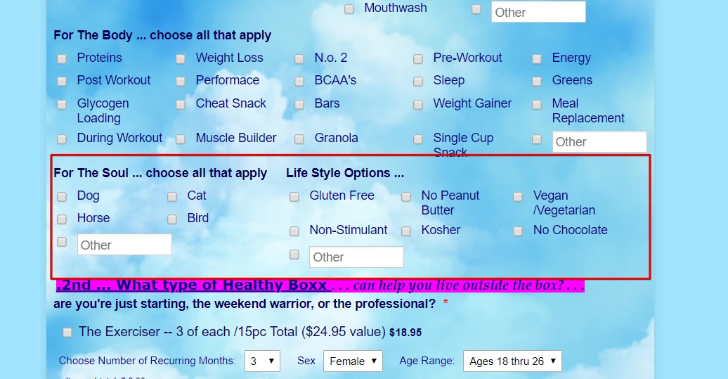
issue B -- no that is not what i mean... look at my attachement
i want the spacing between the lines very super tight...
like the lines almost on top of each other... line when you type in
word .95 line spacing.
issue C - speed loading... lets figure out the line spacing first.
thanks,
... -
Ivaylo JotForm SupportReplied on August 14, 2019 at 1:04 PM
I will work on a workaround and contact you later today.
-
HealthyBoxxReplied on August 14, 2019 at 3:43 PMok.- thanks!
... -
Ivaylo JotForm SupportReplied on August 14, 2019 at 6:36 PM
In order to decrease the space between options in the multiple choice field, please try the following CSS code:
li#id_8 {
width: 400px;
}
#input_8_4 {
margin-top: -2.5px;
}
#input_8_5 {
margin-top: -2.5px;
}
#input_8_2 {
margin-top: 10px;
}
#input_8_1 {
margin-top: 10px;
}
#input_8_0 {
margin-top: 10px;
}
#input_8_3 {
margin-top: -2.5px;
}
#other_8 {
margin-top: -2.5px;
}
Please give it a try and let us know, how it works for you.
-
HealthyBoxxReplied on August 16, 2019 at 11:43 AMno - this did not work.
... -
Kevin Support Team LeadReplied on August 16, 2019 at 1:20 PM
You may recude the space between the options with this code:
li#id_7 .form-checkbox-item, li#id_8 .form-checkbox-item {
margin: 0;
height: 20px;
}
Note that you can change the value in the height property in order to set the desired space.
Here's the result: https://form.jotform.com/92274866320965
-
HealthyBoxxReplied on August 16, 2019 at 10:18 PMKevin -- high five !!!!!!!! That worked awesome for the
check-boxes... it didn't work on the items for sale inside the square
cc processing frame... Can you PLEASE fix that too !??!
thanks,
Chris
... -
Jed_CReplied on August 16, 2019 at 11:36 PM
Please add the CSS code below:
span.form-product-item.hover-product-item {
margin-bottom: -10px;
}
If you want it more closer, increase the negative value of pixel.
Let us know if you have any questions or if you need further assistance.
-
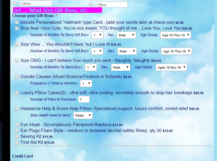
HealthyBoxxReplied on August 17, 2019 at 12:43 PMhi -- jed -- that worked great...
except for the drop down boxes... see attached.
...what is the code to raise those lines ??
for example ... under words "size Awe -How cute"
is the line "number of Months to Send Gift box " ....
.... how can i move THAT line that says Number of MOnths to SEnd gift box
closer to the check mark box...
AND
is it possible to move the line "Number of Months to SEnd Gift Box, etc."
5 spaces in, so that the word number is under the word Awe ? ... you know, so
its easier to see the drop down choices goes with that particular
check box sale item.?
THANKS - I greatly appreciate your Help!
... -
Mike_G JotForm SupportReplied on August 17, 2019 at 3:07 PM
It appears that the screenshot you tried to include in your last reply was not posted. Probably because you are replying from your email. To include a screenshot in your reply, please see the instructions in this guide — How-to-Post-Screenshots-to-Our-Support-Forum
Even without the screenshot, I managed to understand your requirements. Thanks to your description, I appreciate it.
As for the solution, please inject the following CSS codes into your form.
.form-product-item .form-sub-label-container {
margin: 0px -45px 10px 56px !important;
}
Here's how it will look like after.
Feel free to contact us again anytime if you need any further assistance.
-
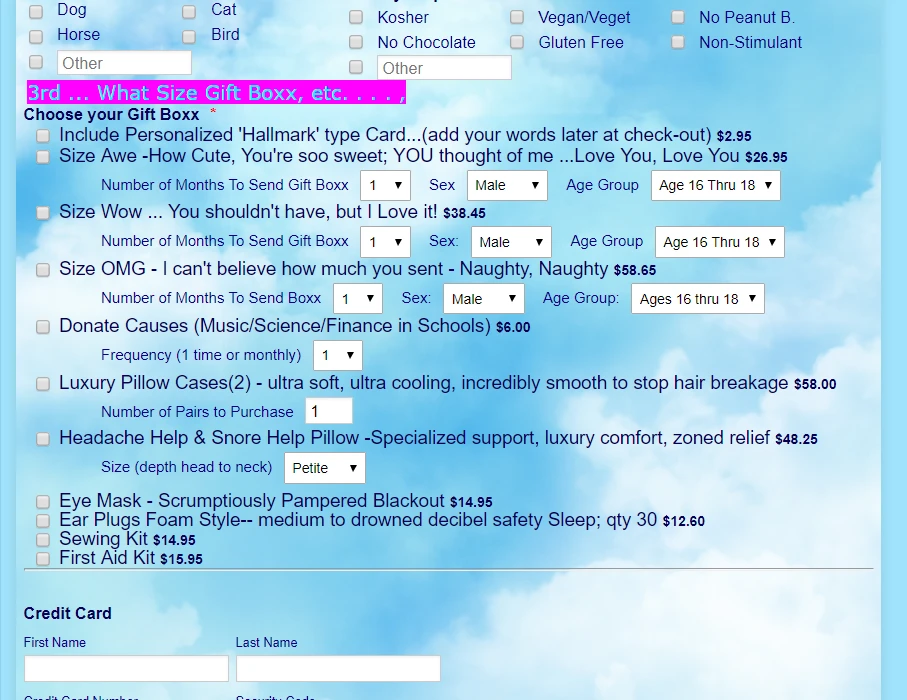
HealthyBoxxReplied on August 17, 2019 at 10:43 PMthanks mike - that worked !!!
there are 2 more things that need to be fixed in that section.
... i'm not sure of the word i'm looking for - padding? margin?
but the product items that have the drop down menu line.
... the drop down menu line and the space to the next product item
needs to be closer.
... so if you goto my site or see the published form...
i'm talking about
Size Awe, etc.
...number of months to send
[ space that needs to be made narrower, line instead of a 12px maybe a 8px]
Size Wow, etc.
... number of months to send
[space that needs to be made narrower, like instead of a 12px maybe an 8px ?]
............ issue 2 ........ lines squeeshed together like the rest of the form
for the following sections ...
the actual credit card box section
first name , last name
credit card security code
express date
... AND...
the actual address box section - the actual shipping box section
THANKS ! ENjoy yoru day!
... -
Jed_CReplied on August 18, 2019 at 12:36 AM
Ok. so you want the entire product items to be closer. Try the code below:
.form-product-item-detail {
margin-bottom: -3px;
margin-top: -6px;
}
#cid_9 > div:nth-child(1) > div > div > span:nth-child(1) {
margin-bottom: -10px;
}
Sample output:
I hope that helps. Let us know if you have any questions or if you need further assistance.
-
HealthyBoxxReplied on August 18, 2019 at 1:43 PMthat did NOT work... i'm going to open a new support ticket so i can
show you what i'm talking about...
...
- Templates
- Integrations
- INTEGRATIONS
- See 100+ integrations
- FEATURED INTEGRATIONS
 PayPal
- Slack
- Google Sheets
- Mailchimp
- Zoom
- Dropbox
- Google Calendar
- Hubspot
- Salesforce
- See more Integrations
- Products
- PRODUCTS
- Form Builder
- Jotform Enterprise
- Jotform Apps
- Store Builder
- Jotform Tables
- Jotform Inbox
- Jotform Mobile App
- Jotform Approvals
- Report Builder
- Smart PDF Forms
- PDF Editor
- Jotform Sign
- Jotform for Salesforce Discover Now
- Support


