


-
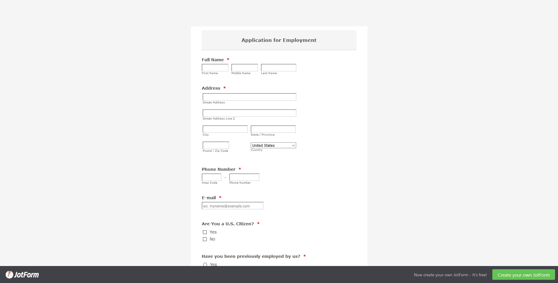
bsccp01Asked on August 14, 2019 at 6:42 PM
My form looks narrow on a computer, just right on a tablet, and too wide on my phone. Is there a way that it will resize? See the screenshot and how narrow it displays on my computer.
-
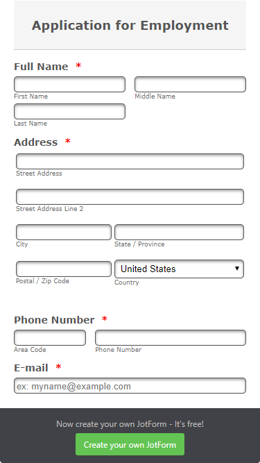
Elton Support Team LeadReplied on August 14, 2019 at 9:18 PM
You can inject this CSS code to your form so the form would expand on desktop based on its defined maximum width. You can change the maximum width value if you want to expand it more.
.form-all {
width: 100% !important;
max-width: 1000px;
}
Guide: How to Inject Custom CSS Codes
For the mobile, it should fit perfectly on the mobile screen. Example:
If you want to reduce its width on mobile, you can append this CSS code. Just change the 90% width value to your preference.
@media only screen and (max-device-width: 550px){
.form-all {
width: 90% !important;
}
}
Let us know if you need further assistance.
- Templates
- Integrations
- INTEGRATIONS
- See 100+ integrations
- FEATURED INTEGRATIONS
 PayPal
- Slack
- Google Sheets
- Mailchimp
- Zoom
- Dropbox
- Google Calendar
- Hubspot
- Salesforce
- See more Integrations
- Products
- PRODUCTS
- Form Builder
- Jotform Enterprise
- Jotform Apps
- Store Builder
- Jotform Tables
- Jotform Inbox
- Jotform Mobile App
- Jotform Approvals
- Report Builder
- Smart PDF Forms
- PDF Editor
- Jotform Sign
- Jotform for Salesforce Discover Now
- Support
