
-
ncaacaAsked on August 20, 2019 at 11:30 PM
https://www.jotform.com/build/92315327661153
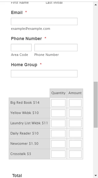
In mobile view the spaces for the quantity and amount can be smaller so the names/prices don't have to wrap
please advise
-
Jed_CReplied on August 21, 2019 at 2:42 AM
Try injecting the CSS code below.
@media screen and (max-width: 480px), screen and (max-device-width: 768px) and (orientation: portrait), screen and (max-device-width: 415px) and (orientation: landscape){
th.form-matrix-column-headers {
width: auto !important;
min-width: auto !important;
}
.form-matrix-row-headers {
min-width: 65px !important;
}
}
That should adjust the quantity and amount when viewed on mobile browser.
-
ncaacaReplied on August 21, 2019 at 10:26 PM
Thank you for that code. It is working better.
However there still is not space enough to fit the wording in on mobile in the matrix field. The words get wrapped in funny ways on a mobile view. Is there a way to use all of the screen space just for the matrix in mobile view? Move the element all the way to the left on mobile view only and fill the mobile screen?
Please be aware the problem is complicated by the fact that this form is embedded in https://form.jotform.com/92301208201136 as one of 4 payment methods.
see it at www.dc-aca.org/literature-order-form on your mobile device. Choose credit card to see the matrix part.
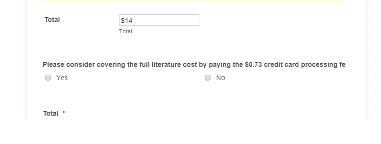
Also on the desktop version the question about credit card processing fees, under the matrix, is getting cut off because it is embedded. You can see this happen when you preview https://form.jotform.com/92301208201136 or the live embed. If you need to start another thread for this I understand. But since the CSS was on the same form, I wanted one tech to look at it in case any of the code conflicted with each other when solving these two problems.
brad
-
Jed_CReplied on August 22, 2019 at 9:25 AM
I just checked this thread again and found that you have updated your response after I marked it as answered (with your thank you response). Make sure to post your new response so it will be posted in the forum or I will be notified rather than editing the response.
Going back to your concern, I found that this form https://form.jotform.com/92301208201136 is using an iframe embed code as a multi payment option. I would suggest that you embed the CSS I've provided in my previous message to each widget's CSS tab.
ex.

Reference guide: https://www.jotform.com/help/428-How-to-Inject-CSS-Codes-to-Widgets
Please try that and let us know how it goes.
-
ncaacaReplied on August 22, 2019 at 10:49 AM
Will do on future posts.
I had already put that css into the main css part of the credit card form (embedded form) which fixed the column issue. And I added it to the widget as you suggested However it still does not make enough space for the names in the matrix.
I'd like to use as mush of the screen as I can for just the matrix so I can get as much of the text as I can on one line.
2nd question
On the desktop view the question about credit card fees (in the embedded form) is getting cut off.
Thanks
Brad
-
ncaacaReplied on August 22, 2019 at 10:51 AM
I did add the code to the widget as you suggested (see previous post for followup)
-
John Support Team LeadReplied on August 22, 2019 at 12:58 PM
Hi @ncaaca,
Please try using this code below:
@media screen and (max-width: 480px), screen and (max-device-width: 768px) and (orientation: portrait), screen and (max-device-width: 415px) and (orientation: landscape){
th.form-matrix-column-headers {
width: auto !important;
min-width: auto !important;
}
.form-matrix-row-headers {
min-width: 65px !important;
white-space: nowrap!important;
}
.form-matrix-table{
margin-left:-7px!important;
}
}
You were using 4 payment forms, right? I suggest injecting these code to each of the forms instead. Here's how it looks on my end:
Please try that and let us know how it goes.
-
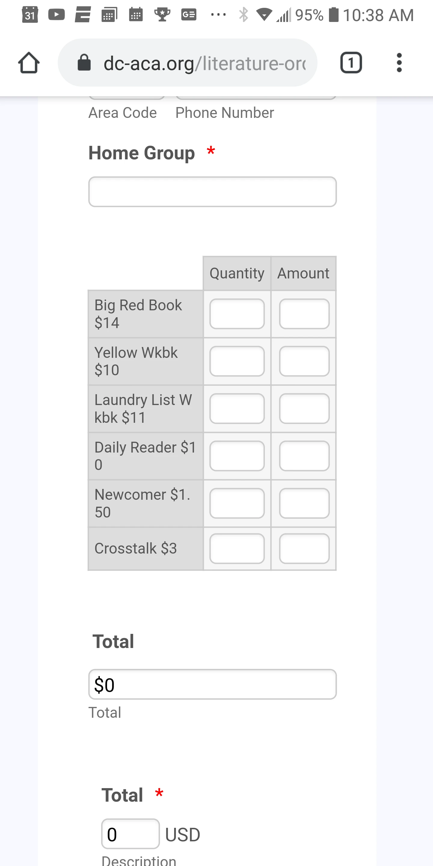
ncaacaReplied on August 22, 2019 at 1:11 PM
The matrix now runs off the screen on my phone.
I am testing on the live version. dc-aca.org/literature-order-form
I am only updating the credit card css so far as we test it. So please choose credit card to see what I am talking about. Here is my screenshot.

-
VincentJayReplied on August 22, 2019 at 2:46 PM
Please add this custom CSS code in the Credit Card form:
@media screen and (max-width: 480px), screen and (max-device-width: 768px) and (orientation: portrait), screen and (max-device-width: 415px) and (orientation: landscape)
.form-matrix-table {
width: 90% !important;
}
Here's a guide: How-to-Inject-Custom-CSS-Codes
I hope this helps.
-
ncaacaReplied on August 23, 2019 at 12:36 AM
This did not work but I did figure it out. I put left padding to 0x for the iframe, but just in the mobile view. That gave me the space that I needed.
- Templates
- Integrations
- INTEGRATIONS
- See 100+ integrations
- FEATURED INTEGRATIONS
 PayPal
- Slack
- Google Sheets
- Mailchimp
- Zoom
- Dropbox
- Google Calendar
- Hubspot
- Salesforce
- See more Integrations
- Products
- PRODUCTS
- Form Builder
- Jotform Enterprise
- Jotform Apps
- Store Builder
- Jotform Tables
- Jotform Inbox
- Jotform Mobile App
- Jotform Approvals
- Report Builder
- Smart PDF Forms
- PDF Editor
- Jotform Sign
- Jotform for Salesforce Discover Now
- Support