


-
bdoodleAsked on August 24, 2019 at 2:42 PM
I'm working on new versions of my live forms, trying to make them responsive.
https://www.jotform.com/build/92316762356966
The above is a link to a clone of my most important order form.
1.) All the form's buttons and all* my small input boxes and dropdowns at the bottom of the form fill the whole screen horizontally when I look at it on my iPhone 5 even though they look fine when I preview the form. (*Exception is phone number where I have width tag in CSS.) It's good that each field is on a separate line, but most should not be so wide. It goes without saying that my buttons should not be so wide.... (Note: my Submit button only shows up once a sail is ordered so you won't see it unless you enter a quantity above.)
2.) I added media queries at the bottom of my CSS to prevent the images in my purchase order from appearing on a mobile device and to appear smaller when viewed on a tablet. The images do disappear in preview mode for a mobile device, but not when I actually look at the form on my test page with my iPhone. I have not checked it on a tablet yet.
Can you please help?
Thank you!
-
MikeReplied on August 24, 2019 at 5:58 PM
The form takes the available size of the placeholder element. Since some elements of your website are set to 1000px the website and form look wide on the mobile.
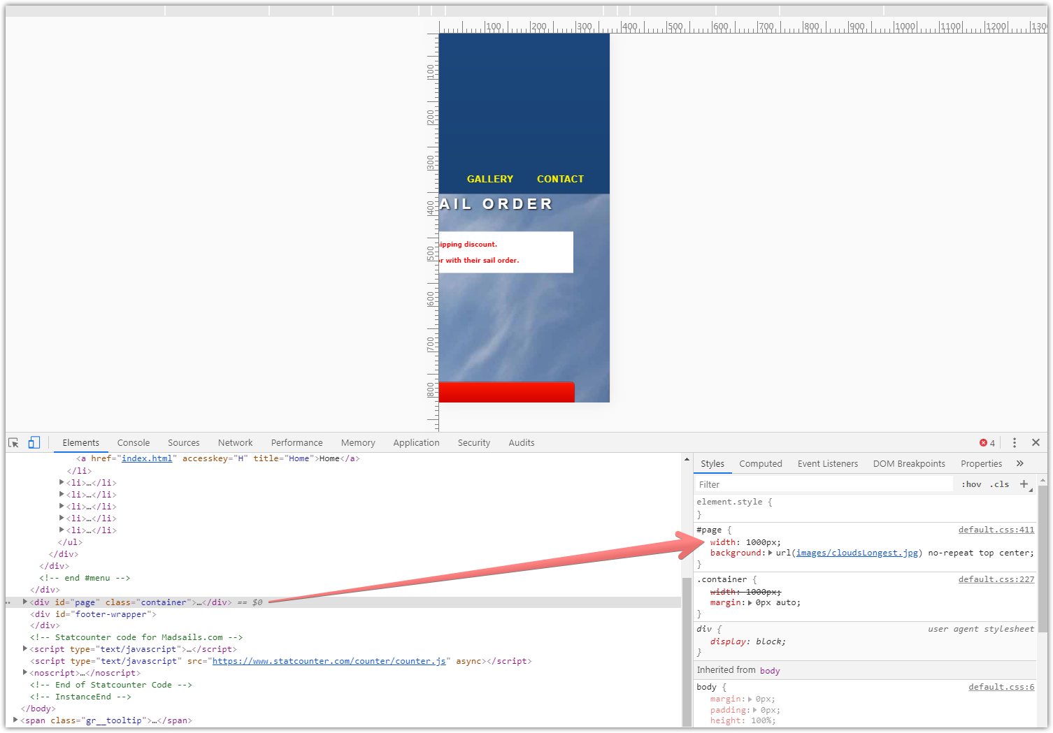
You may try applying some media queries to your website first to make it mobile friendly.
-
bdoodleReplied on August 25, 2019 at 12:33 PM
I think I fixed the issue on my webpage, but problem #1 described above remains. Must I specify explicit widths on all the fields and buttons to prevent them from being so wide? NOTE: I have made updates to the form and its CSS as well since I originally asked the question.
The problem doesn't seem to exist in Chrome and Firefox when I reduce screensize, but on Safari on my iphone, it does exist.
-
MikeReplied on August 25, 2019 at 1:50 PM
You may try adding the next CSS to the form to see if this is what you are looking for:
@media only screen and (max-width: 600px){
.form-line, .form-line.form-line-column {
width: initial !important;
}
}
-
bdoodleReplied on August 25, 2019 at 2:32 PM
Yes. That worked. Thank you so much!
- Templates
- Integrations
- INTEGRATIONS
- See 100+ integrations
- FEATURED INTEGRATIONS
 PayPal
- Slack
- Google Sheets
- Mailchimp
- Zoom
- Dropbox
- Google Calendar
- Hubspot
- Salesforce
- See more Integrations
- Products
- PRODUCTS
- Form Builder
- Jotform Enterprise
- Jotform Apps
- Store Builder
- Jotform Tables
- Jotform Inbox
- Jotform Mobile App
- Jotform Approvals
- Report Builder
- Smart PDF Forms
- PDF Editor
- Jotform Sign
- Jotform for Salesforce Discover Now
- Support
