-
bdoodleAsked on August 25, 2019 at 12:20 PM


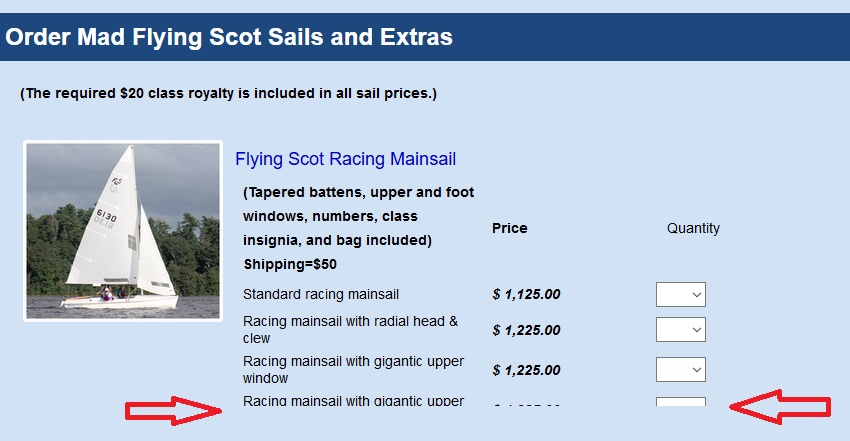
I'm trying to make my forms responsive. Several of my forms have products with subproducts. When the form is displayed on a device with a smaller screen, the bottom subproducts are overlaid by the product below. My sense is that the form-product-child-table needs some CSS to prevent this, but I don't know what to do. Can you help? Thanks!
Additional note: The truncation doesn't just affect the subproducts, but even the top labels of the product.

-
BJoannaReplied on August 25, 2019 at 3:18 PM
You can set the min-height of your products. However, you would need to use a different height for each screen resolution. Example:
.form-product-item {
min-height: 230px!important;
}
@media only screen and (min-width: 768px){
.form-product-item {
min-height: 400px!important;
}
}
-
bdoodleReplied on August 25, 2019 at 5:58 PM
Thank you. However, I don't think this solution does the trick. Screens smaller than 768 still show the bottom subproducts cut off. Also, this code causes excessive space between products on larger screens.
I tried the following instead:
.form-product-item-detail {
height: initial !important;
}With a quick look, I think it works. Do you think this code is correct?
Thank you.
-
David JotForm Support ManagerReplied on August 25, 2019 at 6:33 PM
That code is correct, I checked the form on my end, and found not issues with the products, they were still shown when resizing the browser window.
Let us know if you have more questions.
-
bdoodleReplied on August 26, 2019 at 6:12 AM
Thanks!
- Mobile Forms
- My Forms
- Templates
- Integrations
- INTEGRATIONS
- See 100+ integrations
- FEATURED INTEGRATIONS
PayPal
Slack
Google Sheets
Mailchimp
Zoom
Dropbox
Google Calendar
Hubspot
Salesforce
- See more Integrations
- Products
- PRODUCTS
Form Builder
Jotform Enterprise
Jotform Apps
Store Builder
Jotform Tables
Jotform Inbox
Jotform Mobile App
Jotform Approvals
Report Builder
Smart PDF Forms
PDF Editor
Jotform Sign
Jotform for Salesforce Discover Now
- Support
- GET HELP
- Contact Support
- Help Center
- FAQ
- Dedicated Support
Get a dedicated support team with Jotform Enterprise.
Contact SalesDedicated Enterprise supportApply to Jotform Enterprise for a dedicated support team.
Apply Now - Professional ServicesExplore
- Enterprise
- Pricing


