


-
bdoodleAsked on September 14, 2019 at 5:59 PM
I've been tweaking my form, trying to get subproduct data to look good on all screen sizes. Right now, the details are appearing below, not to the right of the product img that I've specified. When I have a small screen, I suppress the display of the img with @media CSS code and then, of course, I don't have a problem. But on a larger screen, the details should (and used to) appear to the right of the img. Please help me with the proper CSS code to fix this.
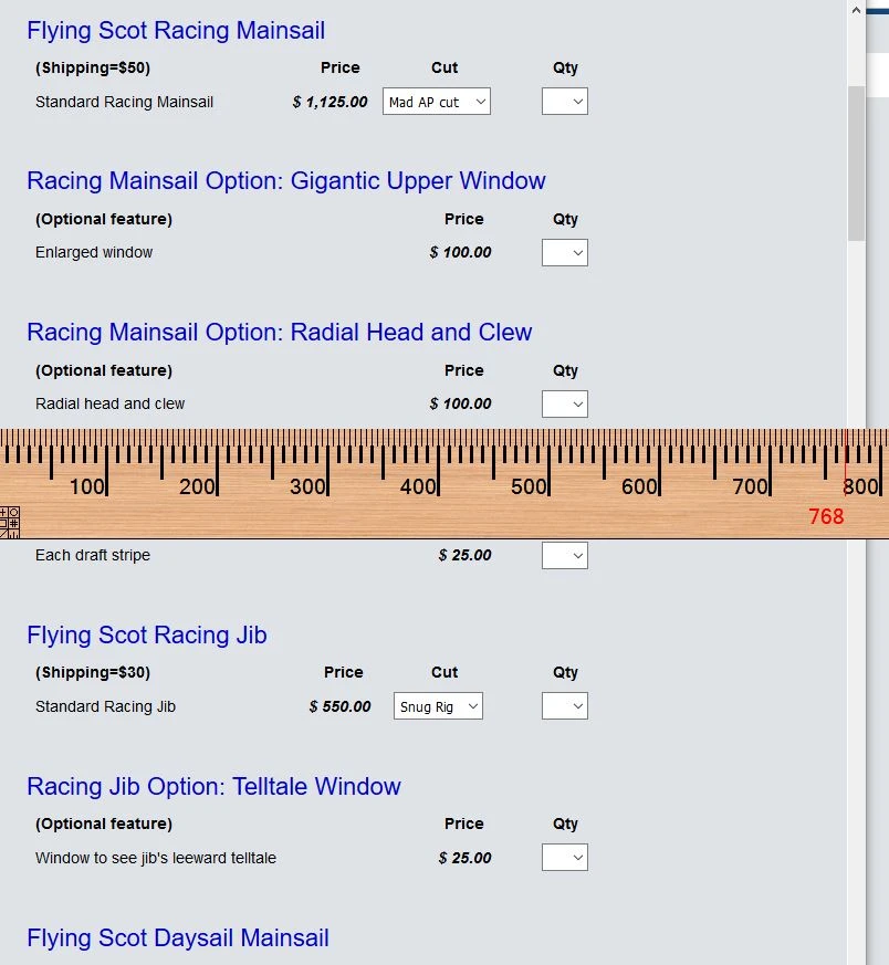
Screen larger than 768px:
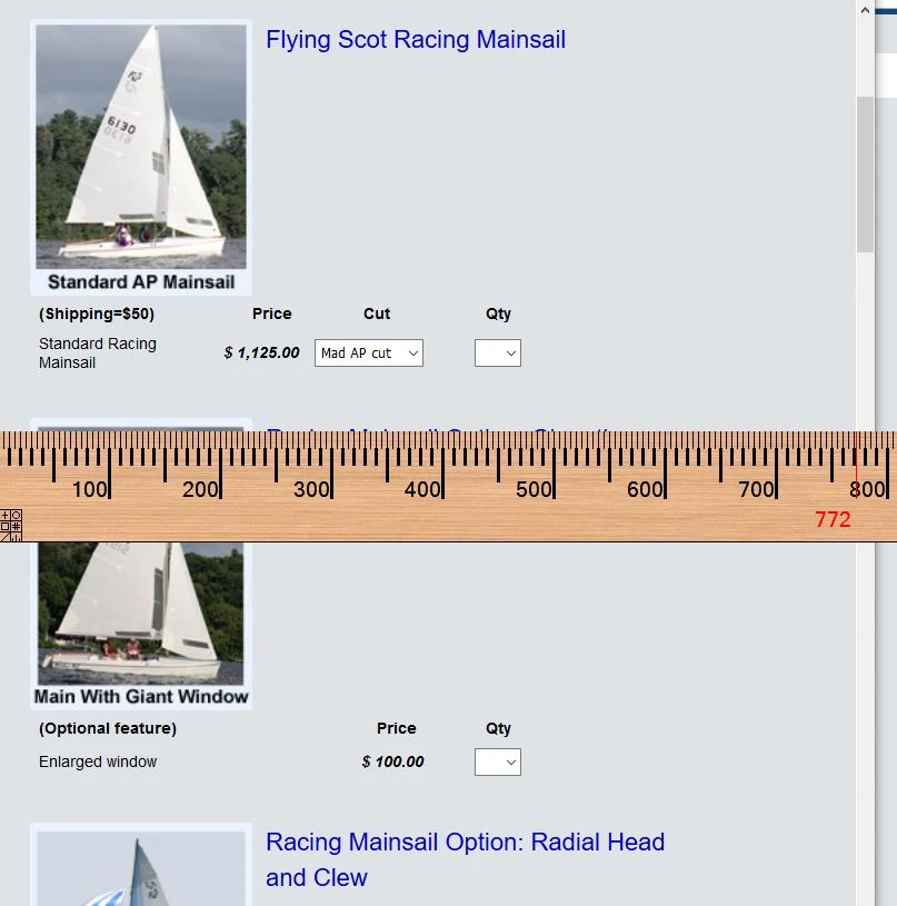
Smaller screen:
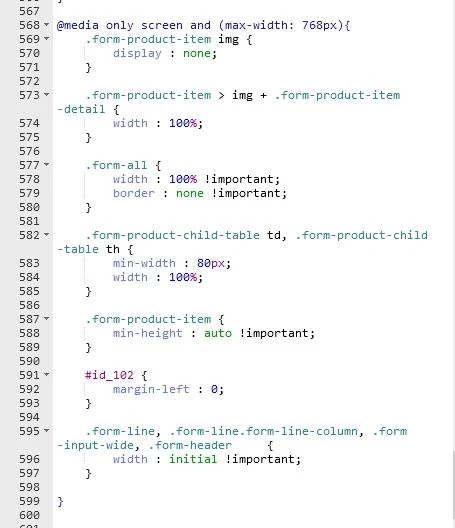
@media CSS:
Thank you.
-
Augustine_OReplied on September 14, 2019 at 7:07 PM
I can't seem to find your form in the link provided (https://www.madsails.com/Order_FS_sailsTest.html). Please, provide the direct link to the form to help us investigate this issue further.

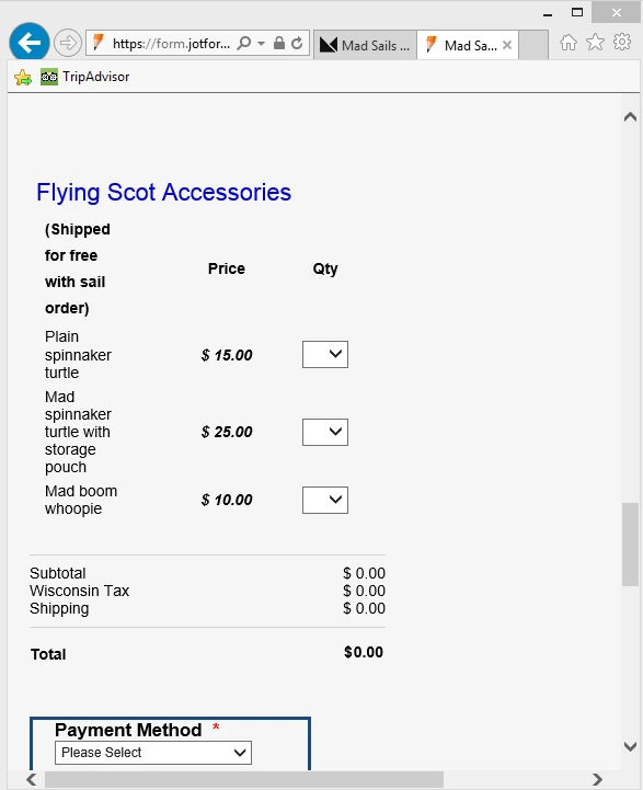
Nonetheless, I accessed one of your form (ID: 83393371242961) and the images seem to be aligned to the left as desired. See image below:

I believe this is the view that you want. If it's not you can let us know and please, provide the direct URL to the said form.
Thanks.
-
bdoodleReplied on September 15, 2019 at 10:32 AM
The above form is not the problem. I had a problem that prevented you from seeing the form I referred to that has been fixed now. Please take another look. Thanks!
-
David JotForm Support ManagerReplied on September 15, 2019 at 11:59 AM
"But on a larger screen, the details should (and used to) appear to the right of the img"
Did you fix it? I have checked it in my Laptop, and it looks to the right of the img:

Let us know if you need more help.
-
bdoodleReplied on September 15, 2019 at 4:09 PM
On my desktop, when I reduce the browser window size to see how the form looks at different sizes...
The text appears UNDER the product imgs all the time ON FIREFOX except when the imgs are prevented from appearing on a smaller screen size by my @media code
The text appears UNDER the product imgs only on some of the products and only when the screen size is a little larger than when the imgs disappear to about 1000px wide ON CHROME
The text appears UNDER the product imgs only on some of the products and only when the screen size is a little larger than when the imgs disappear (< 768px?) to about 900px ON IE. On IE, it also cuts off the details of the subproducts within that screen size range as well.
I'm not able to get my iphone/Safari to bring up the page just now because my reception is so bad.
-
Elton Support Team LeadReplied on September 15, 2019 at 6:07 PM
Inject the following in your form, this should help.
span.form-product-item > div {
float: left !important;
width: 70% !important;
display: inline-block;
}
-
bdoodleReplied on September 17, 2019 at 5:31 PM
Thanks. That fixes everything I found wrong except the cutting off of the subproduct details (that I mentioned above), on IE only, when the screen size is less that about 700px. I tried to fix that myself, but I failed. If you could help with the needed CSS to prevent this in IE, I'd appreciate it greatly. (I'm still not able to test with Safari.)
See example of problem below. The bottom subproduct in the purchase order starts to get cut off (see red arrow) when the screen is just < 700px (see blue arrow) and more and more is cut off as the screen size gets smaller.

-
David JotForm Support ManagerReplied on September 17, 2019 at 5:58 PM
Please inject the following CSS code:
span.form-product-item > div {
height: auto !Important;
}
That should solve the issue:
Let us know if you need more help.
-
bdoodleReplied on September 17, 2019 at 7:55 PM
Yup! That fixed it! Thank you soooooo much!
- Templates
- Integrations
- INTEGRATIONS
- See 100+ integrations
- FEATURED INTEGRATIONS
 PayPal
- Slack
- Google Sheets
- Mailchimp
- Zoom
- Dropbox
- Google Calendar
- Hubspot
- Salesforce
- See more Integrations
- Products
- PRODUCTS
- Form Builder
- Jotform Enterprise
- Jotform Apps
- Store Builder
- Jotform Tables
- Jotform Inbox
- Jotform Mobile App
- Jotform Approvals
- Report Builder
- Smart PDF Forms
- PDF Editor
- Jotform Sign
- Jotform for Salesforce Discover Now
- Support


