


-
abltAsked on October 10, 2019 at 5:13 AM
Hi,
When my forms are viewed in mobile, the words get cut at at random places to start the new line. Is there a way to make sure that the word starts on the new line instead of getting cut in half?
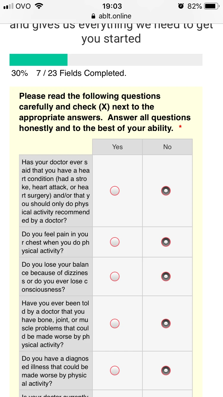
Please refer to the attached image for an example of this happening.
Kind regards,
Pierre
-
VincentJayReplied on October 10, 2019 at 5:53 AM
Hi,
Maybe we can try injecting custom CSS code to the form to adjust the width of the question text. Please share the form URL so we can check it further.
Here's a guide: https://www.jotform.com/help/401-Where-to-Find-My-Form-URL
We'll wait for your response.
-
abltReplied on October 18, 2019 at 12:42 AM
Thanks Vincent,
I replied to the email last week but it doesn't look like that goes through to you guys.
URL is: https://form.jotform.co/ablt/above--beyond-questionnaire
-
Jed_CReplied on October 18, 2019 at 3:24 AM
You can try the CSS code below:
@media only screen and (max-width: 480px){
.form-matrix-row-headers, .form-matrix-column-headers {
word-break: break-word;
}
}
This should not separate the text of the word in another line.
ex.

If you want the text in a single line, you can use the CSS code below.
@media only screen and (max-width: 480px){
.form-matrix-row-headers {
white-space: nowrap;
}
}

I hope that helps. Let us know if you have any questions or if you need further assistance.
- Templates
- Integrations
- INTEGRATIONS
- See 100+ integrations
- FEATURED INTEGRATIONS
 PayPal
- Slack
- Google Sheets
- Mailchimp
- Zoom
- Dropbox
- Google Calendar
- Hubspot
- Salesforce
- See more Integrations
- Products
- PRODUCTS
- Form Builder
- Jotform Enterprise
- Jotform Apps
- Store Builder
- Jotform Tables
- Jotform Inbox
- Jotform Mobile App
- Jotform Approvals
- Report Builder
- Smart PDF Forms
- PDF Editor
- Jotform Sign
- Jotform for Salesforce Discover Now
- Support


