


-
dctaxAsked on October 26, 2019 at 3:45 PM
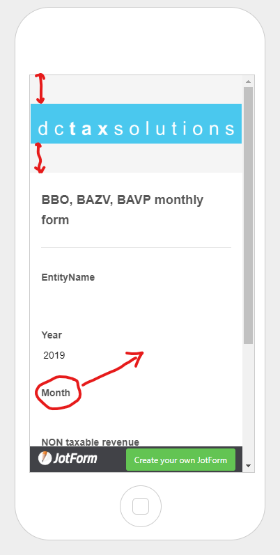
Using advice on custom CSS I was able to scale the logo. But still stuck with 2 issues.
1. I want to get rid of the grey background around the logo
2. How can I make sure the month field stays on the same row as the year?
-
Richie JotForm SupportReplied on October 26, 2019 at 8:20 PM
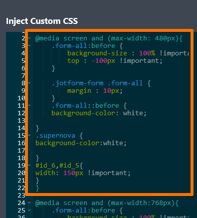
You may add these custom CSS inside your mobile media CSS block
.form-all::before {
background-color: white;
}
.supernova {
background-color:white;
}
#id_6,#id_5{
width: 150px !important;
}
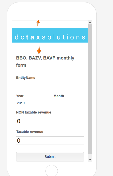
Please give it a try and let us know if you need further assistance.
-
dctaxReplied on October 27, 2019 at 9:30 AM
Thank you, the year and month fix is working. And the header background is no longer grey. But I should have formulated my question better ;)
On mobile, I want to shrink the height of the header to the height of the logo,not wasting screen real estate. Maybe even reduce line spacing a bit, so the whole form and submit button are 'above the fold'.
-
John Support Team LeadReplied on October 27, 2019 at 11:57 AM
Please try adding this code to your injected CSS:
div.form-header-group {
margin-top: -20px!important;
margin-bottom: -20px!important;
}
This would be the result:

-
dctaxReplied on October 28, 2019 at 8:19 AM
nope, not working for me. For now I set the background behind the logo back to grey, to make things visible. I want that grey background to shrink away, so only the logo in that header row shows.
-
Richie JotForm SupportReplied on October 28, 2019 at 8:54 AM
Unfortunately, it is not possible to shrink the height of the grey background.
We can however change the background to color to white.
.supernova {
background-color:white;
}
- Templates
- Integrations
- INTEGRATIONS
- See 100+ integrations
- FEATURED INTEGRATIONS
 PayPal
- Slack
- Google Sheets
- Mailchimp
- Zoom
- Dropbox
- Google Calendar
- Hubspot
- Salesforce
- See more Integrations
- Products
- PRODUCTS
- Form Builder
- Jotform Enterprise
- Jotform Apps
- Store Builder
- Jotform Tables
- Jotform Inbox
- Jotform Mobile App
- Jotform Approvals
- Report Builder
- Smart PDF Forms
- PDF Editor
- Jotform Sign
- Jotform for Salesforce Discover Now
- Support


