


-
RainspringAsked on January 17, 2020 at 6:53 PM
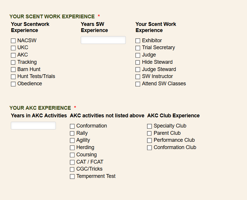
In this form:
https://form.jotform.com/200167313564146
when I set up the first configurable list, the columns are nicely distributed and it did it on its own.
when I did the second configurable list, it's crammed together instead of spread.
The CSS and other things related to spacing appear the same to me.
Help!
Page URL: https://form.jotform.com/200167313564146 -
Richie JotForm SupportReplied on January 18, 2020 at 7:11 AM
I have checked your configurable list and it seems to be aligned correctly.
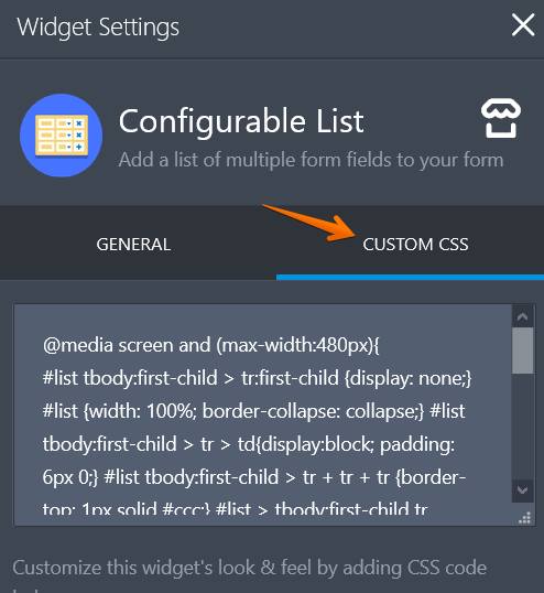
However, if you want the configurable list to be responsive.
You may use this custom CSS
@media screen and (max-width:480px){#list tbody:first-child > tr:first-child {display: none;} #list {width: 100%; border-collapse: collapse;} #list tbody:first-child > tr > td{display:block; padding: 6px 0;} #list tbody:first-child > tr + tr + tr {border-top: 1px solid #ccc;} #list > tbody:first-child tr td.col1 {padding-top: 20px;} .mobileColumnName {display: inline-block; padding-bottom: 4px; width: 40%; box-sizing: border-box;} .mobileColumnName + input, .mobileColumnName + textarea, .mobileColumnName + select, .mobileColumnName + .radio-container, .mobileColumnName + .checkbox-container, .mobileColumnName + .dateContainer {width: 60%; display: inline-block; box-sizing: border-box; vertical-align:top; box-shadow:none;} .buttonsColumn {text-align: right;}}Kindly add the CSS code inside your configurable list widget.
- Templates
- Integrations
- INTEGRATIONS
- See 100+ integrations
- FEATURED INTEGRATIONS
 PayPal
- Slack
- Google Sheets
- Mailchimp
- Zoom
- Dropbox
- Google Calendar
- Hubspot
- Salesforce
- See more Integrations
- Products
- PRODUCTS
- Form Builder
- Jotform Enterprise
- Jotform Apps
- Store Builder
- Jotform Tables
- Jotform Inbox
- Jotform Mobile App
- Jotform Approvals
- Report Builder
- Smart PDF Forms
- PDF Editor
- Jotform Sign
- Jotform for Salesforce Discover Now
- Support

