


-
YHA20Asked on February 10, 2020 at 9:45 AM
Hello, I have been getting a quirk on mobile devices when testing forms. It doesn't happen all the time but if I'm going to use these forms for check out and payments, they need to run perfect.
What happens is the fields are sometimes covered up and cannot be pulled up to fill out.
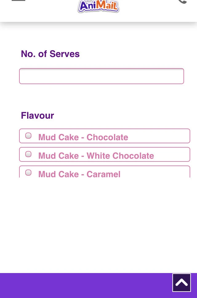
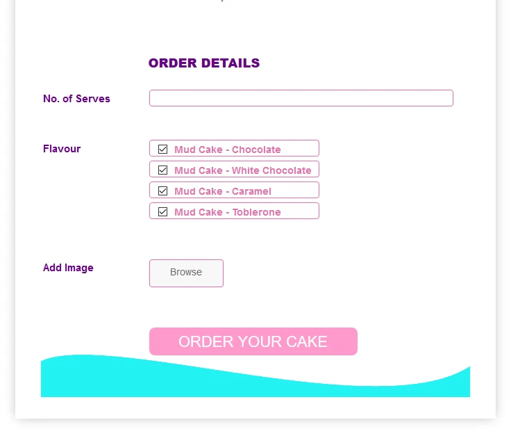
Screen shot of what happens:

Screen shot of what should happen:

I'm using a DUDA website builder and have tried to embed these forms by: EMBEDDING, IFRAME and using the DUDA platform app you provide with the same quirk occasionally happening with either. I have also tried turning off the "Quick navigation" on DUDA.
Any ideas?

-
BJoannaReplied on February 10, 2020 at 12:11 PM
Did you embed the form by following steps from this guide?
How to embed a form to Duda website builder?
Please provide us a webpage URL. Also, please tell us if the issue is related to some specific device or browser.
-
YHA20Replied on February 10, 2020 at 12:53 PM
Yes, I embedded using those steps.
The test page is at: https://rwarren663.dudaone.com/reindeer-co
-
Richie JotForm SupportReplied on February 10, 2020 at 3:05 PM
I am able to replicate the issue at my end using my mobile phone.
The issue could be with your web page not being responsive.
You may try adding this meta element in your webpage to make your viewport responsive.
<meta name="viewport" content="width=device-width, initial-scale=1.0">
Please give it a try and let us know how it goes.
-
YHA20Replied on February 10, 2020 at 5:05 PM
That did not do it :(
I'll just try and start another website and see if it happens there as well.
Thanks!
-
Jed_CReplied on February 10, 2020 at 8:20 PM
I checked the source code of your site and it doesn't include the meta tag provided by my colleague. Did you removed it or maybe you haven't saved it yet? Can you please try adding it again so we can test?
If you have already created another website, please share the URL so we can see.
Looking forward for your response.
-
YHA20Replied on February 11, 2020 at 9:26 AM
I just re applied the code. Let me know if it works on your end.
Maybe my mistake...(i had applied it yesterday to only the page. Today i placed it in the website header)
-
Richie JotForm SupportReplied on February 11, 2020 at 10:35 AM
I have checked your web page and it seems the form is mobile responsive at my end.

Please check your web page again and let us know if the issue still remains.
-
YHA20Replied on February 11, 2020 at 12:54 PM
It seems to be working so far, i'll keep testing.
So should I insert that tag into the new duda website when we build and launch the real one? Or do you think this happened from a quirk in the test site which we played around with a ton.
-
Richie JotForm SupportReplied on February 11, 2020 at 2:05 PM
I would recommend adding the meta tag to all your webpage that you would like to be mobile responsive.
If you have further questions, let us know.
-
YHA20Replied on February 11, 2020 at 4:17 PM
Well, it's happened again on the original test page, thought it might be the way i'm building a form from scratch. So i created a new test page (https://rwarren663.dudaone.com/post), put in the meta info, grabbed one of the stock JOTFORM templates and it is happening there as well, not letting the bottom of the form show. I just checked it on another phone and same thing. Thoughts?
Showing:
Should be showing:
-
Jed_CReplied on February 11, 2020 at 6:35 PM
Kindly try adding this CSS code to your form and see if that helps.
@media only screen and (max-width: 480px){
li#id_2 {
margin-top: 22px;
}
#id_20 {
margin-top: -25px;
}
.form-header-group .form-header {
padding-left: 1px;
}
}
Before:

After:

Let us know how it goes.
-
YHA20Replied on February 12, 2020 at 9:05 AM
So an update. After trying on DUDA all the fixes, it still kept happening. So I decided to try a webflow site and it happened initially but after inserting the meta tag in the head, it went away and seems to be working fine. Perhaps it has an issue with DUDA's rows or HTML box sometimes not expanding?
-
Richie JotForm SupportReplied on February 12, 2020 at 10:22 AM
Unfortunately, we are not familiar with DUDA rows however, that could be the issue.
The responsive meta tag is the basic step to add if you want your page to be mobile responsive however, it could be that DUDA has their own way to make the web page responsive. You may ask their support for more information.
- Templates
- Integrations
- INTEGRATIONS
- See 100+ integrations
- FEATURED INTEGRATIONS
 PayPal
- Slack
- Google Sheets
- Mailchimp
- Zoom
- Dropbox
- Google Calendar
- Hubspot
- Salesforce
- See more Integrations
- Products
- PRODUCTS
- Form Builder
- Jotform Enterprise
- Jotform Apps
- Store Builder
- Jotform Tables
- Jotform Inbox
- Jotform Mobile App
- Jotform Approvals
- Report Builder
- Smart PDF Forms
- PDF Editor
- Jotform Sign
- Jotform for Salesforce Discover Now
- Support


