
-
lritterAsked on February 25, 2020 at 8:56 AM
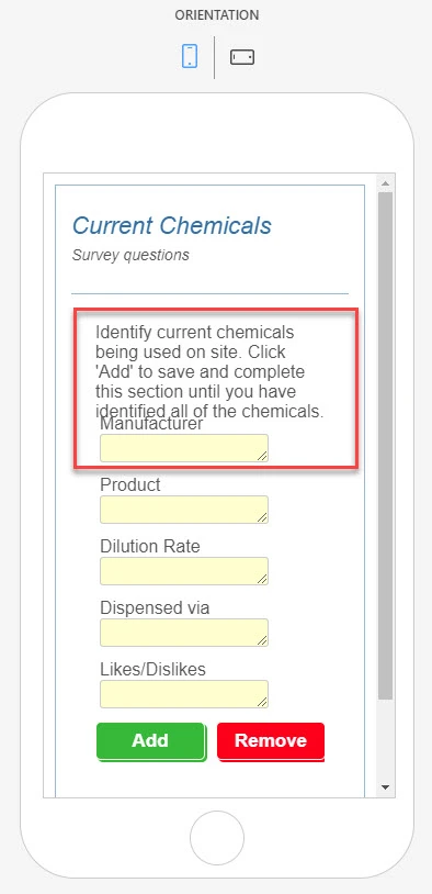
Hello! I'm having some challenges with fields not showing correctly in mobile/portrait view. Thank you in advance:)!
Page URL: https://form.jotform.com/200095956591159 -
BJoannaReplied on February 25, 2020 at 11:17 AM
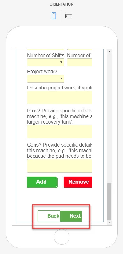
I can only replicate the issue with the page break buttons on my phone. To resolve it please add this CSS code to the form:
#form-pagebreak-back_245, #form-pagebreak-back_271, #form-pagebreak-back_306, #form-pagebreak-back_325, #form-pagebreak-back_335, #form-pagebreak-back_366 {
width: 80px!important;
}
pagebreak-next_271, #form-pagebreak-next_306, #form-pagebreak-next_325, #form-pagebreak-next_335, #form-pagebreak-next_366 {
width: 80px!important;
}
.form-all .form-pagebreak-back, .form-all .form-pagebreak-next {
padding: 9px 5px!important;
}
How to Inject Custom CSS Codes
To properly test the form please open it on an actual mobile device.
-
lritterReplied on February 25, 2020 at 12:53 PM
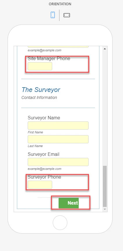
They are still a little too close to each other (Back and Next) on my mobile phone. On the Jotform portrait preview, they overlap, but that's not as important as an actual phone. If I can get them a little further apart, that would be great, but not critical.
Thank you!
-
Albert_GReplied on February 25, 2020 at 4:43 PM
Hi lritter,
In order to fix this, we need to do two things.
1. Remove this code from your CSS. This restricts the whole page break area to a small space. This is why they were getting up off the first time.
.form-pagebreak {
width : 50% !important;
margin-right : auto !important;
}2. Replace the code my colleague gave you with this. Instead of using padding, which is this space between the element's content and its borders. We will margin, this creates a space outside of the element's borders.
Please feel free to adjust the pixels (ie. 12px) of the margin as needed.
.form-all .form-pagebreak-back, .form-all .form-pagebreak-next {
position: relative;
margin: 12px;
}Please let us know if this helps.
Thank you.
-
Albert_GReplied on February 25, 2020 at 5:47 PM
Hi lritter,
In addition to the above, here's how to fix the other fields, please adjust as required.
Phone Field:
[data-type=control_phone] .form-sub-label-container:first-child {
width: 100% !important;
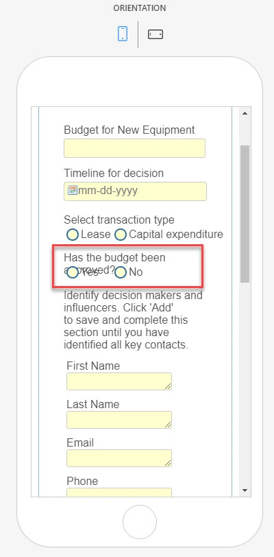
}Has the budget been approved and Demo site as company address radio:
@media only screen and (max-width: 600px) {
#label_326, #label_377{
padding-bottom: 25px!important;
}
}Configurable List Question (Add on Widget CSS):
@media only screen and (max-width: 600px) {
td.col1 {margin-top:15px;}
}Please let us know if you require further assistance.
Thank you.
-
lritterReplied on February 25, 2020 at 8:12 PM
Everything works perfectly except...
Configurable List Question (Add on Widget CSS):
@media only screen and (max-width: 600px) {
td.col1 {margin-top:15px;}
}It looked ok in portrait, but not landscape. However, instead, I removed the paragraph (question) from the Configurable List Widget and added it to a simple text field above the widget. I also adjusted the Widget question field to 0px
/*Adjust Height of Labels
in Configurable List Widget*/
#label_362,#label_368,#label_332,
#label_371,#label_372,#label_373 {
height : 0px!important;
}
Thank you so much for your help!
-
BJoannaReplied on February 26, 2020 at 2:03 AM
If I understood correctly all issues are now resolved.
Feel free to contact us if you have any other questions or issues.
-
lritterReplied on February 26, 2020 at 8:38 AM
Yes, thank you BJoanna!
- Templates
- Integrations
- INTEGRATIONS
- See 100+ integrations
- FEATURED INTEGRATIONS
 PayPal
- Slack
- Google Sheets
- Mailchimp
- Zoom
- Dropbox
- Google Calendar
- Hubspot
- Salesforce
- See more Integrations
- Products
- PRODUCTS
- Form Builder
- Jotform Enterprise
- Jotform Apps
- Store Builder
- Jotform Tables
- Jotform Inbox
- Jotform Mobile App
- Jotform Approvals
- Report Builder
- Smart PDF Forms
- PDF Editor
- Jotform Sign
- Jotform for Salesforce Discover Now
- Support