-
cory_cionvicaAsked on May 30, 2020 at 7:42 PM
-
Mike_G JotForm SupportReplied on May 30, 2020 at 7:58 PM
We will be glad to help you with your concern. When I view your form on a computer the Quantity fields on the payment field look like this.

On mobile, here's how it looks like on my end.

Can you tell us how would you like to position the quantity field in your form, please? Please give us more details.
We will wait for your response.
-
cory_cionvicaReplied on May 31, 2020 at 4:45 AM
Hi, I would like them to be one under another one, as you see some are more towards the left and others more towards the right
-
VincentJayReplied on May 31, 2020 at 8:56 AM
Please add this custom CSS code to your form:
.form-product-child-table td, .form-product-child-table th {
padding: 0px !important;
width: 20% !important;
}
.form-product-item .form-sub-label {
margin-right: 40%;
}
Here's a guide on how to add the code to your form:
https://www.jotform.com/help/117-How-to-Inject-Custom-CSS-Codes
-
cory_cionvicaReplied on May 31, 2020 at 9:40 AM
super it looks great now, thank you so much
-
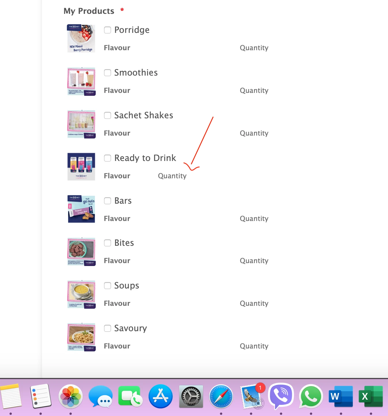
cory_cionvicaReplied on May 31, 2020 at 3:39 PM
this odd one is out of place and i have no idea why

-
Mike_G JotForm SupportReplied on May 31, 2020 at 5:07 PM
The issue can be fixed by injecting the custom CSS codes below to your form.
table#input_53_1002_subproducts {
width: 100% !important;
}
Please give it a try and let us know if you need any further assistance.
- Mobile Forms
- My Forms
- Templates
- Integrations
- INTEGRATIONS
- See 100+ integrations
- FEATURED INTEGRATIONS
PayPal
Slack
Google Sheets
Mailchimp
Zoom
Dropbox
Google Calendar
Hubspot
Salesforce
- See more Integrations
- Products
- PRODUCTS
Form Builder
Jotform Enterprise
Jotform Apps
Store Builder
Jotform Tables
Jotform Inbox
Jotform Mobile App
Jotform Approvals
Report Builder
Smart PDF Forms
PDF Editor
Jotform Sign
Jotform for Salesforce Discover Now
- Support
- GET HELP
- Contact Support
- Help Center
- FAQ
- Dedicated Support
Get a dedicated support team with Jotform Enterprise.
Contact SalesDedicated Enterprise supportApply to Jotform Enterprise for a dedicated support team.
Apply Now - Professional ServicesExplore
- Enterprise
- Pricing


